When I started Park Lore, I really hoped that this site would become the place on the Internet to read in-depth but accessible theme park and ride histories; a sort of deep dive library where you could get lost in the interconnected stories of Lost Legends, Declassified Disasters, Modern Marvels, never-built Possibilitylands, and more… I’ve also written hundreds of quick-read Extra Features, and dozens of in-depth Special Features reserved just for those who support this project with Memberships.
Three years and hundreds in-depth stories later, I’m still proud of those evolving stories… but I think I see a bigger picture now. As simple as it may seem, my Park Paths series and my Comparing Kingdoms diagram seemed to make a lot of people happy, and change the way they thought about the parks they know so well. Then, I hand-drew over a hundred detailed ride layouts, trying to create a cohesive, colorful collection that would help “paint the picture” of the parks in a new way.
Finally, following in the footsteps of the incredible S.W. Wilson of Ideal Build-out, I developed my own Blue Sky, armchair-Imagineered visions for how Disney California Adventure and Disney’s Hollywood Studios could (and in my mind, should) evolve, culminating in the design of my own from-scratch concept theme park – Disney Fantastic Worlds.
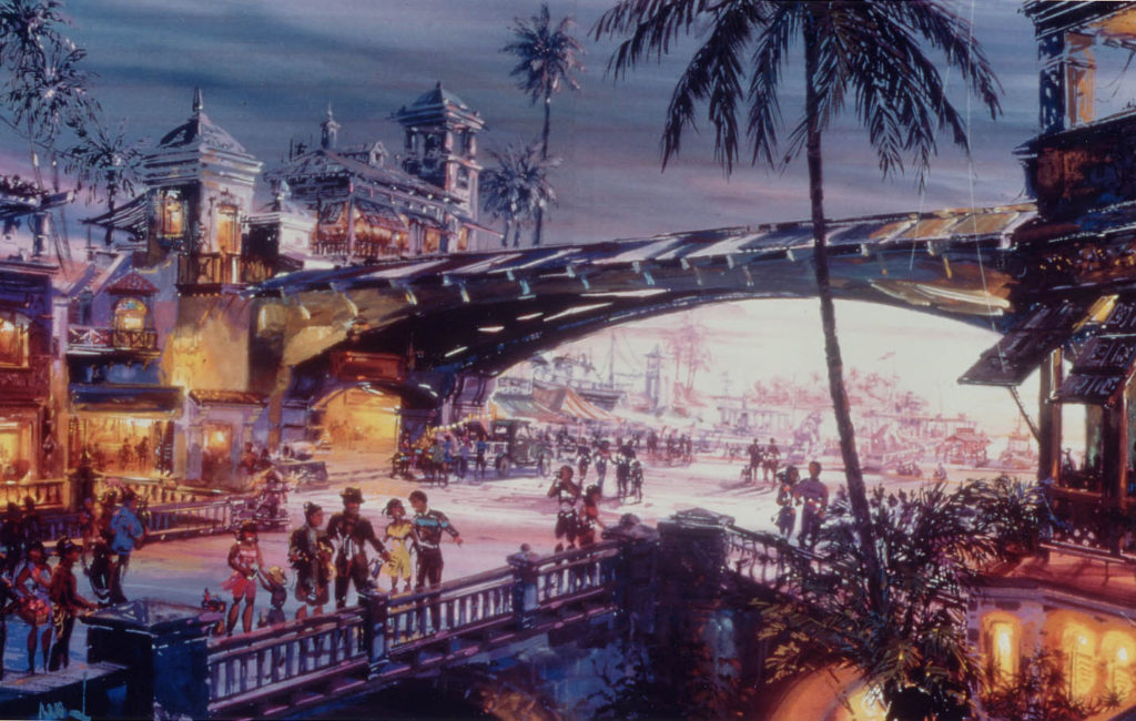
And now I think that maybe Park Lore’s purpose is more than just cataloguing history, but creating new ways to see the parks we know so well.
Weirdly, that inspired me to return for another armchair-Imagineered redesign of one of my favorite parks. Today, we’ll set course for Universal’s Islands of Adventure, envisioning what this park could look like at full build-out. As always, this is my interpretation of how I’d like to see Islands of Adventure evolve. It’s purely hypothetical, impossibly unlikely, and we’re talking about full build-out – like, a decade of non-stop expansion and billions of dollars. Put another way: it’s just for fun.
The quick tour of this built-out park can be found on my Twitter, but if you’re ready for the deeply reflective, in-depth written report with all my reasoning and thoughts laid bare, then settle in for a tour to the four corners of the world in my reimagined Islands of Adventure!
A Love Letter to “IOA”
I should start by saying that I absolutely love Universal’s Islands of Adventure. There are really two essential loglines that define the park:
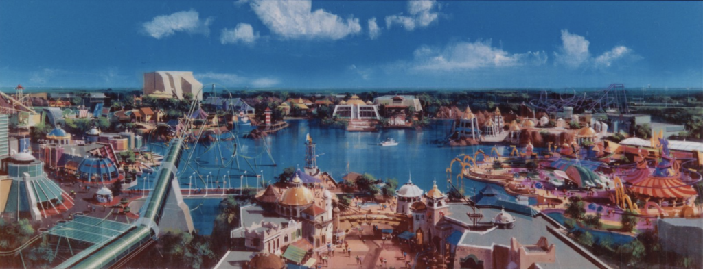
- That it was Universal’s first attempt to break away from the “studio” aesthetic of soundstages and backlots and interchangeable IPs and instead build immersive environments meeting and exceeding Disney’s standards, and
- That – sort of without even noticing how revolutionary it was – the park invented the “IP Land,” where an entire area of the park was wholly dedicated to a single intellectual property… a concept that the park then re-invented a decade later with the Wizarding World of Harry Potter, and that now serves as the industry standard. (So much so that my magnum opus, armchair-Imagineered, from-scratch new Disney Park, Fantastic Worlds, borrows the “IP Islands” concept and layout.)
Like all great parks, it seems that a dash of chaos theory is to thank for the park’s final form. Initially envisioned as a “Cartoon World” of licensed characters who could compete with Disney’s stranglehold on the family market, a falling out with Warner Bros. (who would’ve contributed DC Heroes and Looney Tunes) caused the park’s lineup to swerve.
The Hail Mary licensing of Marvel Super Heroes, the success of the Lost Legend: Jurassic Park: The Ride in Hollywood, and the development of from-scratch lands of legend maybe-kinda drawn from Disney’s cancelled Beastly Kingdom like a game of Telephone lead to a new park, with a new physical arrangement.
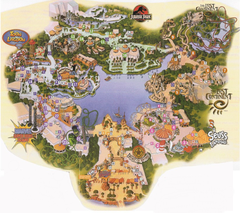
The final product – Universal’s Islands of Adventure – appeared at first glance like something of a grab bag of random intellectual properties arranged among six “islands”: Port of Entry, Seuss Landing, The Lost Continent, Jurassic Park, Toon Lagoon, and Marvel Super Hero Island. In the early days, Universal concocted some ridiculous expositional mythology as to how all these “islands” ended up situated together around a lagoon, but suffice it to say that as Spielberg taught us, sometimes not seeing is more effective.
There’s a brilliance to the way these “islands” butt up against each other; how they clash; how their unique visual languages are communicated by their very dissimilar shorelines when looking across the lagoon from any given point. They’re all “adventures.” They’re all “islands.” They’re nautical in name and concept. And that’s enough! I actually love how the bridges between each island serve as “jump cuts,” “flashing” guests between totally disconnected worlds. It works.
And more to the point, I’m so, so thankful that Islands of Adventure was built in the Goldilocks time that it was – after the “Ride the Movies” era had supercharged theme parks with new technologies and blockbuster budgets, but before the “IP Wars” of today. I think we take for granted that right now, in the Year of our Lord 2023, we have a top-10 theme park whose rides aren’t necessarily based on movies, but on stories.
Think about it: whether intentional or not, Islands of Adventure is fundamentally a literary park. Port of Entry is a pulp adventure; Seuss Landing, picture books brought to life; The Lost Continent is a land drawn from Greek mythology, the voyages of Sinbad the Sailor from One Thousand and One Nights, and Arthurian legend; Toon Lagoon, the “Sunday funnies” and comic strips; Marvel Super Hero Island is specifically the comic book interpretation of the characters, perhaps with a dash of Saturday morning cartoon. Even Jurassic Park and the later addition of the Wizarding World – while clearly based on movies – trace their roots to a sci-fi novel and a young adult fantasy book series, respectively.
That lends Islands of Adventure something that (arguably) no other Universal park has: timelessness. The stories, characters, and worlds it brings to life are, by design, evergreen and intergenerational, without the pressure to reflect whatever’s hot at the box office like its Studio sister.
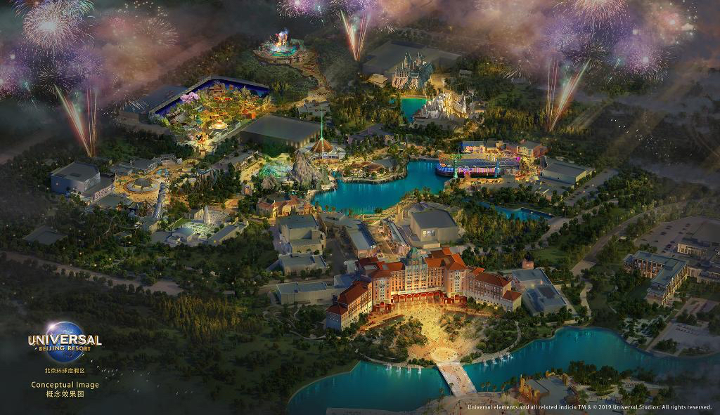
Seriously, to see what an Islands of Adventure would look like if it were built today, just look at Universal Studios Singapore or Beijing (above) – Universal’s two “post-IOA” parks that are both Studio parks in name, but Islands in arrangement with single-IP lands around a lagoon… Instead of timeless, evergreen, intergenerational stories, both parks make pretty clear analogous swaps for movies.
It goes to show that an “Islands of Adventure” today would almost certainly feature Hollywood instead of Port of Entry; Minions instead of Seuss; Transformers instead of Marvel; Kung Fu Panda instead of Toon Lagoon; even Jurassic World rather than Jurassic Park. And frankly, I don’t think I’d be inspired or changed or in love with that park.
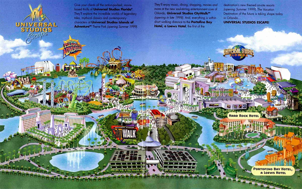
Timing aside, Islands of Adventure is lucky to be the only “Second Gate” in Universal’s portfolio, meaning it can leave Transformers and Minions and Fast & Furious and other movies to its Studio sister. The difference is apparent not just in the park’s built-in, permanent thematic infrastructure poured in scenic concrete, but in its actual offerings. Despite being only nine years younger than Universal Studios Florida, Islands of Adventure retains nearly every one of its Opening Day Original rides, whereas the Studios has only one left with its originals treated as transient attractions taking up swappable soundstages. At Islands of Adventure, there’s little pressure to stay tuned to box office receipts and “franchises.” I really like that.
So as we head off into my “built-out” Islands of Adventure, I want to be clear that you will not see Minions or Transformers or Shrek or Madagascar, because (insert claps between words) that’s not what this park is for or about. Yes I have added new rides, attractions, and even a few new lands. But overall, I wanted to strengthen Islands of Adventure’s timelessness, not replace it. This transformation is far less severe than my build-out of Hollywood Studios. But I do think if you love Islands of Adventure like I do, you’ll enjoy it.
Branding
A quick note on branding. When Islands of Adventure opened in 1999, it coincided with a fresh branding identity rolled out across the property as part of its all-at-once transformation from a single theme park to a multi-park resort destination. We chronicled the very costly mistake that was “Universal Studios Islands of Adventure at Universal Studios Escape” in our recent in-depth look at why Disney doesn’t seem too worried about their third attempt at overtaking Orlando, Universal’s Epic Universe.
Obviously, just after the new millennium, “Universal Studios Islands of Adventure” adopted the now-industry-standard possessive “Universal’s”. At that time, the wordmark in the park’s logo was altered (probably for legibility) and the subtly different logo was swapped out in marketing and at the park’s entrance – but aside from that swap, the logo hasn’t changed. It’s not a bad logo, capturing the pulpy, Indiana Jones-esque look in its wordmark and enclosing Universal’s iconic globe within a dimensional golden compass.
In 2017, Comcast deployed a new brand mark across its Universal division. The trickle-down effect meant that both Universal Studios Florida and the larger Universal Orlando Resort debuted new logos that dispensed with the style launched in the ’90s, cooling the color palate, pulling back the saturation, and reducing the texture.
Even the “modern” Universal Studios Florida and Universal Orlando Resort logo are far more dimensional than most modern logo updates, which basically amount to Helvetica wordmarks with an abstract icon if you’re lucky. But there’s no question that the new logo is still sleeker and more clearly of the 2010s as opposed to the former.
What’s weird is that Universal’s Islands of Adventure did not get a similar update. Which is fine. The park’s original logo still holds up, and because even the new the Universal Studios Florida logo is still quite dimensional and WordArt-y, Islands of Adventure’s doesn’t look too terribly out of sorts. My friend Mario Graciotti posted a great concept drawing of what both parks’ logos would look like if they were flattened and modernized using the same design language, and I think you could definitely go that route.
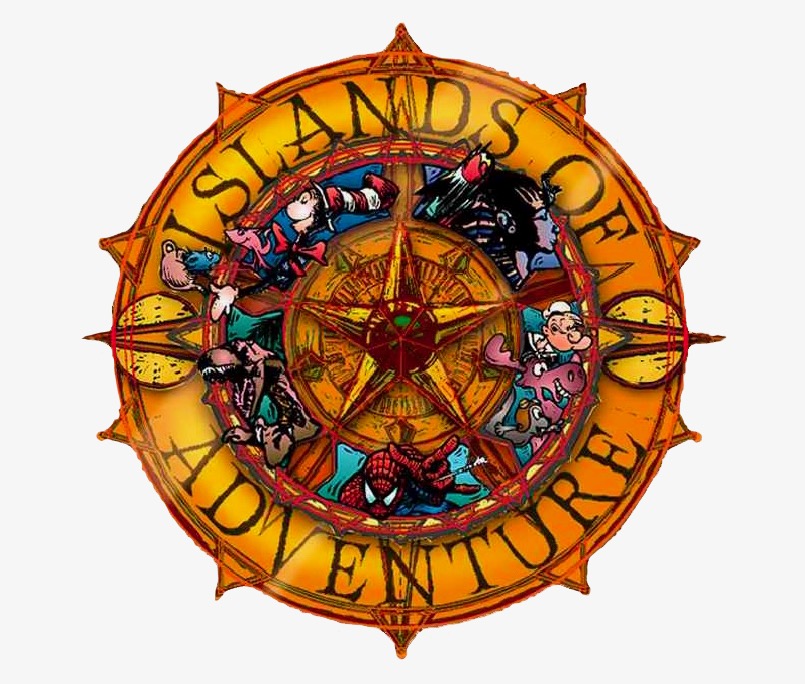
I instead went back in the archives. Several very cool, very weird logos were used at different moments in the development of the park, but the one above (used on documentation and likely clothes belonging to the project teams working on the park) is just so weirdly, perfectly modern that I just adjusted the colors and voila. It works as a full logo, and it also works as just a wordmark with the “compass” element pulled away. So I think a modern park logo is right under Universal’s nose, and I’m going to use it!
With that in mind as a sort of mood-setter, let’s head inside…
Port of Entry
Background
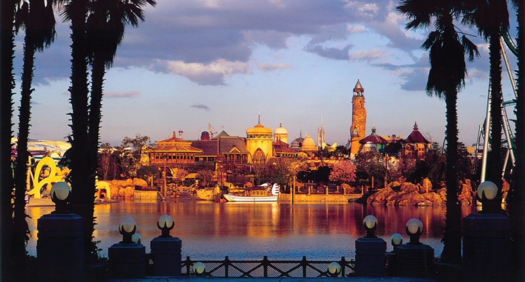
This is an easy one, because Port of Entry is pretty much perfect. It’s kind of surprising that in twelve Disney Parks, not one has touched this genre – an eclectic, fantastical, adventurous, literary village and nautical trading market. We’re meant to imagine that this crossroads of the world – somehow removed from any geographical place or time – is a harmonious port where adventurers, explorers, inventors, and travelers have brought their stories, cuisines, and architecture with them from the four corners of the globe.
The result is a sprawling village of windmills, pagodas, stone temples, stucco, thatched roofs, domes, and more, representing building styles from around the world.

In some of the most beautiful music ever composed for a theme park, Port of Entry is brought to life by a score of chimes, gongs, drums, claps, castanets, flutes, violins, and sea birds. Yes it’s the park’s “Main Street,” but Port of Entry also winds a bit, using overhead bridges to conceal vistas, break the street into thirds, and encourage onward exploration rather than ending in a single, domineering structure that would glue eyes, cameras, and feet forward, missing the details along the way.
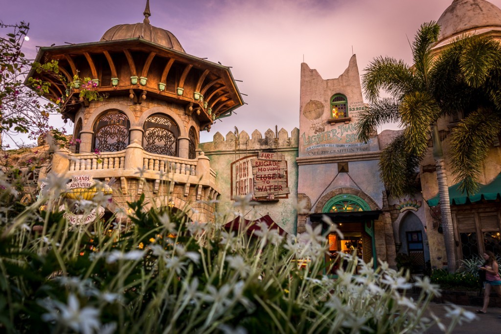
This is the perfect first land for Islands of Adventure. It’s highly distinct for a park that needed to prove its difference from its older sister; it’s about dissimilar things coming together, reflecting the park to come; it’s wholly original; and narratively, it’s our place to gear up, fuel up, and prepare for adventure in the morning, before returning to its comfortable, warm streets by night, following the beam of the Pharos Lighthouse home. That’s a powerfully complete solution to a whole lot of needs.
Build-Out
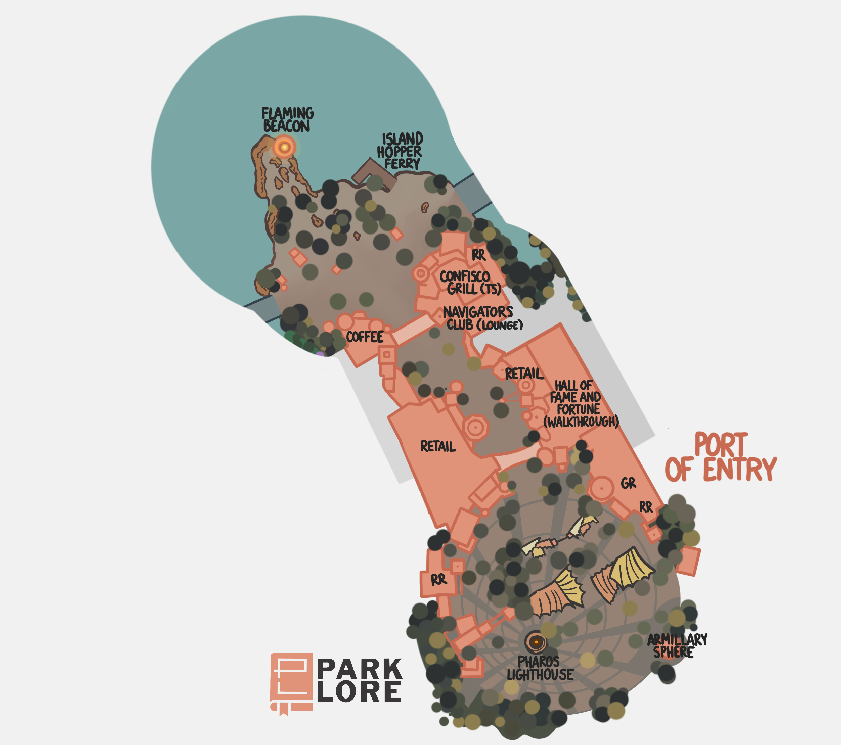
I think Port of Entry has one of the most striking entry sequences since Disneyland’s wrought iron gates and train station on a hill. The clever notion of placing the park icon outside of the gates (with PHAROS LIGHTHOUSE beckoning visitors opposite Universal Studios Florida’s complementary Studio Gates) is made even stronger by the park-like woods and rocky coastline that surround it and the iconic yellow and orange clamshell tarps that shield the ticket area and turnstiles, looking very nautical and saturated and fantastic. Even more clever is that, from above, the pavement here look like an aureole of light emanating from the Lighthouse, which is just too cool.
There are just a few finishing details I’d add here. The first is the addition of a bronze ARMILLARY SPHERE outside the park. The entry sequence at Islands is a mirror image of that for the studios, including twin checkered bridges that lead to each park’s respective icon with a circular cutout at the end. The cutout at the Studio holds the iconic Universal globe; the cutout at the Islands side just holds a planter with a compass rose in the pavement around it. I’m almost certain I’ve seen concept art or a model that had a bronze device of equal size to the Universal globe in this spot, and I think restoring it would echo the smart mirrored relationship between the two parks.
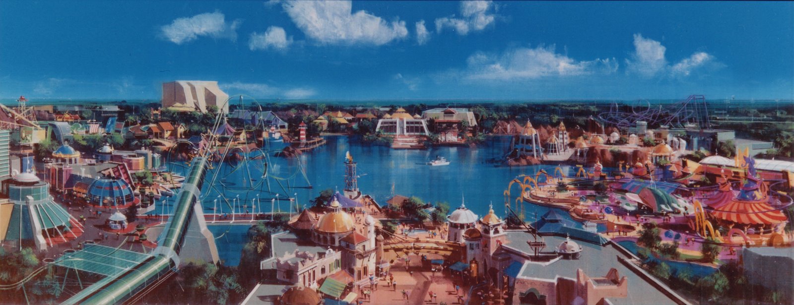
Likewise, while I wouldn’t relocate the Pharos Lighthouse to deeper in the park, I do think that a “weenie” of some sort should appear when you round the bend in Port of Entry. In theory, I think that was meant to be the Jurassic Park Discovery Center, but grown-in trees now essentially have Port of Entry terminate in a negative space.
Late stage concept art (above) showed a sizable FLAMING BEACON at the end of the rocky peninsula that juts into the lagoon. It was clearly cut late into development, but I think the time is right to have a second, proto-lighthouse on the coast – perhaps even with a few steps up to an observation story overlooking the lagoon.
As with most “Main Streets,” there’s little to change within the land itself – especially since there’s little space to add much. For example, I wouldn’t change a thing about CONFISCO GRILLE (one of two table service restaurants in the park), set in the land’s customs building and thus cleverly drawing elements from every other island as if they’ve been confiscated (hmmm…) from past travelers.
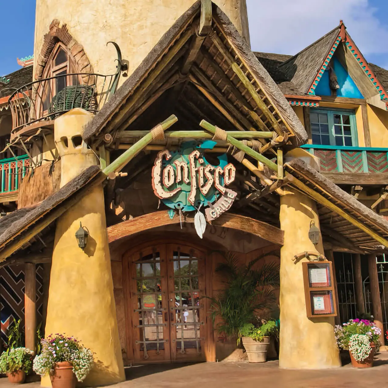
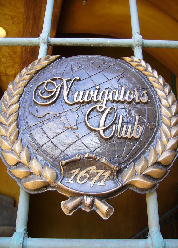
The one space that would lend itself well to reimagining is the second story above Confisco… Accessing the second story of a “Main Street” is cool enough, and the promise of inhabiting the top floor of Port of Entry’s eccentric architecture is even cooler. But the real excitement here comes from an intriguing metal gate and bronze marquee blocking the stairs from public access. A bronze, tilted globe ringed in a laurel wreath reads: “Navigators Club. 1671.”
For many years, the Navigators Club was a space fans loved to mythologize about. You can understand why. The name and its location insinuate that Islands of Adventure contains some sort of venue with the exclusivity of Club 33 and the theatrics and mythology of the Lost Legend: The Adventurers Club, all hidden among the second floor of a very cool, original land. The truth is… well…
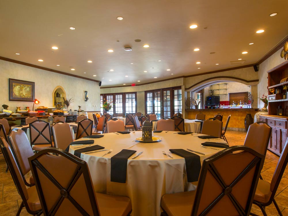
Actually, the Navigators Club is a fairly bland, rentable event space with tile floors, banquet tables, and modern recessed lighting. Over the years, it’s served as an “exclusive” dining room for Annual Passholders (even though, frankly, the regular Confisco Grill interior is much more elaborate) and today, it seems to be used as overflow dining for Confisco whether you’ve got an Annual Pass or not.
Easily the best parts of the “Navigators Club” are the tables placed in the open air patio of the large pagoda that overlooks the Backwater Bar and Seuss Landing. The rest feels like it’s ready for a bar mitzvah or baby shower with only the lightest of “adventure” decor and flatscreen TVs looping ads for Universal Express and backstage tours.
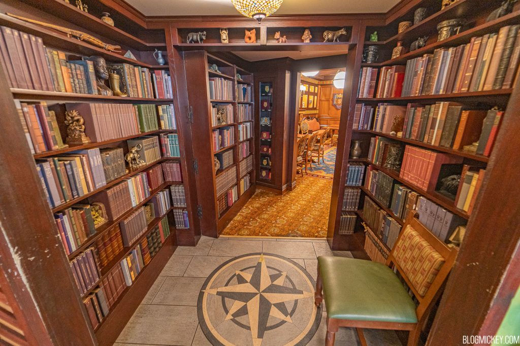
With all that in mind, I think the least I can do in my version is gut the interior and turn the NAVIGATOR’S CLUB into a well-appointed bar and lounge space, which I think would be a fan favorite a la Trader Sam’s. A warm, bookish, comfortable space filled with adventure memorabilia is just such a no-brainer, and this space would suddenly become a must-visit for people like me. I would also give visitors to the Navigator’s Club access to the bridge across the main entry and – if space could be carved out above the Starbucks opposite – a small “hidden” dining room would be an awesome plus.
And speaking of the Navigators Club, because I love world-building, I couldn’t help but use my rare and unlikely chance at a dreamy build-out to unthinkably replace some retail space in Port of Entry. The Islands Trading Co. on the south side of the street already serves as the park’s main emporium-scaled retail space, so while salvaging the cute Christmas Shoppe, I expanded out the remaining retail space for a new experience.
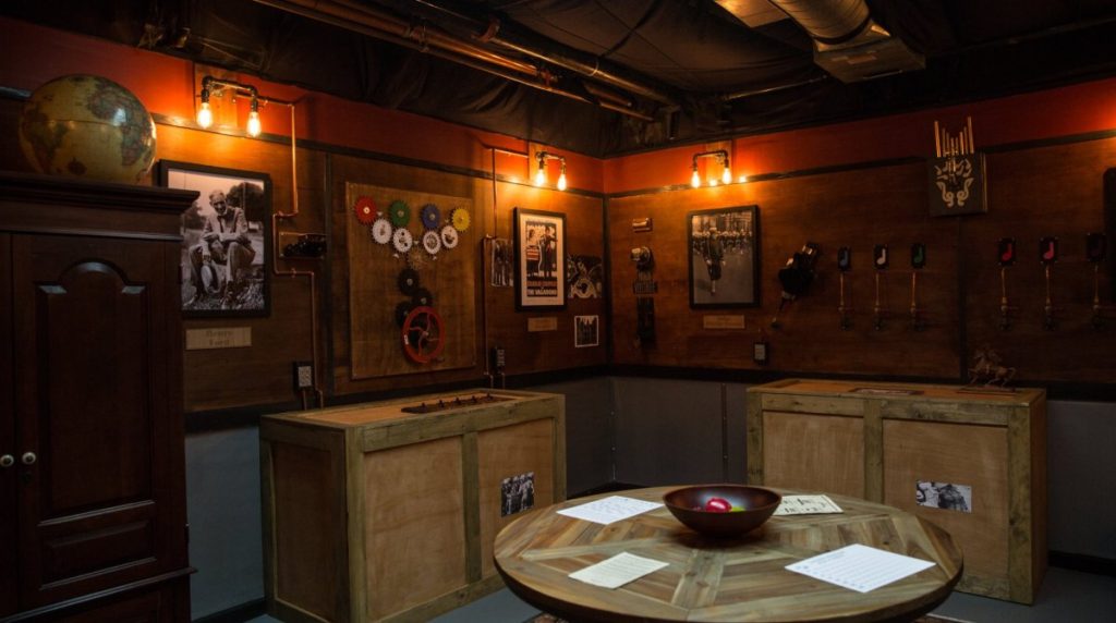
I imagine the NAVIGATORS CLUB HALL OF FAME OF FORTUNE as a walkthrough, in-universe “exhibit” hosted by the Navigators Club, with immersive rooms dedicated to its six founding members – each of whom discovered or hails from one of the subsequent islands we’ll see in the park.
The cool thing is that this Hall of Fame and Fortune would be not just a sort of in-universe Preview Center for the rest of the park, but an interactive, family-friendly, at-your-own pace funhouse and escape room. In each of the Founders’ rooms, you could browse not only their sketches, artifacts, models, and interactives from the islands they represent, but play interactive games centered on their skills and specialities – puzzle solving, creativity, perseverance, teamwork… Filled with “magic” moments and world-building, the Hall of Fame and Fortune would conclude in a Navigators Lab, inviting you to put your accumulated skills to the test through interactive multimedia experiences.
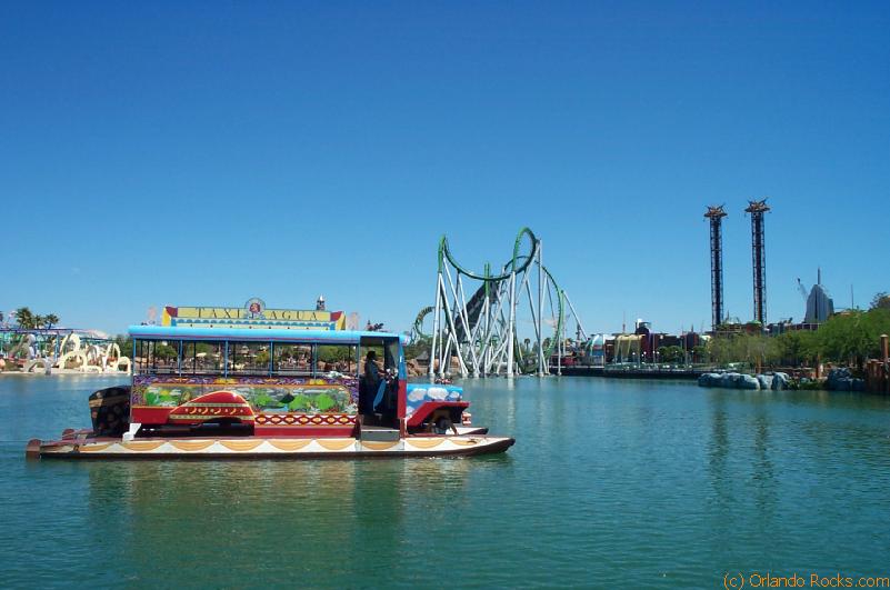
Last but not least, I’ve restored “taxi” service across the lagoon, now called ISLAND HOPPER FERRY. The original incarnation of this service has developed a cult following despite operating only at peak times and only for two-ish years, probably thanks to its three “eclectic” boats (including a bus on pontoons and a boat affixed with airplane wings and propeller).
The ride originally closed for several reasons. The first – that park attendance was far, far lower than anticipated – isn’t an issue anymore. The second – that, like Animal Kingdom’s “Discovery River Cruise”, it was mistaken by guests as a full-fledged attraction – was probably due to its name, “Island Skipper Tours”, which I think the Ferry name solves. The third – that Islands of Adventure really isn’t a very big park and doesn’t strictly need an intra-park transit ride despite its “wheel” format – is something we can just conveniently ignore in a Blue Sky build-out.
But for the sake of accessibility and kinetics, I think it makes sense to connect Port of Entry to a deeper point in the park, so we’ll see the other dock for this ride later on…
PORT OF ENTRY
RIDES
- NEW! Island Hopper Ferry (intra-park transit)
ATTRACTIONS
- NEW! Navigators Club Hall of Fame and Fortune (interactive walkthrough)
RESTAURANTS
- Confisco Grille (TS)
- Croissant Moon Bakery (QS)
- Backwater Bar (Bar)
- NEW! Navigators Club (Lounge)
Speaking of which, let’s continue our tour to see what’s changed in my built-out Islands of Adventure!


You should do universal next or epcot
I got to say, I was not expecting to like the Pokémon land. Then I saw that lil’ otter guy… he melted my heart! This is one of my favorite buildouts yet (DCA was my favorite). Keep up the good work!