The Golden Gates
Welcome to the new Esplanade – the central hub of the reimagined and newly-named Disneyland Resort. You’re facing the historic entrance to Disneyland, with its elegant wrought-iron gates and – on the hill ahead – the lovely, fanciful, iconic Train Station of Main Street, U.S.A. It’s a timeless entry into a romantic, idealized small town sometime at the turn of the 20th century. And it reflects what’s beyond in the rest of Disneyland: lands that remind us of real times and places, but as we wish they’d be: historic and reverent, but lovely and picturesque and perfected.
But something has changed. If you’re facing the entrance to the park, you may be used to the expansive blacktop parking lot being behind you. Turn around now, though, and you’d notice quite a difference. Directly across from Disneyland’s turnstiles is the entrance to the resort’s new “second gate”: Disney’s California Adventure Park. Disney promises that this new park is “the most unusual theme park in the Disney family.” You may start to get that sense even from outside the park.
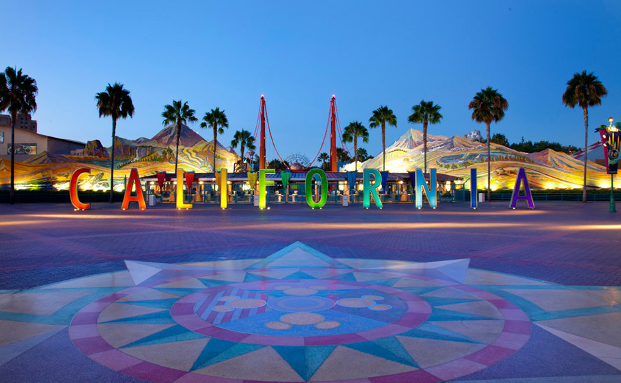
In stark contrast to the understated and historic entrance to Disneyland Park, the entrance to Disney’s California Adventure is larger than life. It starts with 11-foot-tall concrete letters spelling out C-A-L-I-F-O-R-N-I-A. The letters stand out against a backdrop made up of massive mosaic ceramic murals (the largest in the world) flanking the park’s entrance. Get up close and you’ll see that the sweeping mosaics depict sights from around the Golden State, from bustling cities and airports to wildlife and snow-capped mountain peaks. Between those is a stretched-and-skewed cartoon-perspective recreation of the Golden Gate Bridge with a metallic golden sun rising beyond it.
The unique entrance is not a bad one at all. In fact, it’s breathtaking in its scale, and unique from any other entry portal at any Disney Park. The pieces are meant to add together to create the illusion that you’re stepping into a giant postcard of California. However, in order to convincingly understand the effect, you’d have to A) know to look for it, and B) approach it from directly straight-on despite pedestrian traffic entering from the extreme left and resort traffic entering from the extreme right.
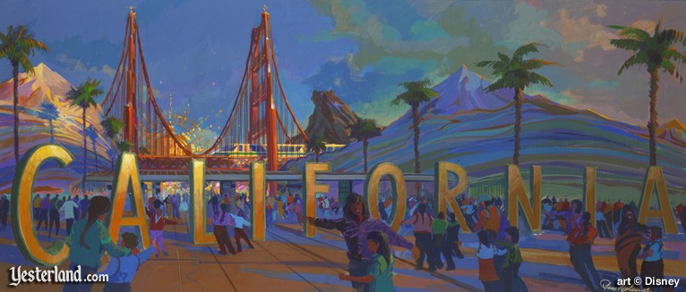
The original entrance to Disney’s California Adventure wasn’t awful. Truthfully, it might’ve been one of the most impressive thing about the park in 2001. However, the effect was lost on many visitors. Disneyland, after all, had been designed by cinematic veterans who built believable exteriors and habitable worlds; the entrance to Disney’s California Adventure was a stark contrast to that style: post-modern, concrete, and imposing; a cartoon-stylized and saturated portal that didn’t feel like a counterpart to Disneyland’s, but a competitor.
Your first thought might be that Disney’s California Adventure is a whole lot different than anything Disney’s done before. That’s on purpose. Executives hope that this park will be edgy, hip, irreverent, and very different from the tired old Disneyland next door. Creative lead Imagineer Barry Braverman might’ve put it best: “There’s a kind of brash California attitude that we wanted to capture. Much more pop culture and MTV with a little tongue-in-cheek thrown in.” Let’s head into the park’s four “districts.”
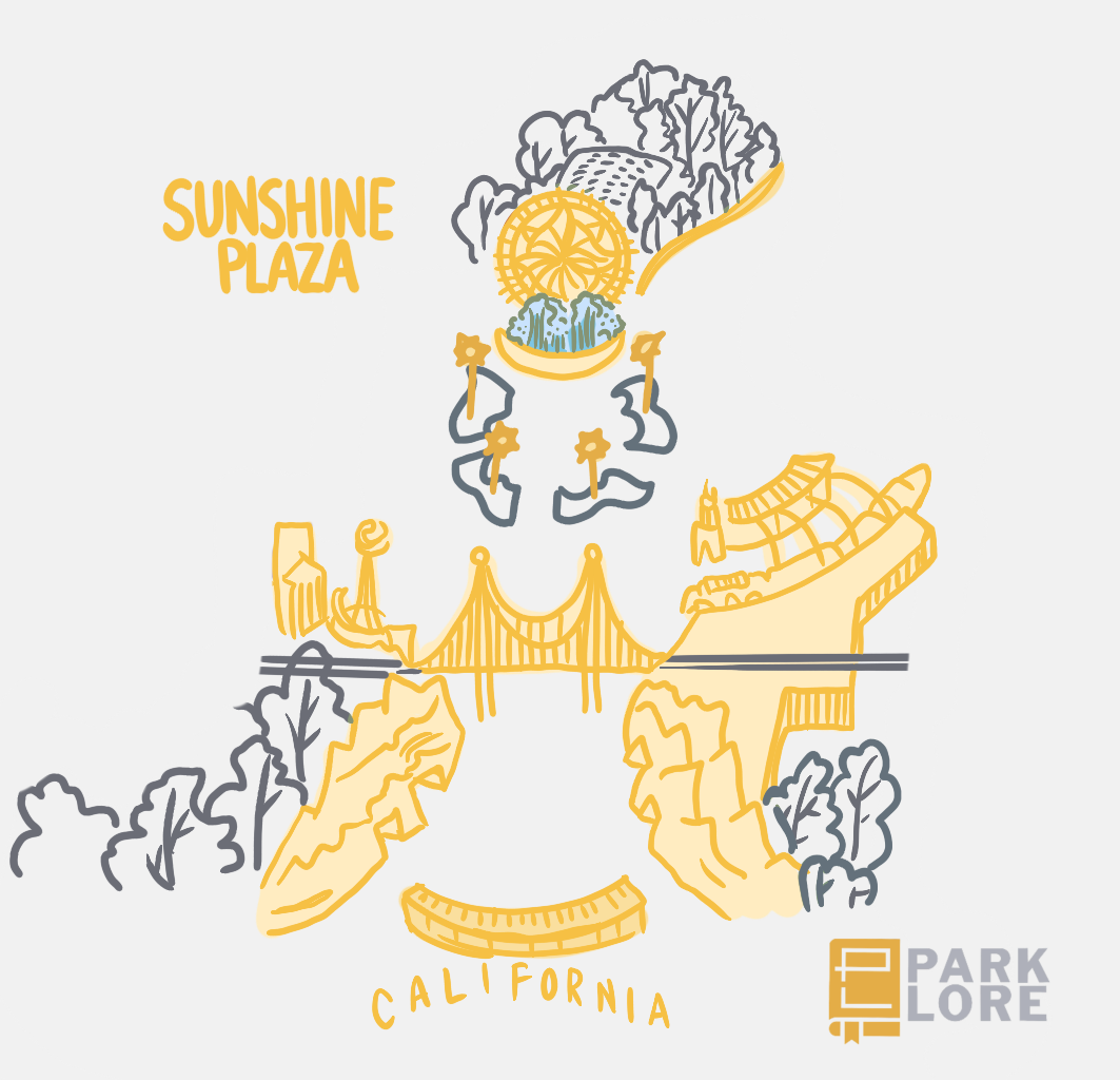
1. Sunshine Plaza
Disneyland Park has the quaint, charming, warm, Main Street U.S.A. with its turn-of-the-century storefronts recalling idealized memories of an early 20th century childhood lovingly remembered. It’s a snapshot of a world where gas lamps and Edison bulbs coexisted; where horse-drawn carriages and rattling automobiles shared the roadways. The picturesque street is lit by glittering incandescent bulbs and ragtime music. It’s a real place and time, but passed through a lens of idealization It’s warm and welcoming and historic, touched with just a bit of fantasy and magic – Disney’s specialty!
Disney’s California Adventure has… something different. The uninspired Sunshine Plaza entry to the park served as a crash course in the “hip, edgy” styling of Disney’s “brash, Californian attitude,” where corrugated steel walls, exposed ductwork, and visible showbuildings clue you in that this is not your grandfather’s Disneyland anymore.
In Leslie Iwerks’ The Imagineering Story, fan-favorite Imagineer Kevin Rafferty said of of California Adventure’s entry sequence, “There were all these visual cues that were kind of contradictory. You know, there were great big California letters. There was a stylized Golden Gate Bridge that was kind of foreshortened and was kinda of fake and suggested that this wasn’t a real place…”
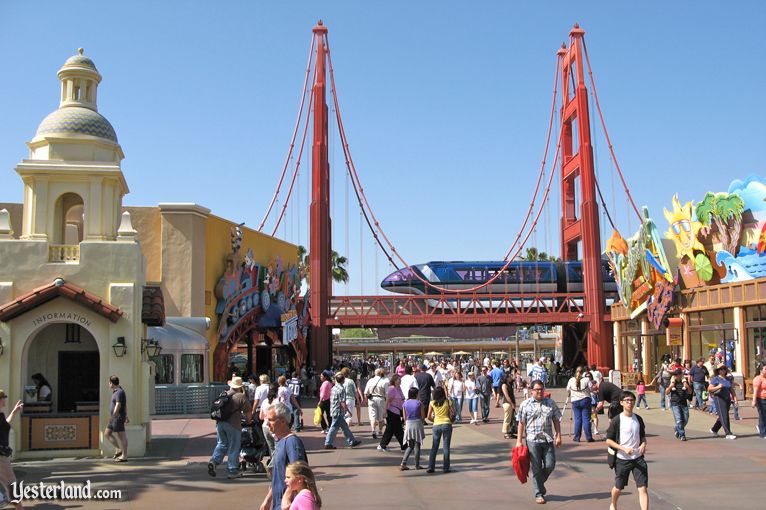
It’s true. After passing between the tile mosaics, the next “layer” of the postcard to peel away is the stretched-and-squashed Golden Gate Bridge (actually serving as a pathway for the resort’s Monorail). The exaggerated, comic-book-ready recreation of the San Francisco icon doesn’t look “real”… but… it’s not really supposed to.
You’re not meant to imagine that that’s the “real” Golden Gate Bridge, nor to mull over where you are. Sunshine Plaza isn’t meant to make you feel as if you’ve been transported to a different place or time – it’s about being here, in Disney’s California Adventure Park, today! This park isn’t so interested in idealization or fantasy, and that’s meant to be part of the fun.
If anything, you’re supposed to think of Sunshine Plaza as a living, three-dimensional post card; an abstract, stylized, multi-layer pastiche of California that’s intentionally exaggerated and outsized. It’s an aesthetic on full display in the park’s main gift shop, marked by a giant postcard (within the postcard) marquee and a smiling, neon-lit sun wearing sunglasses.
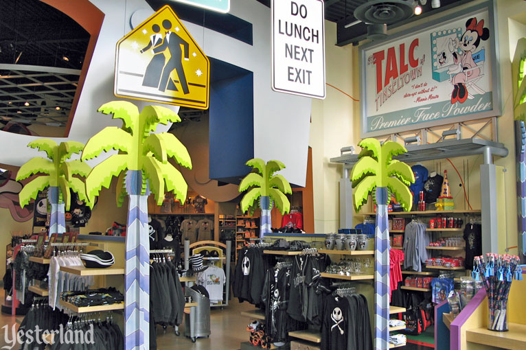
Forget Disneyland’s turn-of-the-century Emporium filled with wood, brass, and fine Victorian finishing. California Adventure’s Sunshine Plaza features the park’s main retail space: “Greetings from California,” a shop filled with metal racks, “punny” road signs, exposed HVAC, concrete floors, overt references to today’s world, and an intentionally-’90s color palette. Make no mistake: while this aesthetic was certainly a product of the park’s low budget, designers tried to embrace their limitations, too…
Tom Morris recalled, “We were doing it to just do the opposite [of Disneyland] because we haven’t tried that yet and we like to do new things. […] We need to break rules ’cause breaking rules is fun and you do discover new things when you break rules… But you have to have rules in place before you could break them. [With California Adventure,] we were just trying some wacky stuff that either wasn’t appealing, the guests had no interest in, or sometimes, they were appealing but weren’t operationally feasible.”
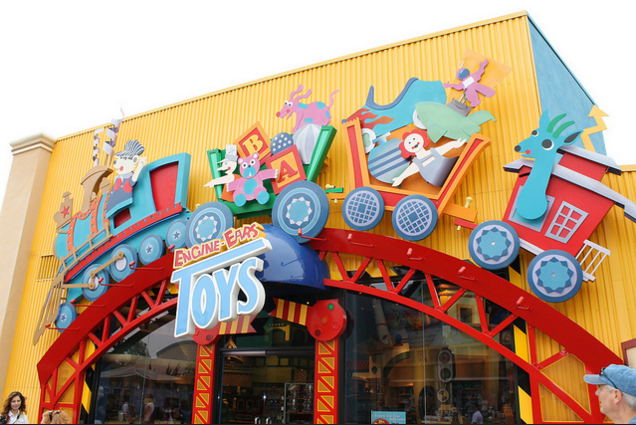
Across from “Greetings from California” resides more retail – “Engine-Ear Toys” – located in a big, visible showbuilding behind yellow corrugated steel walls. Such a sight in Disneyland would cause gasps of disbelief, but in Disney’s California Adventure, it was supposed to be part of the fun; in this next-generation park, seeing the “fantasy” of Disney stripped away was meant to create a compelling counterbalance; a modern, quippy, clever park catering to children of the countercultural, cynical ’80s and ’90s just as old-fashioned Disneyland had been for children of the ’50s.
The place is here, and the time is now! We’re on a wacky journey through Disney’s post-modern spoof of California, its landmarks, and its culture! Who needs ragtime music? California Adventure’s entry features music by Bob Seger, Dionne Warwick, Randy Newman, and the Beach Boys – “I wish they all could be California girls!”
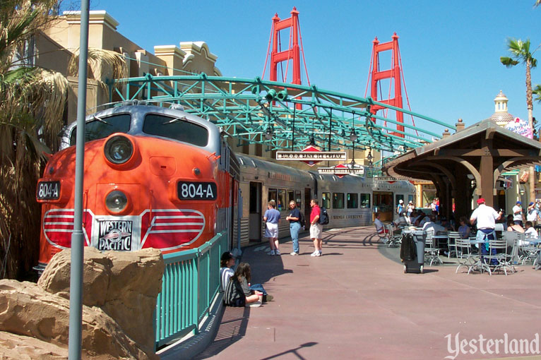
At least there’s something sincerely redeeming about the entry land to Disney’s California Adventure: just like Disneyland, it has a train! Unlike Disneyland’s, though, this park’s train didn’t go anywhere. The parked California Zephyr and its platform was actually a cleverly disguised facade whose individual “cars” served as entry to the park’s ice cream shop, bakery, and toy shop. It’s one of the few places in Sunshine Plaza that you might be able to squint and convince yourself that this is a theme park like all the rest, transporting us to a different place and time… if you’re into that sort of thing.
But any illusion of the kind is quickly dashed by the park’s own central icon; the “Californian” counterpart and complement to Disneyland’s Sleeping Beauty Castle…
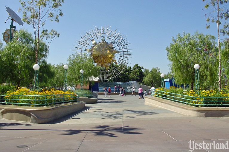
Yes, we’ve finally reached the namesake of Sunshine Plaza: a wide, concrete, open plaza centered around the metallic Sun Icon (which first guest-starred as the rising sun in the “postcard” entry). The Sun Icon (nicknamed “The Hubcap” by early visitors) was truly a large titanium sculpture of the sun cleverly suspended over an impressive Wave Fountain. Like so much of Disney’s California Adventure, it’s not that the Sun Icon or Sunshine Plaza was bad… it’s that it certainly didn’t read as the centerpiece of a Disney Park.
Kevin Rafferty probably put it best in the The Imagineering Story docu-series: “The first statement that you saw when you walked in the gate was this sharp sun. And frankly, you could’ve seen that in a shopping mall in Newport Beach, and it’s like, ‘Why is it here?'”
With curling metal rays stretching out from all sides, the Sun Icon was meant to reflect the real sun, bathing the plaza in warmth. Unfortunately, since Main Street, U.S.A. was oriented due north to keep the castle bathed in sunlight all day, that leaves Sunshine Plaza facing due south. Ironically, the Sun Icon spent every day of the year cast in shadow.
Thankfully, designers had an answer: four telescoping mirrors were installed in the plaza and programmed to trace the real sun’s path all day, concentrating real sunshine and reflecting it onto the Sun Icon. That way, the Sun Icon could reflect the real sunlight onto the plaza. Get it? Unfortunately, the system never worked as intended, and Sunshine Plaza remained cold, concrete, and perpetually backlit.
Is Sunshine Plaza a fitting companion to Main Street? The Sun Icon a fair counterbalance to Sleeping Beauty Castle? If you don’t think so, then you may already be wishing you’d decided to use your Disneyland Resort ticket at that “old-fashioned, tired” theme park across the Esplanade. But you’re inside now, so let’s press on and visit the next of the park’s four districts.
2. Hollywood Pictures Backlot

Visitors to the Disney-MGM Studios are no doubt familiar with its entry – Hollywood Blvd. – and how it’s easily one of Disney’s best themed lands anywhere. The teal towers of the Pan-Pacific Auditorium; the soaring, neon cityscape with odes to real Hollywood architectural icons; the big band and swing music playing down the street; the sense of traveling back in time to the heyday of Tinseltown!
That Hollywood Blvd. brings to life an idealized, romanticized, historic Hollywood of yesteryear, forever set in the Golden Age of moviemaking.
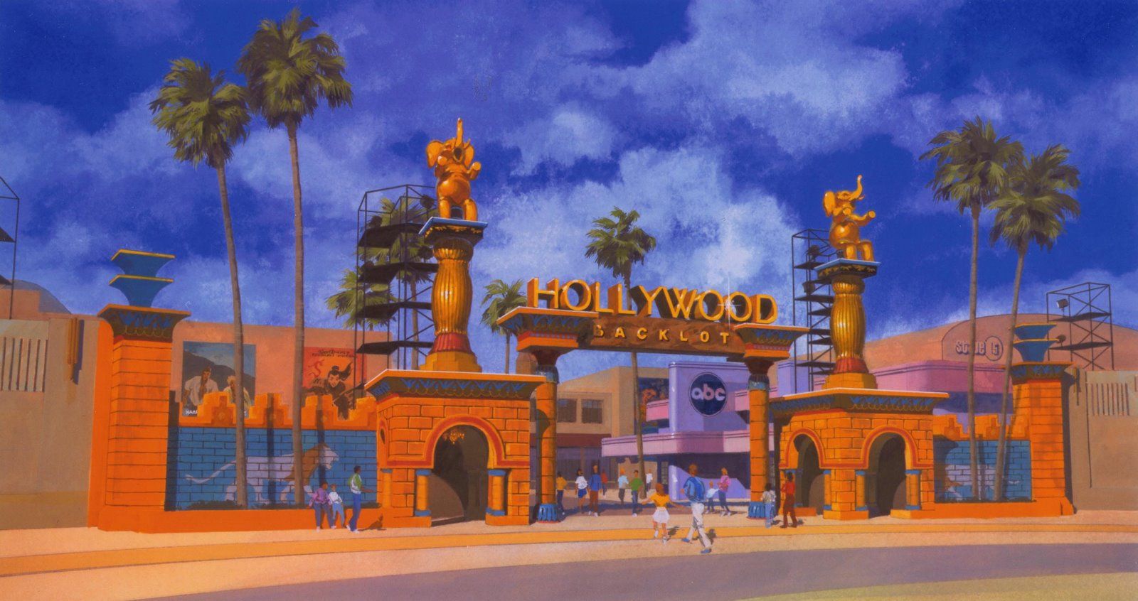
Disney’s California Adventure has a whole land dedicated to Hollywood, too. But instead of recreating a Hollywood that “never was, but always will be,” Hollywood Pictures Backlot is meant to bring to life the Hollywood that is. When you pass between its elephant statues, you won’t find yourself in a long-gone “Golden Age” of Tinseltown. You won’t see glamorous starlets, classic cars, lavish boutiques, or elegant, historic movie palaces…
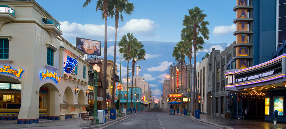
… Quite the contrary, in the Hollywood Pictures Backlot, the time is now and the place is here… er… well, 30 miles north up the 5. This is a Hollywood of today (where “today” is the early 2000s) thematically planted in the Age of the Tabloid. This version of Hollywood is defined by paparazzi, spray tans, TMZ, spoof movies, and cheetah print. Forget transporting you to a long-lost time. The deepest aspiration of California Adventure’s Hollywood Pictures Backlot would be to replace a road trip to the real Hollywood with a day at Disney’s stylized recreation of it.
The downside of choosing to visit Disney’s version of Hollywood over the real thing is that you’ll pay Disney Parks prices for food. The upside is that there are far fewer people on California Adventure’s Hollywood Blvd. than on the real Hollywood Blvd.
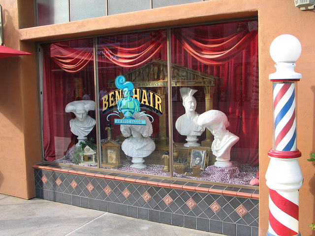
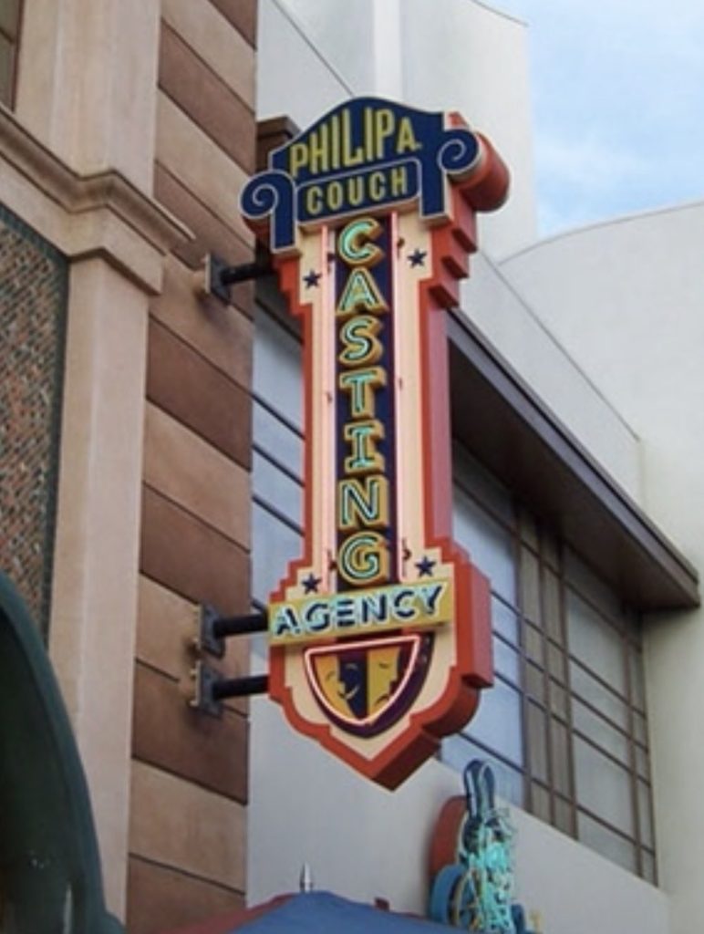
Since this park is a spoof of California, Hollywood Pictures Backlot is a great place to have a laugh. Here on this “hot set,” an empty false front carries the marquee and window display of a hair salon called “Ben Hair” (referencing the epic 1959 adventure film Ben-Hur). Overhead, a sign suggests that a gym named “Dial M For Muscle” (spoofing 1954’s thriller film Dial M for Murder) exists on a second floor. An upper-level shop even carries a phallic sign advertising the “Philip A. Couch Casting Agency” referencing Hollywood’s infamous “casting couch” culture – wherein casting directors promise roles to young, naive, would-be starlets in exchange for sexual favors. Fun, huh?
And the jokes don’t end there. Part of the fun of Hollywood Pictures Backlot is that this isn’t Hollywood at all. Though the buildings that flank the street may resemble modern Hollywood locales, get a little closer… yep – they’re empty! These facades are mere shells, concealing structural supports, scaffolds, and plywood interiors.
You fell for it! This isn’t really Hollywood. It’s a Hollywood set… of Hollywood… in the Hollywood Pictures Backlot! Get it? More like “Dial M for Meta.”
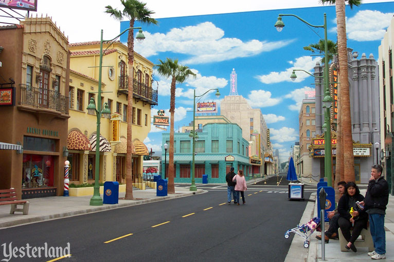
To that end, if you’re looking for the iconic Chinese Theater or a copy of its lavish and expensive Lost Legend: The Great Movie Ride, don’t hold your breath. At Disney’s California Adventure, Hollywood Blvd. ends in a towering flat façade painted with a matte blue sky and forced perspective buildings, as if to imply that the street goes on and on. It’s a clever illusion, and it might even fool you at first glance. (That’s the magic of the movies, after all.) But it’s definitely not what you expect from Disneyland.
The “blue sky” doesn’t just fill in the blank at the end of the street. It actually conceals the fly of the Hyperion Theater – the park’s 2,000-seat, full proscenium, Broadway-ready stage complete with orchestra, mezzanine, and balcony seating. Unfortunately, it’s not playing a Disney musical adaptation of a recent Disney Renaissance favorite. After all, this is a serious park for serious adults who like serious entertainment. (It’s Opening Day show – Steps in Time – was so bitterly reviewed, it closed within six months of the park’s opening, replaced with The Power of Blast – a “Stomp”-style musical revue produced by an outside company).
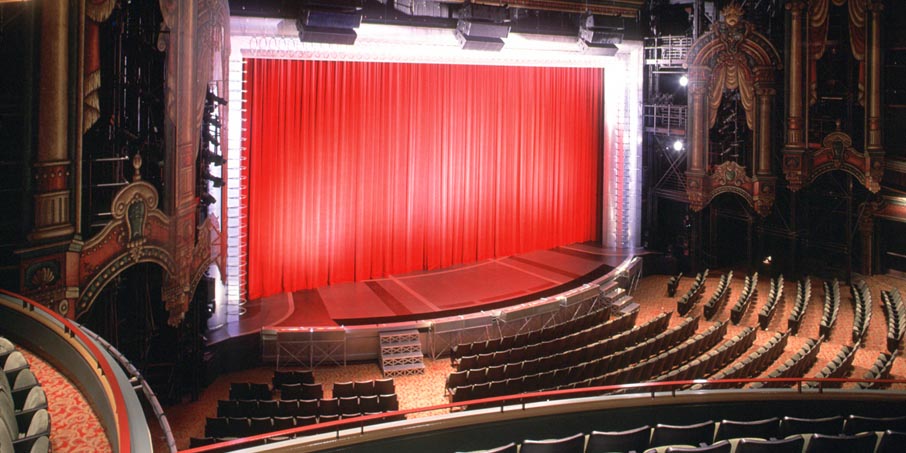
And anyway, though this theater has the makings of a Broadway-style landmark, it’s missing some of the finer details. Executives would likely explain that its exposed lighting rigs, scantily-clad industrial walls, outdoor holding queue, and its lack of either a lobby or even restrooms are all intentional parts of the “backlot” experience.
Speaking of which, if you want to see how the “magic” is made, just continue through the rest of the Hollywood Pictures Backlot. Concealed behind the “streetscape” we just stepped down resides the backlot proper – a wide, concrete plaza littered with bland, beige soundstages, corrugated steel, industrial lighting rigs, and studio flats. From here, you can see that Hollywood Blvd.’s storefronts are indeed just hollow flats held up by steel girders!
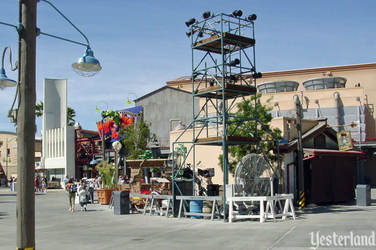
To really show how industrial this behind-the-scenes plaza is, it’s also filled with lighting rigs, electrical poles, shipping crates, and moviemaking ephemera. It’s not pretty, but it’s “real,” and isn’t that what you want from a “next generation” Disney Park?
There, a large, beige soundstage dressed in rusted pipes and wooden poles hosts Muppet*Vision 3D. Technically, the Jim Henson project has already been showing at the Disney-MGM Studios for about a decade. Of course, it’s still a masterpiece, and its inclusion in California Adventure finally brings it to the West Coast, which is a victory in its own right. Besides, surely it’s just part of the land’s “supporting cast.” The true star is just a few steps away, concealed behind flat facades of cartoon-stylized Los Angeles landmarks…
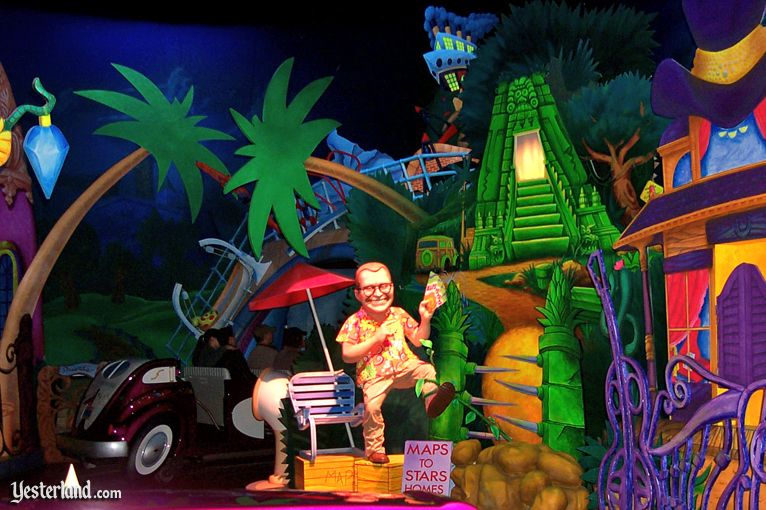
Disneyland has six dark rides in its Fantasyland alone. California Adventure has just one in the entire park. And here in the Hollywood Pictures Backlot, we’ll find that dark ride… but only if we’re among the first visitors to the brand new park.
After all the Declassified Disaster: Superstar Limo is unequivocally the worst dark ride Disney has ever designed. The attraction carries guests through comic book stylized versions of L.A.’s hoity toity neighborhoods for “face-to-face” encounters with miniature figures of Disney and ABC’s C-List sitcom celebrities, game show hosts, and talk show personalities like Drew Carey, Whoopi Goldberg, Regis Philbin, and Joan Rivers, all narrated by a cigar-smoking “agent” leading you to your movie’s big premiere.
Superstar Limo was so unimaginably bad that it closed barely a year after the park opened with no plans to replace it. Think about it. That means that the park was simply stronger with no dark rides than it was with Superstar Limo.
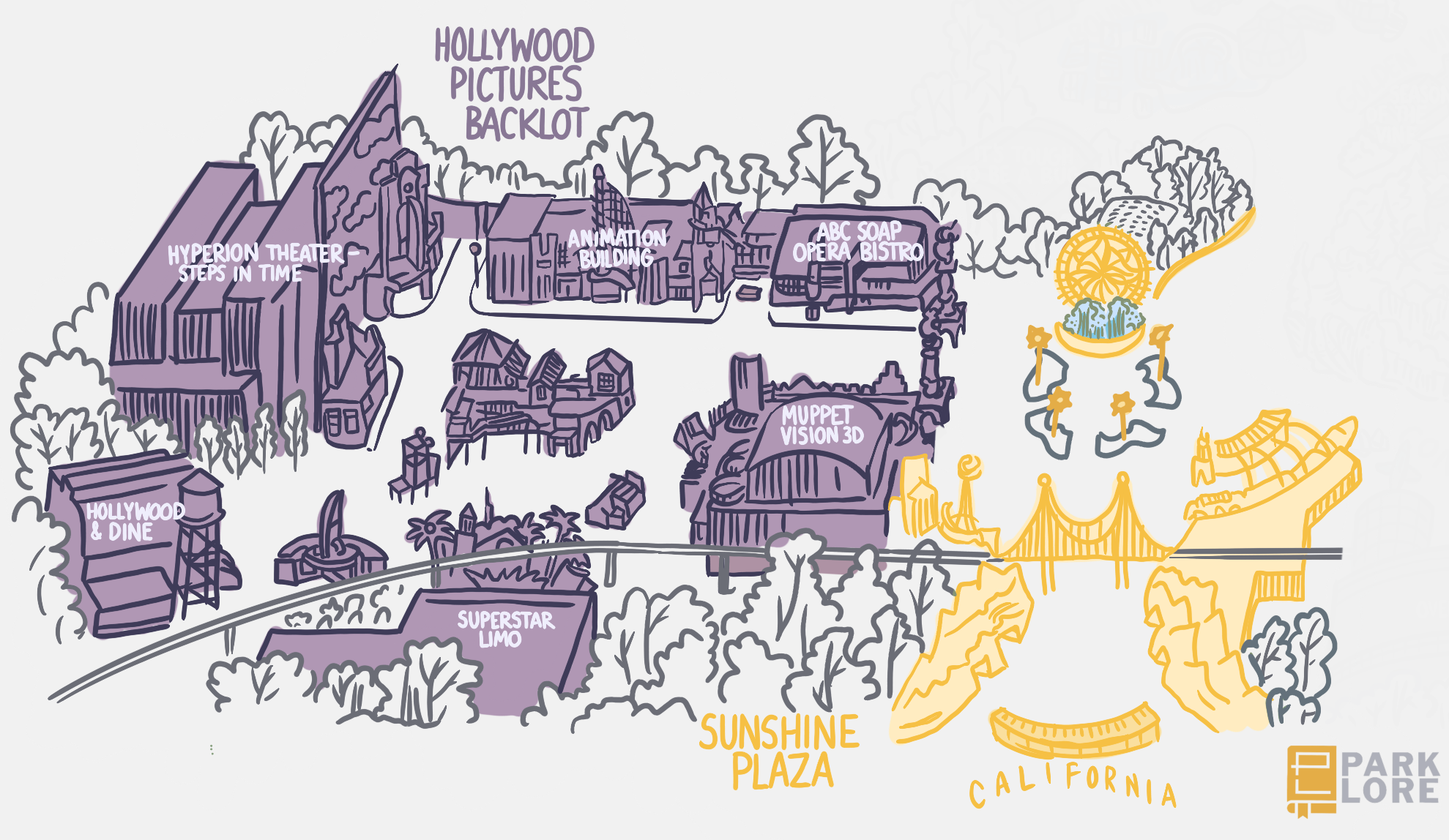
Whereas Disneyland literally invented the tried-and-true hub-and-spokes layout that ensures crowds flow naturally through a park, its neighbor’s Hollywood Pictures Backlot is a dead end. Our only choice now is to head back the way we came, again passing by the Sun Icon to head into the rest of the park – of which there’s surprising little… If you can believe it, with two districts and just one ride under our belts… and we’re technically halfway done with our walkthrough of Disney’s California Adventure in 2001. Only two districts remain… We’ll tackle them on the next page.
