You’ll remember that during California Adventure’s rebirth, Paradise Pier had undergone a pretty significant metamorphosis. Though it still shared a name with its “DCA 1.0” counterpart, the new Paradise Pier had largely succeeded in turning back the clock to an idealized, romanticized time and place. Now, Paradise Pier was a land of clapboard, seaside, Victorian storefronts; strung Edison bulbs; ragtime music; pie-eyed Disney characters plucked from Disney’s classic shorts of the ’20s and ’30s.
Sure, there were holes in just how far the budget then had spread. Some rides (like King Triton’s Carousel of the Sea and the Jumpin’ Jellyfish parachute ride) still looked like saturated ’90s installations in an otherwise sand-and-seafoam-colored classic pier; likewise, the land’s entrance with its metallic seashell towers could use its own “historic” redesign. But as it had been meant to do, “DCA 2.0” had at least lit the way, reorienting the land and showing what further waves of development in Paradise Pier would bring.
… Or so we thought. At the semi-annual D23 Expo Japan in November 2017 (just five years after California Adventure’s official re-opening, and mere months after the launch of Mission: BREAKOUT!), then-Chairman of Disney Parks Bob Chapek was on-hand to announce a project that rumor blogs hadn’t even imagined: Paradise Pier would be the next of California Adventure’s landmarks to get stickered over with character.
2018 – Pixar Pier
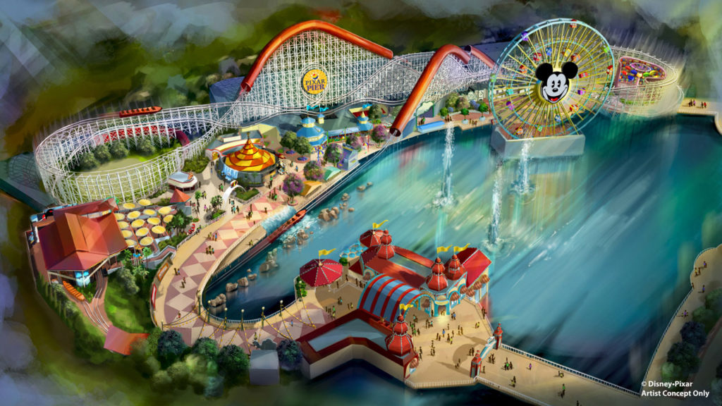
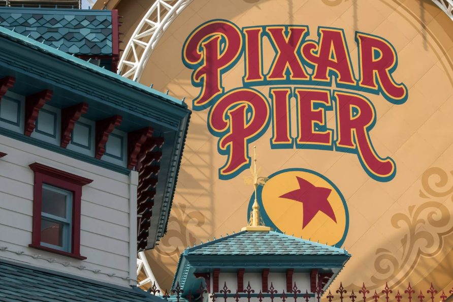
In 2018 – after another staggeringly quick turnaround – Paradise Pier would become Pixar Pier, an overt ode to the Bay Area-based animation studio Disney had acquired a decade earlier and some of its most successful franchises. A land of extremes, Pixar Pier arguably ended up representing the soaring highs and scathing lows of modern Imagineering, all wrapped up in one project…
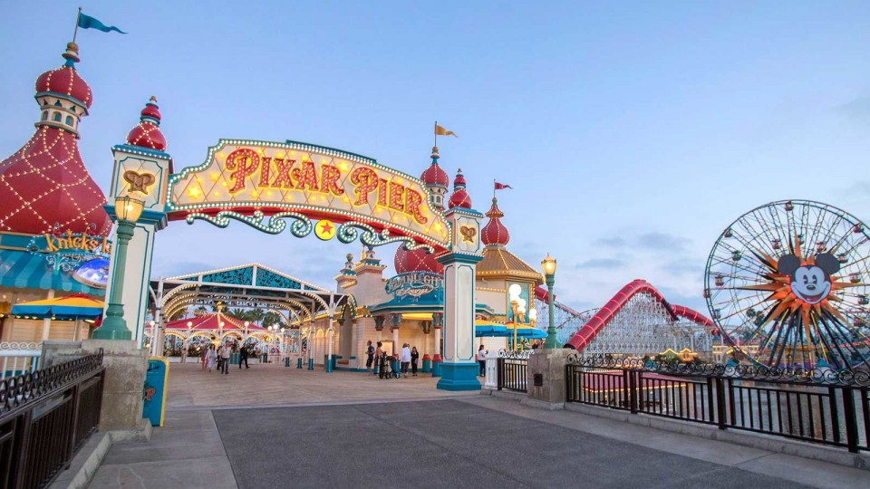
For example, despite the unlikelihood, the capital expenditure released for Pixar Pier served – in many ways – to finish what “DCA 2.0” had begun. The land’s entry was reestylized with elegant bauble turrets dotted with incandescent bulbs, fluttering flags, and turn-of-the-century stylization. Indeed, the Victorian aesthetic that had given the second version of Paradise Pier such a needed sense of place and time was strengthened architecturally in the switch to Pixar Pier.
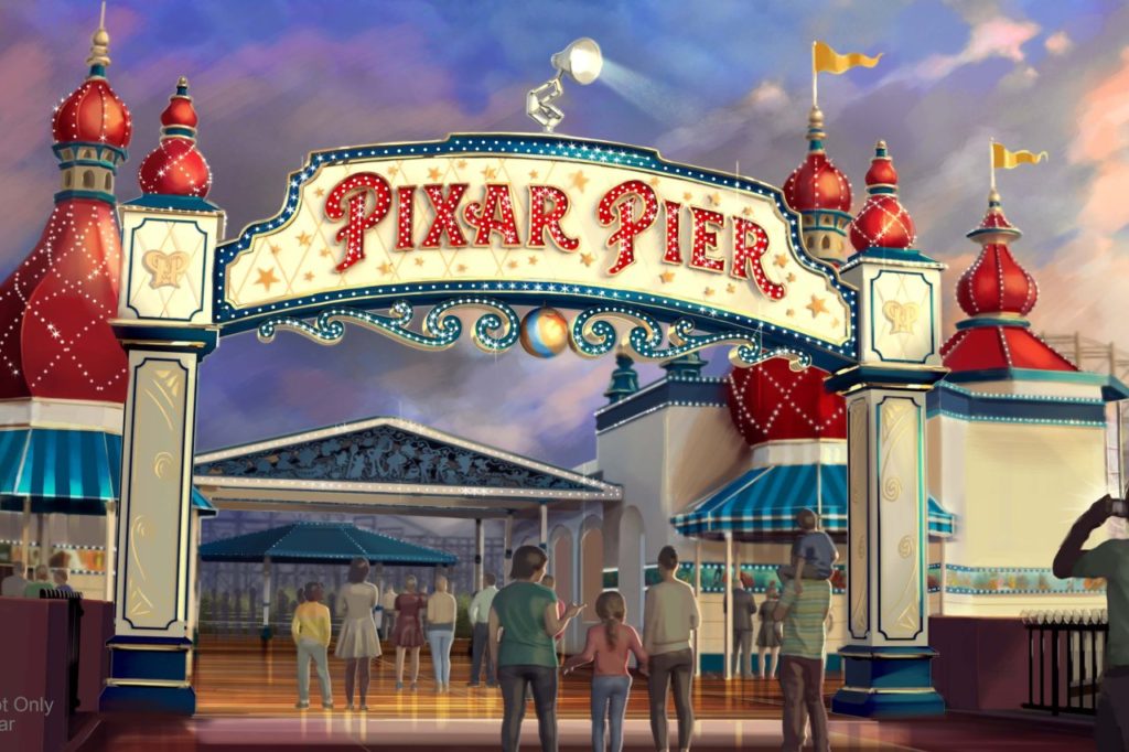
Of course, well-encapsulating the land’s extremes is that the ornate, delicate, historic, flickering marquee is topped with a 1970s desk lamp. Okay, okay, actually, Pixar’s “Luxo” (in many ways, the studio’s equivalent of Tinker Bell) resides atop Pixar Pier’s marquee as an adorable animatronic that gazes out across the park, even turning to watch World of Color at night.
And therein lies the push-and-pull of Pixar Pier. It is, in the best and worst ways, “cute but dumb.” So much of what works well with Pixar Pier is really in spite of the Pixar half of the equation. Yes, Imagineers smartly swept through the land to deepen its richness, embrace its architecture, and update its color scheme (the bold jewel-tones and white base really do work better than the sandy, washed-out seaside colors of yesteryear)…
But they just as quickly set out to obliterate that sense of time and place using Disney’s new favorite thematic scapegoat organizing structure: four incongruent “neighborhoods” that quickly undermine the larger land’s transportational quality…
Incredibles Park
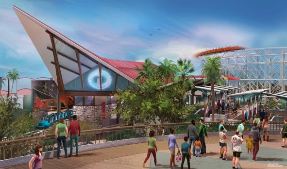
Despite its early-20th-century portal, the first stop along the descending Pixar Pier is Incredibles Park – a plaza of mid-century, ’60s-influenced modern architecture that smartly recalls the wonderful world-building of Pixar’s The Incredibles.
Here again lie the highs and lows of Imagineering! Because even if a 1960s plaza quickly establishes that we have not actually traveled back to a 1910s boardwalk, the fixtures in Incredibles Plaza really are wonderfully fun! There are ledge stone walls; breeze blocks; starburst chandeliers; swirled metal; wooden paneling; upswept roofs and parabolas… Imagineering really rose to the task here, transforming the remnants of “DCA 1.0” left in and around California Screamin’ into something historic and idealized… it’s just a time and place pretty unapologetically incongruent with the land it’s a part of.
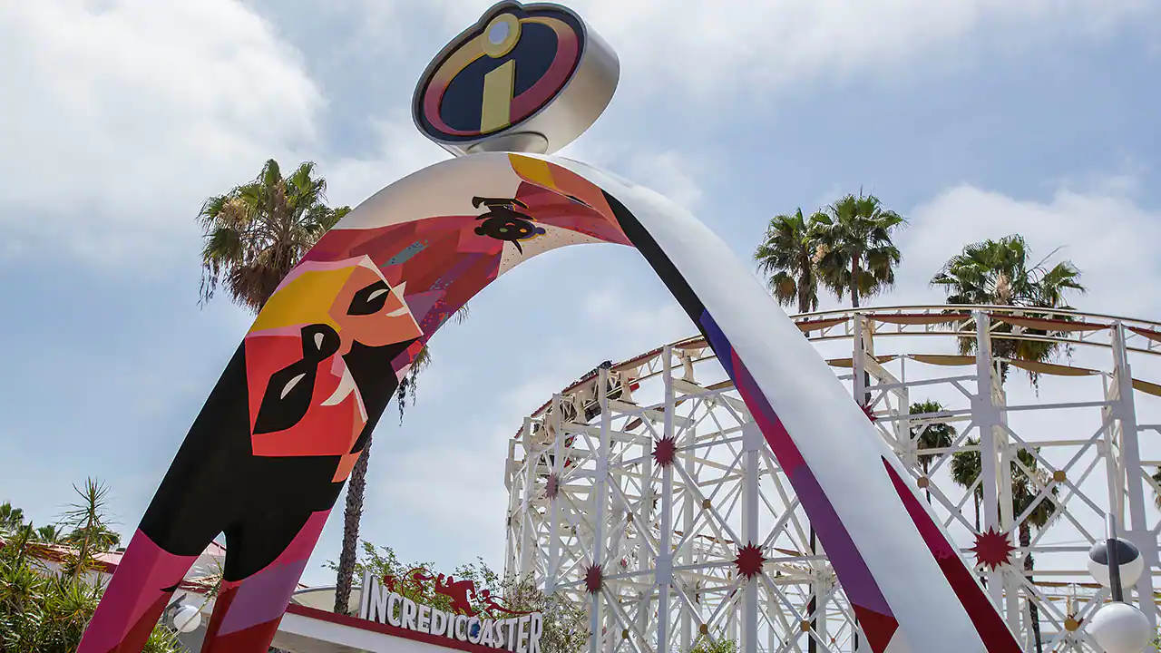
Within Incredibles Plaza, even the seaside street lamps have been replaced with groovy ones, creating a little enclave of ’60s style that almost seems to absolve the once-intrusive Orange County Convention Center beyond. Even harsh critics (like me) might have to sit back and say, “Wait a second… I think this works?”
But then we turn to the “neighborhood’s” anchor – the former California Screamin’, now Incredicoaster. Now the ride is built around the (admittedly contrived) story that the family superhero team The Incredibles is in town for the re-dedication of this classic seaside roller coaster as a tribute to their heroism. (In the queue video, Violet groans “Sure, slap our names on an old ride.” Edna Mode replies, “Quite normal, darling; corporations call it synergy.” Like Rocket’s comments on the converted Tower of Terror, explaining away inconsistencies and overlays as a joke is now par for the course.)
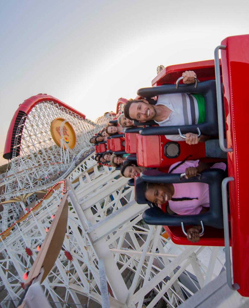
Now, it just so happens that our ride on the newly-rechristened coaster coincides with baby Jack Jack escaping from babysitter Edna Mode, meaning that as we launch into the coaster’s course, the “scream tubes” serve as quick, semi-enclosed show scenes where we see Jack Jack’s nascent, chaotic powers manifest. He shoots eye lasers, turns “gooey,” phases through walls, catches on fire, and multiplies as members of the family take their turn in trying to capture him – and us along the way, made “real” by on-ride audio keeping us abreast of the baby’s moves. It’s not a terrible concept for a coaster, giving us something to “do” (or at least “see”) as we whiz along the course.
But wait. Allegedly, the entirety of Pixar Pier was a pet project of then-Parks Chairman Bob Chapek, who positioned it as a sort of challenge to Walt Disney Imagineering. Could they design, fabricate, and install an IP-oriented, low-cost project in far less time than their usual multi-year process for well under budget? Incredicoaster answers “yes,” but at what cost?
Aside from adding an on-ride score by Incredibles composer Michael Giacchino (which can improve just about any project), Incredicoaster is almost embarrassingly lifeless. Enclosed “scream tubes” are brought to life not with Audio-Animatronics, lighting packages, projection, or wraparound LED screens, but by static, mannequin-like figures of the Incredibles without even the most basic movement. Despite the ride’s speed, such shortcomings are very apparent and fairly cringey…
The finale, for example, sees Jack Jack “multiply,” brought to life by more than a dozen statues of the baby that sit, unmoving, atop steel support poles on Midway Mania’s roof. Even having these static figures rotate on different axes would add life to the scene. Instead, they just sit, frozen, while incandescent bulbs flash on them. (Why not simply slide the audio to have Jack Jack “multiply” as guests enter the coaster’s final, winding helix, where baby figures could ‘climb’ the coaster’s support structure, surrounding riders?)
California Screamin’ might’ve just been a big, bare, steel roller coaster, but at least it would score high marks in that category. Incredicoaster, though, wants us to see it as something more than that, then delivers an uneven show that feels the weight of the time-cost-quality triangle skewing heavily away from quality. It’s not that it’s a terrible ride or a regrettable experience, but it’s a glimpse into the uneven nature of Pixar Pier… Which brings us to…
Toy Story Boardwalk
Around the existing Toy Story Midway Mania would arrive the Toy Story Boardwalk “neighborhood.” That seems a natural fit given the still-starring role of the shoot-’em-up midway ride, especially with its beautiful seaside exterior swapped from sandy peach and sun-faded maroon to a much more attractive white and teal with cherry red accents.
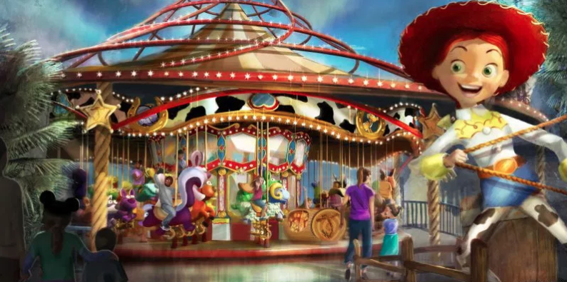
Strangely, though, this “neighborhood” would also transform King Triton’s Carousel of the Sea into the Toy Story-complementary Jessie’s Critter Carousel that unapologetically ditches the classy, elegant Victorian vibe in favor of cow spots and plastic toy tones.
Don’t misunderstand – the inflated, plush-proportioned carousel creatures with their plastic sheen and goofy grins are adorable, but again they swing heavily in a direction opposite the elegant seaside ballroom aesthetic that Pixar Pier otherwise kinda strengthened. Yep, as in the rest of the land, half of Toy Story Boardwalk doubles down on the newly-refreshed turn-of-the-century coastal vibe, while the other half curiously relies on oversized props and figures borrowed straight from Toy Story Land, as if we’ve “shrunk.”
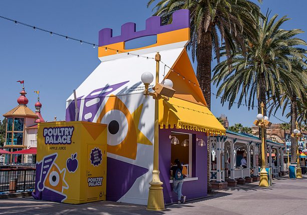
So it goes for a walk-up fried chicken kiosk disguised as a cardboard kids meal and associated juice box from “Poultry Palace” – a fast food restaurant seen only in the 2011 “Toy Story Toon” short, “Small Fry.” It’s an intentional non sequitur plopped down by the dainty, gingerbread-trim gazebos of the boardwalk, actively trying to disrupt the aesthetic.
Whether it’s giant or we’ve temporarily shrunk isn’t any more worth considering than whether it’s the turn-of-the-century, the year of Toy Story‘s debut, or “today.”
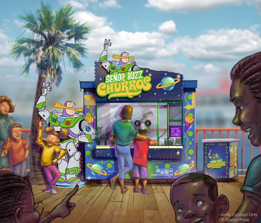
Yes, Toy Story Boardwalk very quickly illuminates that it’s the Pixar part of Pixar Pier that leaves so much to be desired. Uneven, outlandish, and incomplete in ways that can only be intentional, it seems that in Pixar Pier, Imagineers took a step forward and two steps back in applying Disneyland’s M.O. to its younger sister.
In part, it’s beautiful, vibrant, musical, colorful, saturated, and yes, fun! In another part, it’s a somewhat embarrassing “cartoonification” of a land that ultimately weakens its timelessness and saps the transportational quality from it. Don’t misunderstand: no one would stomp their way along the boardwalk, angry over inconsistencies… but anyone who’s been following California Adventure’s story so far would have to ask if maybe Imagineers had lost the plot; overcorrected; actually gone too far in pursuit of finding the balance between Disney, California, and adventure and – by accident – tapped into “DCA 1.0’s” lack of timelessness once more.
Pixar Promenade
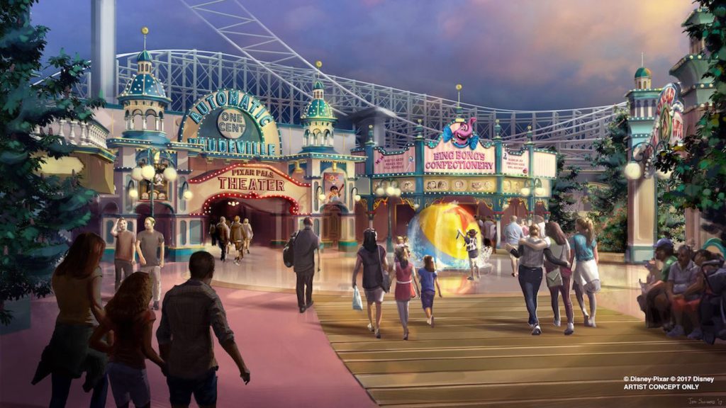
The boardwalk’s third “neighborhood” is the catch-all Pixar Promenade featuring the rest of Pixar’s films (except Monsters Inc., which is in Hollywood Land, Finding Nemo that resides in Tomorrowland, and Cars, which has its own land) recasting the pier’s Games of the Boardwalk to exclusively Pixar themes and adding a floating granite sphere interactive in the style of Pixar’s famous bouncing ball. (The turn-of-the-century “Pixar Pier Theater” shown in the concept art above was apparently cut, becoming the Pixar Promenade Bandstand – an ornate shell used for meet-and-greets and performances.)
Most curiously, Mickey’s Fun Wheel continues to feature the pie-eyed-and-decidedly-non-Pixar mouse on the bay-facing side, but was renamed Pixar Pal-a-Round (which must be one of the worst names in the Disney Parks portfolio, right? Why not Animator’s Wheel? The Color Wheel? Disney’s Wheel of Color?), its gondolas affixed with new vinyl skins featuring famous Pixar pairs.
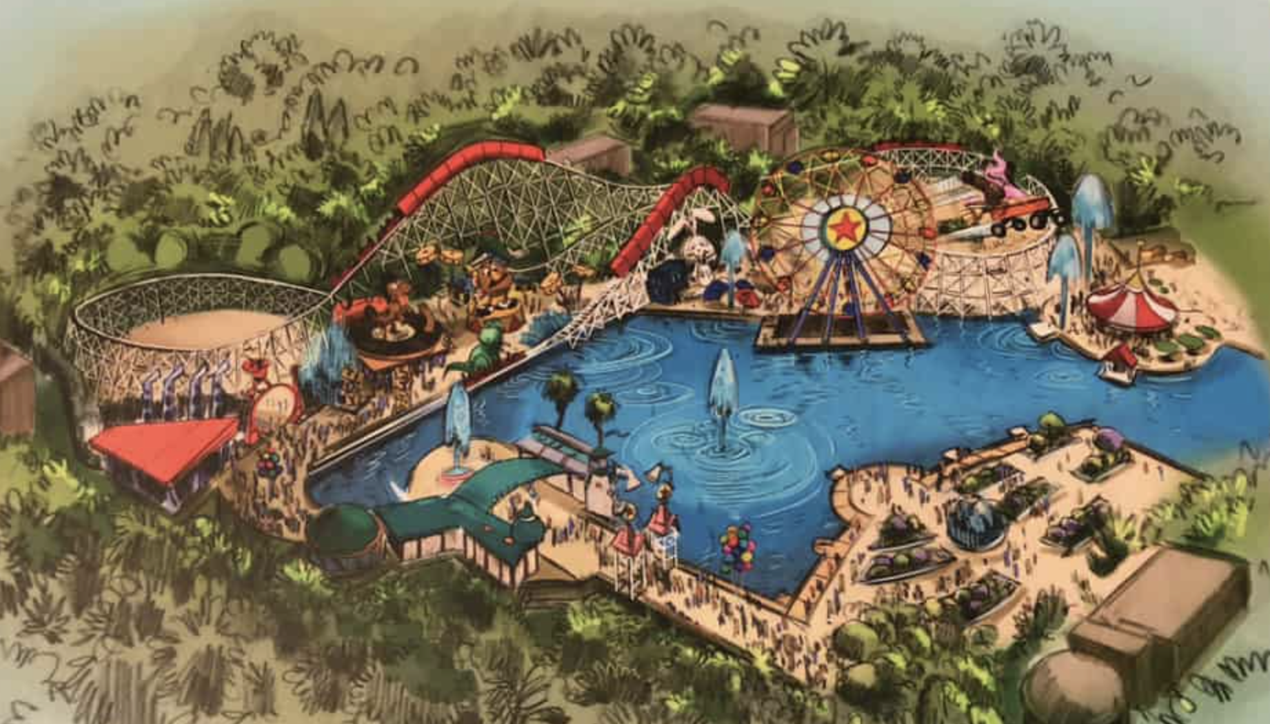
(Early concept art suggests that originally, Pixar Pier would’ve ditched the Mouse for the studio’s bouncing ball as a centerpiece to the Pal-a-Round. Clearly, marketing won out, decreeing that the Mouse-faced Ferris wheel was too well established in imagery, creating the lazy mismatch. The back of the wheel – where the ball might’ve been a nice balance – instead just has no decoration at all. Like we said – uneven.)
Even though the “Pixar Promenade” neighborhood includes two elements named for and stylized after characters from Inside Out – Angry Dogs hot dog stand and Bing Bong’s Sweet Stuff candy shop, it’s technically a separate neighborhood that’s devoted to the 2015 film…
Inside Out Headquarters
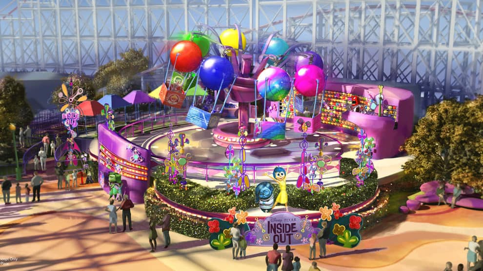
The final “neighborhood” – Inside Out Headquarters – contains only a single spinning family flat ride, relocated from “a bug’s land” and re-clad to resemble the glowing spheres and spinning pinwheels of Inside Out.
And that, in a nutshell, is the problem. Inside Out was a celebrated, critically-acclaimed, award-winning Pixar film exploring the complexities of emotion and growing up, known widely for leaving adults weeping in their theater seats. And rather than a joyful, reflective, adventurous dark ride through the human mind, the Inside Out Emotional Whirlwind is a lightly-decorated spinning carnival ride. This, one can imagine, is Disney’s version of “label slapping” – as when a Six Flags names a roller coaster Superman: The Ride and paints it red, supposing that counts.
“It’s all about story”
Disney’s own marketing tells us that at Walt Disney Imagineering, everything comes down to story, story, story. Well then, let’s read:
- In 2001, the original Paradise Pier’s story seemed to be that we’d simply ventured to a modern California boardwalk that – like the real parks it emulated – featured many different rides from many different eras, with more nods to Californian surfer culture than to Disney. “The time is now, the place is California. Enjoy!”
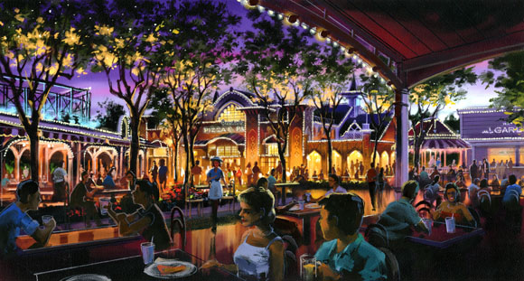
- In 2012, Paradise Pier was reintroduced as a historic, idealized, turn-of-the-century boardwalk populated by Victorian architecture, strung popcorn lights, ragtime music, and classic, pie-eyed Disney characters presented in their most vintage and nostalgic forms. In “Disney” speak, we’d traveled back in time to a romanticized and idealized turn-of-the-century pleasure pier that never was, but always will be – an enduring image of a long-lost place and time.
- In 2018, the opening of Pixar Pier changes that story yet again. To fans’ best estimate, the new “story” that powers Pixar Pier would be that the Walt Disney Company – an international media conglomerate – and its Disney Parks, Experiences, and Products division (then overseen by Bob Chapek) owns a California amusement pier and has decided to overlay the highest-grossing films from its 21st century Pixar intellectual properties across the rides and attractions there.
Well, at least it doesn’t take much imagination…!
Altogether, Pixar Pier may seem relatively harmless – especially since so many good changes accompanied the overlay. But it’s yet another strange infringement upon the uniquely-historic Californian settings that Imagineers just spent five years building. Moreover, it adds to the theory that today’s changes to California Adventure are simply short-sighted moves by management to incorporate Disney brands quickly and cheaply.
Why design the park to veer so closely toward Walt’s California Adventure, only to double back and strip it of its period-appropriate dressing and the attractions that seemed custom-fit for its celebration of Californian stories, environments, history, and legends? It’s a question that we’ll continue to see play out…
2018 – Paradise Gardens Park
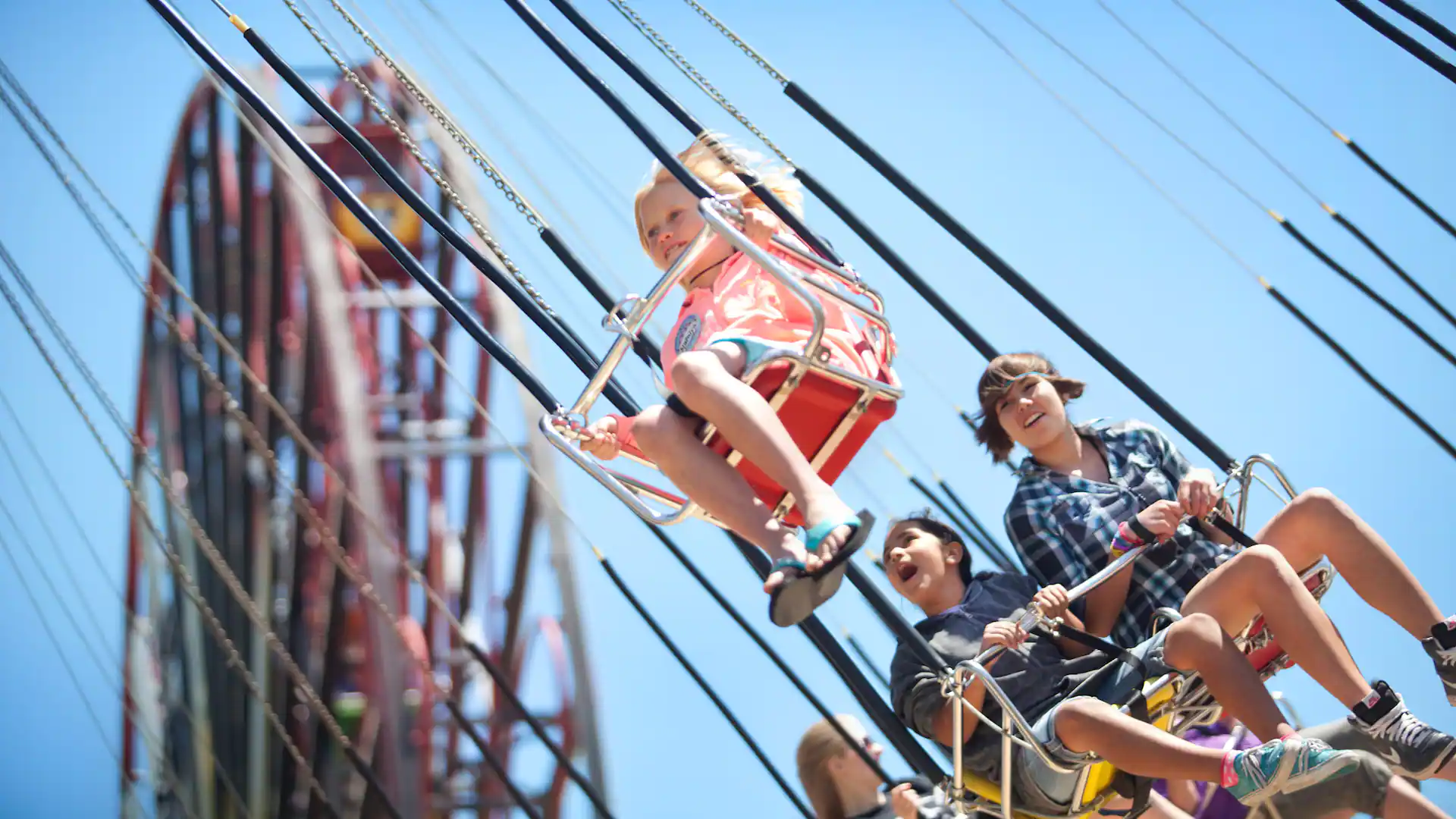
Also worth noting while we’re touring “neighborhoods”: only part of the former Paradise Pier made the transition to Pixar Pier – roughly the stretch of the boardwalk enveloped by the Incredicoaster. The rest of the former Paradise Pier did not. Instead, the remainders – including the Paradise Gardens dining area, the Goofy’s Sky School roller coaster, three flat rides (Silly Symphony Swings, Jumpin’ Jellyfish, and the Golden Zephyr), and The Little Mermaid ~ Ariel’s Undersea Adventure found themselves ceded to a mini-land created just to collect the cast-offs: Paradise Gardens Park.
The somewhat confounding result is that California Adventure’s bay is bordered by two lands that are both historic Victorian boardwalks with the same architectural style. It’s just that at some arbitrary, unlabeled point, the colors shift from white and jewel tones to sandy pink, haphazardly communicating that one pier land has ended and another has begun.
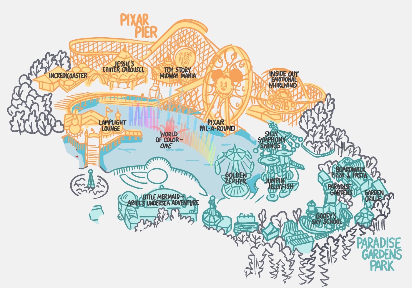
Maybe it’s not worth grumbling about. (Disneyland, after all, has two geographically-similar lands – Frontierland and New Orleans Square – that share a shoreline and likewise “blend” architecturally.) But one has to wonder why Disney didn’t just finish the job, turning the Swings, Jellyfish, and Zephyr into “label-slapped” odes to Soul, Finding Nemo, and Up, Goofy’s Sky School into a Bug’s Life, then converting Ariel’s Undersea Adventure into a Finding Nemo dark ride. (The answer to that wondering: budget.)
As it is, no signage outside of the park map indicates that “Paradise Gardens Park” exists at all as a separate space. Even where Pixar Pier begins – a pathway under the Incredicoaster’s white structure – no “PIXAR PIER” marquee was installed to signal your entry into the new land from the old one, leaving the delineation between these two lands ambiguous. (If you’ve gotten this far in California Adventure’s story, I bet you’d enjoy the solution I came up with for California Adventure’s lagoon-side lands in my from-scratch, armchair-Imagineered build-out of the park!)
And while Pixar Pier may be the oddest addition yet, it’s not the last to “break” California Adventure’s historic billion-dollar redesign…
