Main Street, U.S.A.
Background
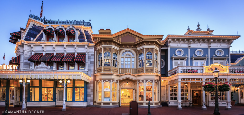
In keeping with the design standard that will pretty much follow through all of Magic Kingdom, the park’s Main Street famously gives us a version of Disneyland’s, but… richer. Disneyland’s Main Street is a small town somewhere in the Midwest that – in many ways – still echoes the home-spun simplicity of the Frontierland it’s set just a few decades after, but strung up with electricity and populated by newfangled horseless carriages.
Magic Kingdom’s (above) is decidedly more East Coast. It’s grand and opulent; a street of fine Victorian cornices, intricate gingerbread trim, elaborate finials. It’s also much more saturated with color. (An intentional design choice that’s true across Disney World; meant to brighten up parks that are often viewed against gray skies versus the perpetual blue skies of Southern California, where colors can be more muted and natural.)
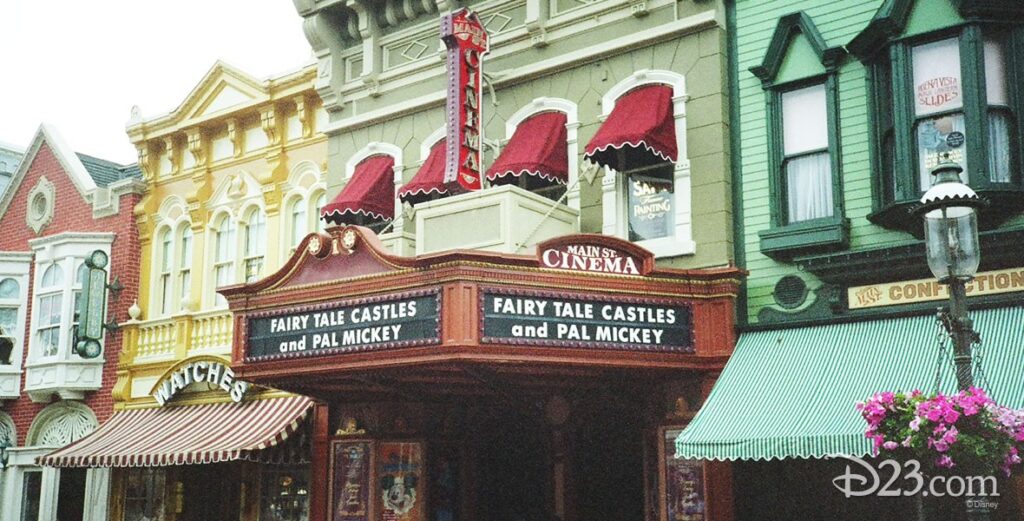
In Florida, tiny retailers or hidden gems like the Main Street Cinema, Silhouette Studio, Penny Arcade, and Magic Shop have long since become false storefronts that all feed into the same gargantuan retail spaces. Obviously, every Main Street amounts to four large rectangular retail warehouses that only look like small businesses, but in Magic Kingdom, actual little mini-shops and artisans have largely been bulldozed through.
Most emblematic is the treatment of “West Center Street” (the left-hand crossroad halfway down the block as you enter) which… well… doesn’t exist. In 2001, Disney enclosed the street and made it more retail, so the west block is one continuous store. (Disneyland uses the same little crossroad for a lovely outdoor cafe that’s a breakfast favorite.)
Oh well. There’s no use wishing Magic Kingdom’s Main Street were Disneyland’s Main Street, because it isn’t and shouldn’t be. And though I’ll no doubt spend a lot of this Build-Out pointing out how Magic Kingdom differs from other Castle Parks, or drawing bits and pieces from them, it’s all so that Magic Kingdom feels more distinctly its own. So here are a few of the edits I made here.
Build-Out
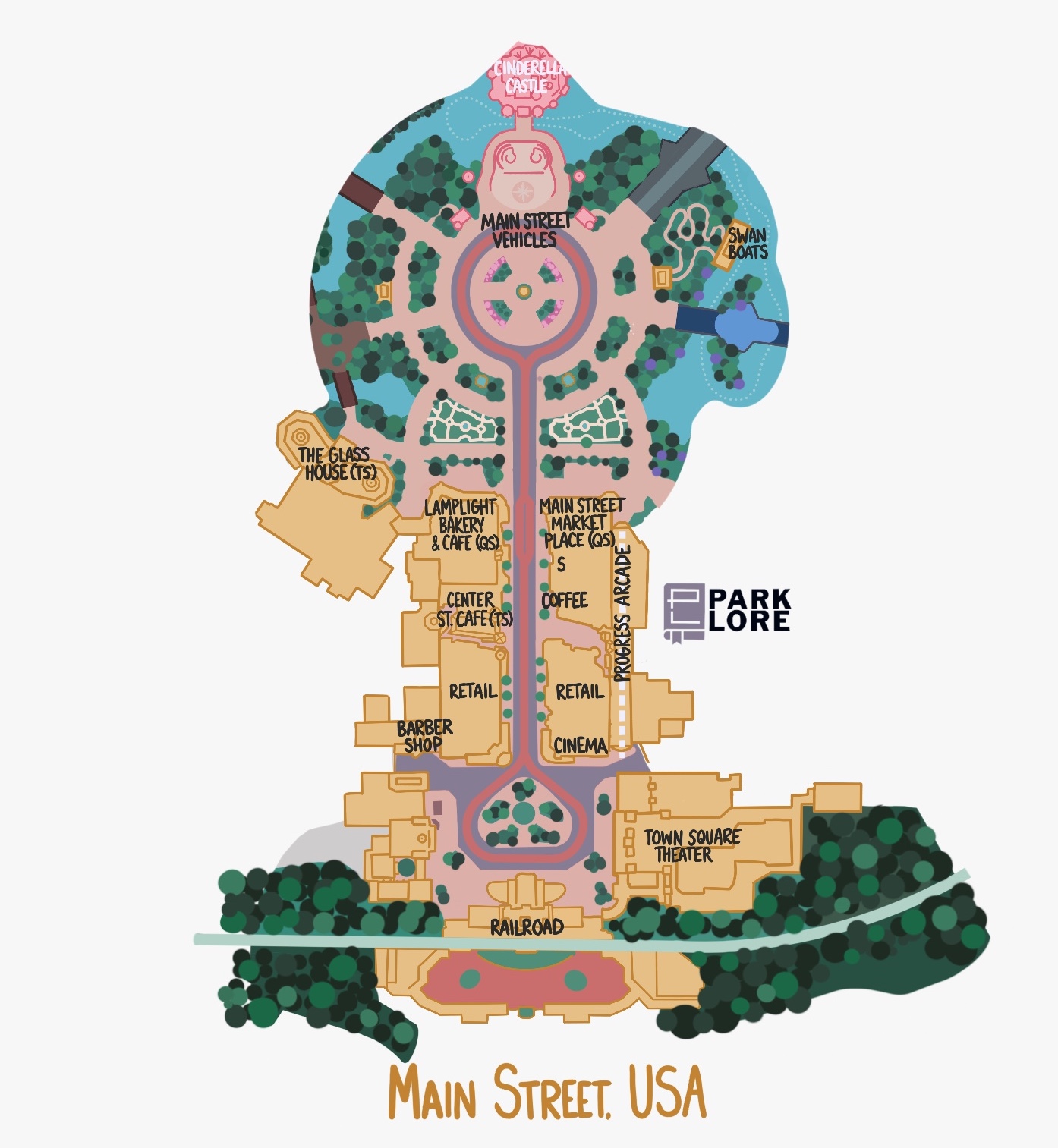
A few quick things we can check off. First, I wanted to be sure to emphasize that the MAIN STREET VEHICLES are a part of my plan. Magic Kingdom’s horse-drawn carriage, double-decker bus, early automobile, and other vehicles tend to make very rare, short-lived appearances in the park, and most fans just brush it off and say, “Well, it’s the number one most-visited theme park on the world, and running those things just isn’t feasible.”
But it’s worth remembering that Disneyland is the number two most-visited theme park in the world (by an increasingly close margin) and manages to make it happen every day, well into the day. So no excuses from me – let’s get those vehicles running to add some warmth, charm, and delight to a park that sometimes leaves those “feel good” details behind.
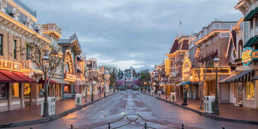
Another small, nit-picky detail: bricks. Disneyland Paris and Hong Kong Disneyland’s Main Streets are both entirely red brick. It’s warm and old-fashioned and very “storybook.” Disneyland California has brick sidewalks and, in 2018, bricked the trolley tracks, creating a pleasant strip of warmth down the street’s center (another effort that almost gave fans heart attacks, but ended up looking perfectly lovely). Magic Kingdom’s Main Street is still all colored concrete, including the sidewalks (with the exception of East Center Street, which was turned to brick in December 2022 – a very good sign). I’m sure the colored concrete was an interesting idea in 1971, but I kind of hate it.
One of the other things that bothers me about Magic Kingdom is that it just doesn’t have many great options for “Quick Service” dining – Disney’s term for restaurants where you grab a tray and load it up with selections before paying and seating yourself, or where you place an order and are called up to a window to receive it. Main Street is particularly harsh, with three reservation-based “Table Service” restaurants (Tony’s Town Square Restaurant, The Plaza Restaurant, and the Crystal Palace), leaving only confectionaries and the limited-menu Casey’s Corner to make up the rest of its dining offerings.
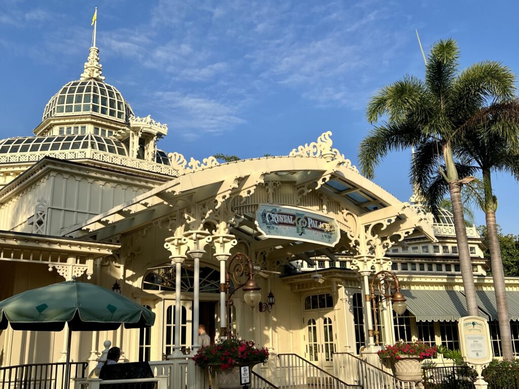
So my build-out changes that. We leave the Crystal Palace (renamed THE GLASS HOUSE) as a Table Service, embracing it as a sort of Victorian botanical garden “Palm House” that begins the “blend” into Adventureland.
But next door, Casey’s Corner has become an elevated Quick Service option – the LAMPLIGHT BAKERY, serving sandwiches, soups, and coffee. These two eateries are now well-positioned to pick up visitors as they circumnavigate the park, or to grab a quick bit before they head off. For those who start their Grand Circle Tour by heading right at the Hub, the Plaza Restaurant has become the MAIN STREET MARKETPLACE – a Quick Service eatery offering grab-and-go lunches and day-starting snacks to be enjoyed in the Hub or in the spacious, sunlit dining room.
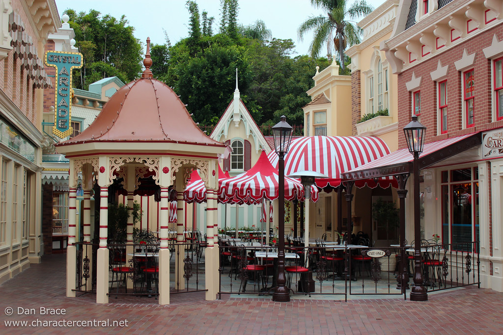
Balancing it, I have restored West Center Street for a new indoor / outdoor cafe called WALT’S. Let me say now: I realize that Florida isn’t California, and that outdoor dining is a luxury to be comfortably enjoyed mere months of the year. But it was still important to me that this space regain the kinetics and pleasantries of having umbrellas and wrought iron patio tables, even if here it would need to be under an elegant gazebo covering as those installed at Disneyland Paris’ Casey’s Corner in 2023.
Otherwise, I didn’t make many changes to Main Street, U.S.A. This is a high-throughout park that needs cavernous retail and dining spaces, and it is what it is.
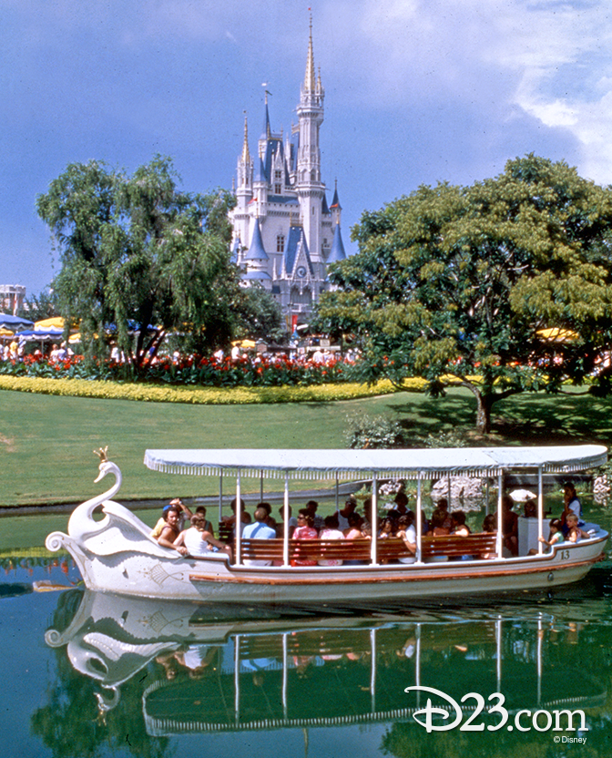
However, I did feel the need to bring back a modified version of a classic attraction: the SWAN BOATS. The former version of this ride (which operated from 1973 to 1983) used fairly elaborate 26-passenger boats, departing from the east side of the Hub and circling all the way to the Swiss Family Robinson Treehouse. My version – perhaps foot and / or hand-pedal-powered with seats for 4 or 5 – would instead merely loop around to the Castle’s east side, giving riders a wonderful photo spot and a chance to get up close to the castle, adding the kind of much-needed “B-Ticket” capacity that gives folks low-wait things to do between E-Tickets.
Obviously, I haven’t done anything revolutionary or astoundingly out-of-the-box to Main Street. (Though concepts of Disneyland Paris’ never-built, 1920s-set version of the land are a thing of beauty and definitely something any armchair Imagineer should look into.) And since dreams of planting trees back in the Hub wouldn’t fall into our requirement to think realistically and reasonably, we might as well just move on in our Grand Circle Tour…
ADVENTURELAND
Background
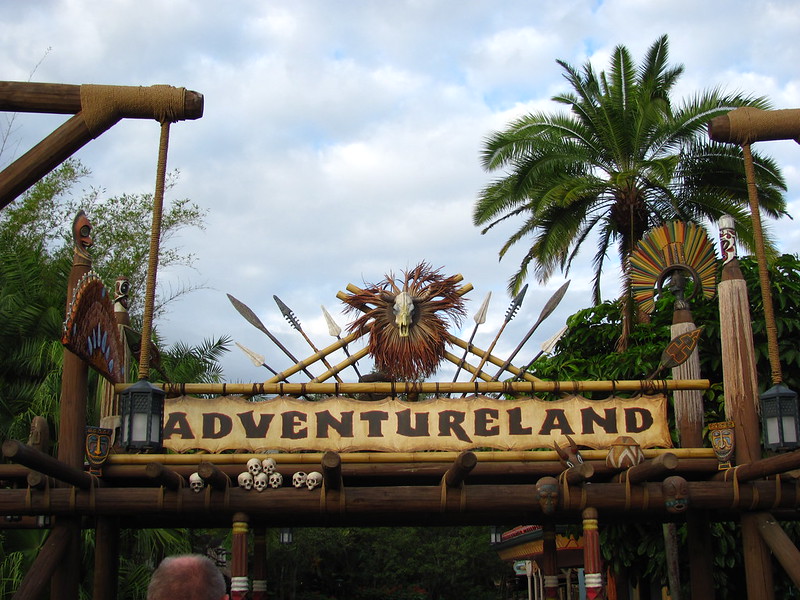
Adventureland is another area where – on the surface – Magic Kingdom would seem to parallel Disneyland. However, “on the ground,” these two manifestations of adventure are surprisingly distinct.
In California, Adventureland benefits from the accidental brilliance of Disneyland’s “naïveté”. Designers there were literally making it up as they went, reacting in real time as they wedged various eras’ ideas of “adventure” together. African jungles (’50s), Tiki birds (’60s), and Indiana Jones (’90s) “swirl” pleasantly into a space that’s scrappy and rough, framed by an overarching 1930s timeline. Contradictions become part of the fun as the Tropical Hideaway and Adventureland Treehouse mix mythologies of S.E.A. and the Jungle Navigation Co. Ltd. and Indiana Jones and Dole Whips. It’s a fascinating, pulpy mix, and it works!
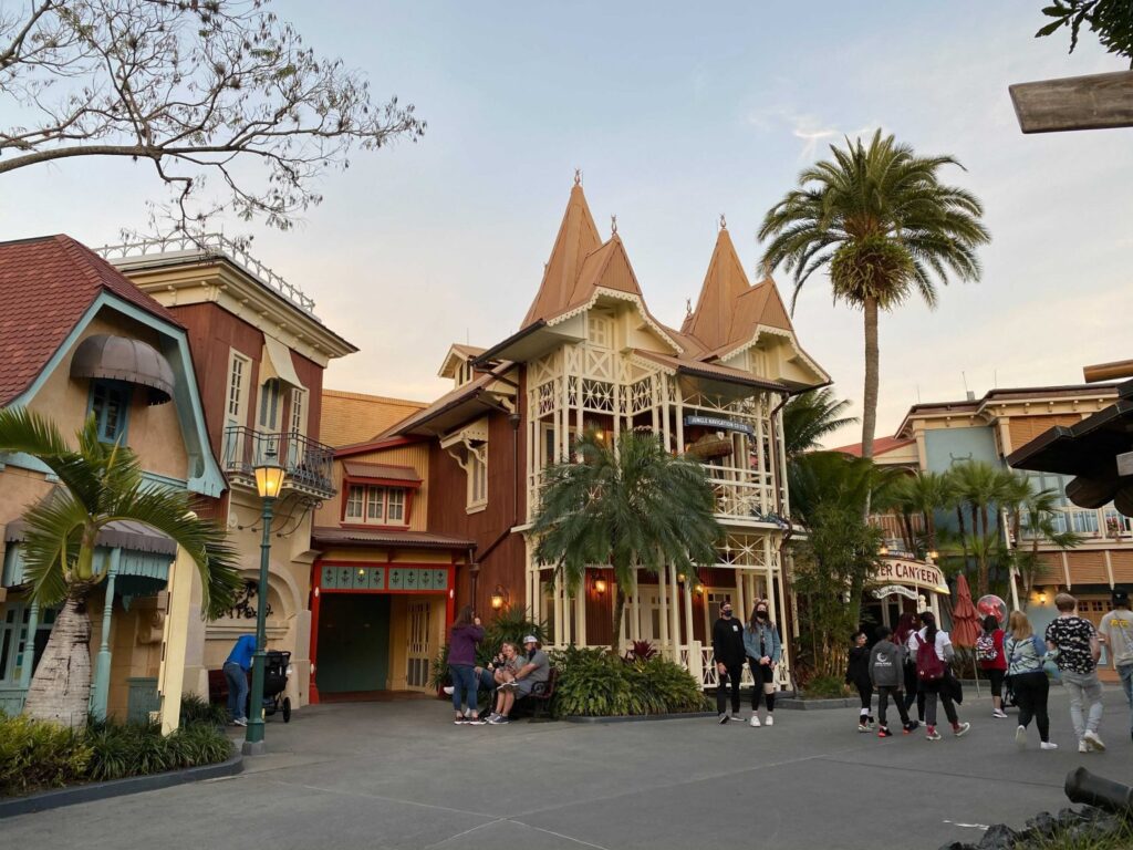
It’s clear that by time Magic Kingdom came about the “rules” weren’t being written anymore; they were being followed. The land has a discrete “Jungle Cruise” section; a discrete “Tiki Room” section; and – in a 1973 addition – a discrete Spanish-Caribbean “Pirates” section. There is very little “swirl” and much less in the way of overlap. Instead, each of the sub-areas (what Disney would now call a “neighborhood”) sort of exists in its own zone, and – in the tradition of Magic Kingdom – is “rich.”
Take the “Jungle Cruise” “neighborhood” of the land (above). Foxx Nolte notes that Magic Kingdom’s Adventureland is really the only Adventureland that’s overtly “feminine.” It’s a compelling distinction. Here, you emerge from the Hub not in a ramshackle, rustic outpost of tin roofs, rocky outcroppings, flaming torches, and makeshift signage, but a delicate colonial outpost behind whose gables, iron railings, lampposts, and finials the well-to-do of the S.E.A. crowd can claim to have been in the jungle, while truly be far removed from its inconveniences. If you squint, it could be Main Street. It’s gingerbread; delicate.
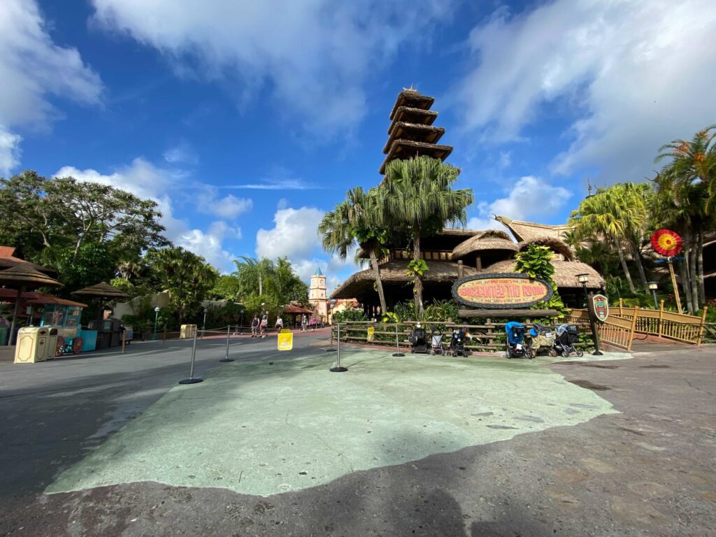
The downside of Magic Kingdom’s master planning is also evident – the park’s wide, plaza-like pathways mean even this greenest of the park’s lands is weirdly sun-drenched. Only the occasional planter with a lone palm breaks up the flat expanse. There’s no illusion that this is an outpost set down in the jungle, because we can see that the trees don’t resume on the back side of the buildings (their backs, after all, are Frontierland).
And besides, as soon as it’s appeared, the “Jungle Cruise” outpost is gone – disappearing to become a Polynesian courtyard built around the Sunshine Pavilion, then the Caribbean Plaza just beyond…
Perhaps the two most distilled issues with Adventureland that I wanted to solve were that it’s both “not enough” and “too much.”
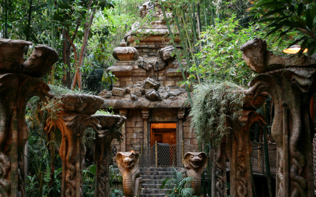
The “not enough” comes by way of a(nother) comparison to Disneyland. The California park benefits tremendously from having a grounding, anchoring centerpiece for the land in the Modern Marvel – Indiana Jones Adventure: Temple of the Forbidden Eye. Not only does this ride’s narrative gravity sweep through the land to dictate its timeline and style, but it also gives the park something in the way of a “PG-13” attraction that’s intense, thrilling, and frightening. It makes Adventureland an important land – both in being a hub of activity and in balancing the thrills found on the park’s east side. Obviously, Magic Kingdom lacks that.
And by the way, Magic Kingdom should not have Indiana Jones Adventure. Again, this is a different Adventureland – one where the well-to-do to dine on exotic dishes, not where dashing, rough-and-tumble heroes gnash on beef skewers and lumpia. This is an Adventureland more fit for Lord Mystic than Indiana Jones, which leaves the build-out worthy question of what an anchoring E-Ticket for it should be…
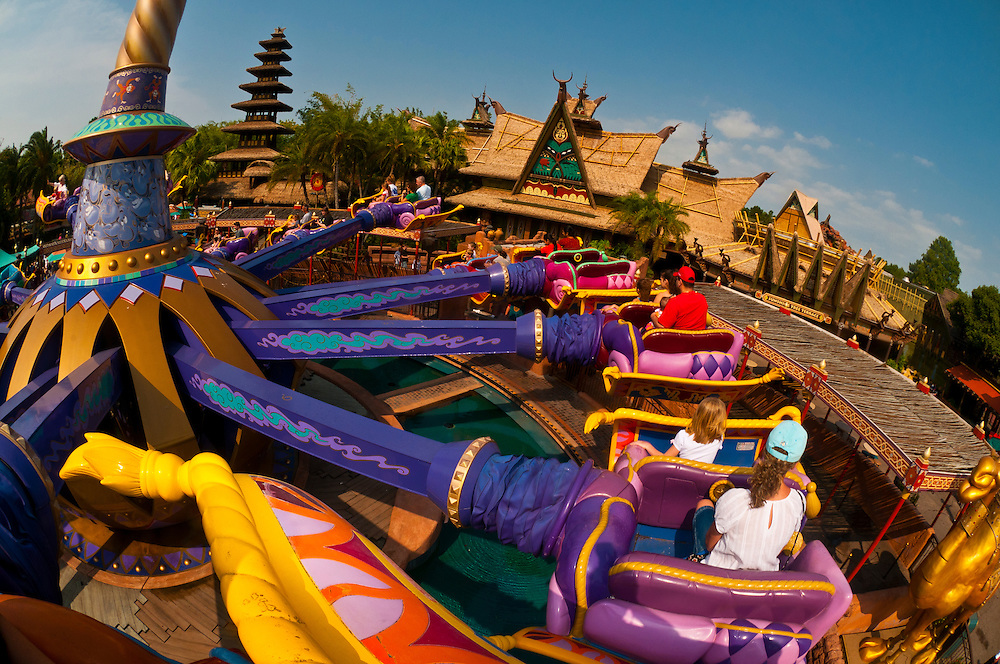
There’s also the “too much” problem. For whatever reason, someone decided that Magic Kingdom needed a third (of an eventual four) essentially identical Dumbo spinners. The result is that, in 2001 – smack dab in the middle of the Polynesian plaza – a pink and purple spinner themed to 1992’s Aladdin appeared, with Middle Eastern tents creating a mini Arabian bazaar around the vibrant, cartoon carnival ride. In an environment as rich as Adventureland, it makes about as much sense as a fiberglass “Flying Bisons” ride being plopped into the otherwise camera-ready Frontierland.
Listen – I’m a huge advocate for Disney Parks having more family flat ride capacity. Again, these sorts of B- and C-Ticket rides are essential. Especially as Genie+ spreads well beyond the 2 or 3 E-Tickets the system should apply to, these mid-capacity, mid-appeal rides give guests “quick wins” with fast-moving lines to do between Lightning Lanes (or now, if you don’t pay for Genie+, any “quick wins” at all.) But even if its capacity is vital, the Magic Carpets of Aladdin is so obnoxious that no build-out of Magic Kingdom would let it live…
So what’s my solution for the “not enough” and “too much” of Adventureland? Read on…


Curious as to how the announced plans for Magic Kingdom at D23 this year alter your thoughts for how this was created
The answer is yes and no. I feel great for having ferreted out that the park would end up with both a “villains” land and a “geysers” land (by way of the new Cars stuff). Obviously I prefer my layout since it maintains the Rivers of America, but Disney not activating a lot of the expansion space that I did suggests that it’s not suitable for development in the real world for one reason or another.
Magic Kingdom was a hard park for me to play with because like I said too many times in this write-up, I don’t really love it to begin with. I think this is a good build-out, but I like the final product a whole lot less personally than I like my California Adventure or Islands of Adventure build-out… I just can’t know if that’s because I like those parks better to begin with and had more fun making them, you know? Haha. I didn’t make this layout for me, necessarily, but for people who I know love Magic Kingdom and want a build-out that embraces its scale and its Americana and its ’70s-ness. I also think it’s the least “reasonable” build-out I’ve done because it’s so largely character-free in a way that’s not at all realistic. Disney would sooner shut the park down than expand Frontierland like I did, or add a ’60s World’s Fair mini-land. It’s outrageously off-the-mark in that way!
I do like your concept for frontierland, although I think replacing splash mountain with a train themed ride when it’s RIGHT next to two other train themed rides is a bit redundant. It would probably have been wiser to replace it with a different flume ride, because even though you did add grizzly river run in elsewhere, a mix between western river and splash mountain would have been better.
im gonna say this is a great buildout i mean its awsome and great ideas for magic kingdom i do wonder if youre ever gonna do another castle park?
Hiya! Thanks for checking it out! I don’t know exactly what I’ll do next, but Castle Parks are hard since they’re so beloved (making it hard to change things) and often quite full. So, we’ll see!
yeah i do imagine its hard to change castle parks but still you did a great job and i think the changes you made are really good. i cant wait to see whatever you have in store next!
I love this buildout! splitting tomorrowland into two parts seems like a new and good step in fixing the “tomorrowland” problem.
What software do you use for creating these buildouts?
Hello! Thanks for reading! I hand-draw these on Procreate on an iPad with an Apple Pencil. Hope that helps!
Big fan of your buildouts! The idea of splitting tomorroland into two parts seems like a good step in solving the “tomorrowland” problem.
What software do you use to draw your buildouts?
Just finished reading the entire build out, word for word. I am genuinely sad it’s over. This was amazingly written, had beautiful illustrations and fantastic ideas. I want to read more about the individual attractions that you have created! Thank you for putting the work into this magical build out!
(Have you considered creating a print off your reimagined MK? I would definitely buy one if you did!)
Thank you so much for saying this! It’s truly the highest praise I could ever hope for, because this is a lot of reading… ahha! I do have some designs on shop.parklore.com, but if you want a print of this I’d be happy to add one! Just let me know. I appreciate you!