PLAZA DE FAMILIA
Build-Out
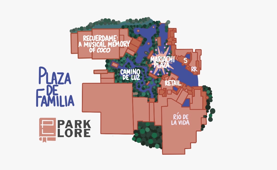
Again I ask that you hold the tomatoes as I offer a somewhat out-of-the-box idea for the former Caribbean Plaza.
Basically, I decided to take this former subsection of Adventureland and cut it away to create an entirely new land for the park – Plaza de Familia. This new land would take hold of the Caribbean Plaza and reimagine it as a Mexican town square, drawing inspiration from the states of Oaxaca and Guanajuato, and – of course – the town of Santa Cecilia from Coco.

A vibrant, colorful, little crossroads in the park’s pathways, Plaza de Familia gets to be a cultural feast filled of picado flags, dancing, fresh cooking, lanterns, and of course, music. I imagine turning the corridor between Pirates and Tortuga Tavern into a buzzing little mexican village with the Church of Santa Cecelia standing at the far end and serving as a “weenie” drawing guests in from Adventureland.
Just in front of the church would be MARIACHI PLAZA – a small musical stage for small acts, perhaps on the scale of the Paradise Gardens Bandstand at Disney California Adventure. Across from it, we have the former Tortuga Tavern. Disney has long-struggled with this venue, which is just too small to offer any kind of sizable menu.
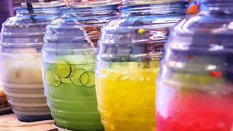
Embracing that, I’ve turned it into one of a handful of small storefronts in town, serving AGUAS FRESCAS – refreshing, iced Mexican fruit drinks traditionally ladled from large jars. Agua fresca usually has real fruit pieces in its bright, pleasantly-sweet, rotating flavors – cucumber lime, orange pineapple, strawberry horchata, blueberry pomegranate, etc. – so every member of the family can get one that sounds perfect for them. I think agua fresca would be a relatively low-lift product to serve, an authentic taste of Mexico, and a perfect treat for sipping from shaded tables around the plaza as you enjoy the live entertainment.
The church would serve as the entry for a new show called RECUÉRDAME: A MUSICAL MEMORY OF COCO. I loved the idea of using this space for a show that’s very “in universe,” where the townspeople have come together to tell stories about Mama Coco and their own loved ones, using larger-than-life puppets, props, and songs to talk about those they love and the Land of the Dead.
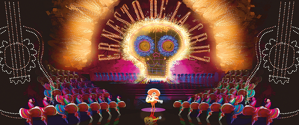
A show like this would be so much more than just a “book report” of the movie, and though it could incorporate songs like Remember Me, Un Poco Loco, and Proud Corazón, it would also be cultural and meaningful, adding new context to Día de los Muertos and to the Mexican traditions surrounding celebrations of life, death, and reunion. It would also finally give Magic Kingdom a true performance venue – a 1,500 seat theater for seasonal entertainment and special events.
Back in town, a gate off of Mariachi Plaza would lead to the Santa Cecilia Cemetery, housing an attraction I called CAMINO DE LUZ. Though it’s small, I loved the idea of this space being something like EPCOT’s Journey of Water, but dealing with light. Here, discrete stops throughout the cemetery would allow guests to interact with and control light. For example, you might wave and watch as walls of candles reflect your movement in light, or raise and swirl your arms and watch marigold petals glow and swirl through the wind.
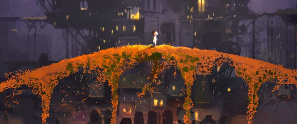
Finally, Pirates of the Caribbean has been reimagined as RÍO DE LA VIDA. Setting sail from town, guests are invited to plunge over the Marigold Bridge and sail the “River of Life” through the Land of the Dead. Like Pirates, it was important to me that this ride not become a book report retelling of Coco, but remain a “cocktail party” where we, as guests, get a glimpse into the neighborhoods of the Land of the Dead where residents live in eternal celebration, reunion, and remembrance.
I feel like there are so many great vignettes here, with “Remember Me” wearing many hats along the way. I imagine a lot of very fun, memorable, and iconic scenes in the Land of the Dead – including many allusions to Pirates! – that would serve as an homage to Marc Davis’ characters and humor, while giving Magic Kingdom a totally unique musical boat ride.
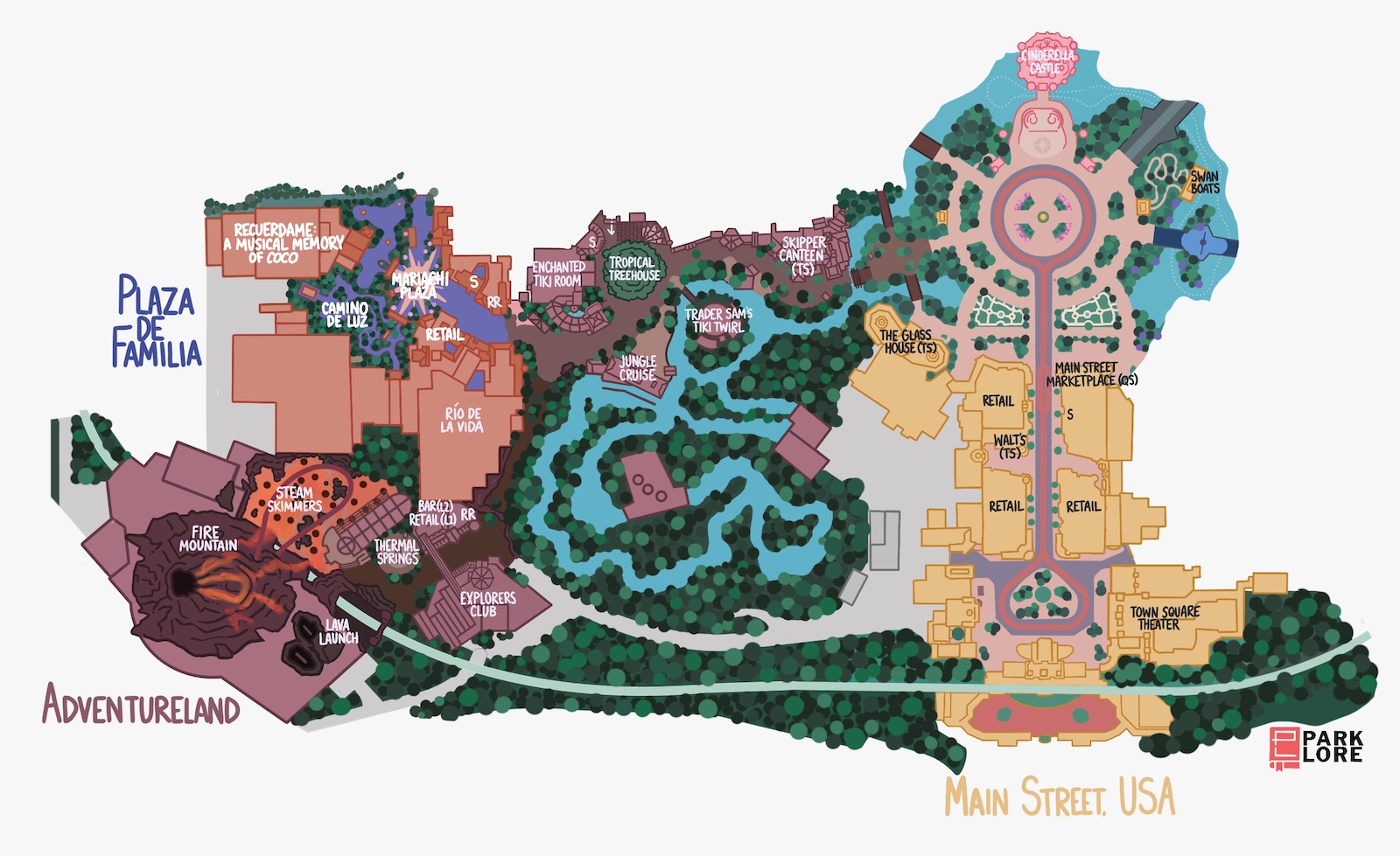
Altogether, I feel like rather than creating a Coco land from scratch, this adaptive reuse of the Caribbean Plaza manages to knock out several to-do items at once, both for this area and for the park as a whole. It makes this area colorful, musical, cultural, and a useful transition between Adventure and Frontier, which is where we’re heading next…
NEW! PLAZA DE FAMILIA
RIDES
- Río de la Vida (musical boat-based dark ride; re-theme of Pirates)
ATTRACTIONS
- Camino de Luz (outdoor interactive walkthrough experience)
- Recuérdame: A Musical Memory of Coco (live musical revue in a 1,500 seat theater)
RESTAURANTS
- Agua Frescas (S)
Liberty Square & Frontierland
Background
Especially in a big picture context, it’s interesting that the lands around Magic Kingdom’s Rivers of America are arranged the way they are. We can imagine that something chronological is going on. At Disneyland, the river flows from Frontierland (1860s) through New Orleans (early 1900s) and on to Critter Country (an indiscernible time and place, apparently somewhere between Georgia and the state of Washington), capturing three distinctly American environments along its shores.
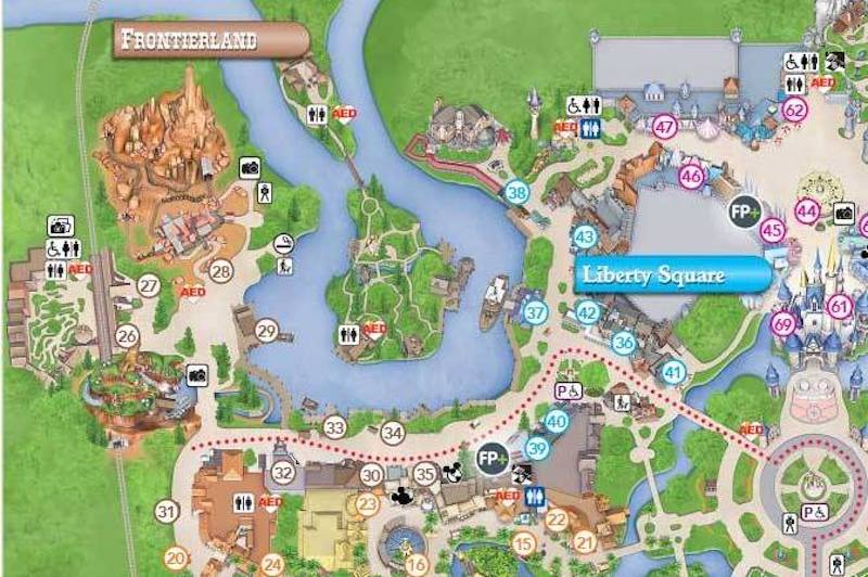
Maybe that explains why Frontierland at Magic Kingdom is on the west side of the river rather than the east… So we begin in Liberty Square (1770s) and – with all the maturity, richness, and master-planning you expect from the Florida park – very gradually head west and through time en route to Big Thunder Mountain (1870s), advancing a century and crossing the country as you travel clockwise around the river’s bend.
Likewise, Disneyland’s Frontierland paints the picture of a simpler, home-spun frontier town in the woods – one of dark, splintered wood buildings, blacksmiths, pioneer spirit, log cabins, fences fashioned from felled trees and leather wraps, and the sort of perennial picture of the hard-fought frontier as seen in The Lone Ranger and Davy Crockett. That makes sense since this image of the “Old West” and the heroes who inhabited it were basically the 1950s equivalent of the superhero genre – thee thing in pop culture during Disneyland’s development. But Orlando is different.
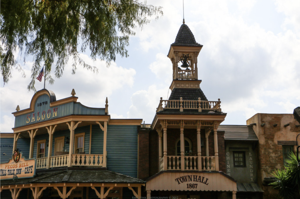
Continuing the trend we’ve seen with Magic Kingdom’s Main Street and Adventureland already, Liberty Square and Frontierland are decidedly “buttoned-up.” This ain’t a rustic frontier outpost. We’ve got quite elaborate spindles, shingled bell towers, decorative flourishes, painted facades… We see buildings in this Frontierland that were “est. 1878” or later, suggesting that we’re in at least the 1880s or 1890 (which puts us within a decade or two or Main Street, U.S.A., and it looks it.)
For context: That’s probably because, by the ’70s, Americans fascination with the Old West had largely waned. At least temporarily, the approaching 1976 American Bicentennial had inspired rampant patriotism (hence, Liberty Square), so it made sense to continue that narrative by making the second Frontierland less about living history and more about the proud, established, refined spirit of a sturdy, self-assured, expanding America. (Obviously, the result is a clever “flow” between these two lands, but also, a level of “more of the same.” In fact, with just a few architectural or paint swaps, this Frontierland could be Main Street, or Liberty Square, or Adventureland, couldn’t it?)
As you’d expect, I have my issues that I wanted to address:
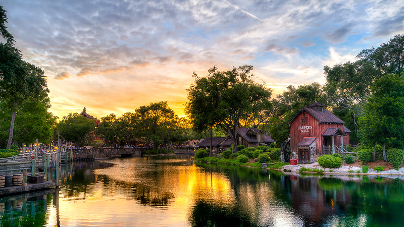
1. Magic Kingdom serious underutilizes its riverfront. A comparison to Disneyland isn’t worth diving into, except to say that Disneyland’s kinetic, open, relaxing, and beautiful riverfront is quite sincerely the heart of the park. Magic Kingdom awkwardly relegates any connection to the Riverfront to an unending series of docks and boardwalks separated from the main path by trees, making the water itself difficult to reach.
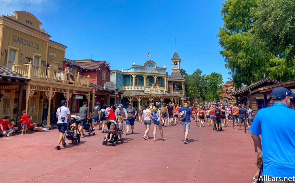
2. Magic Kingdom inexplicably uses these two lands as part of its parade route – a move that absolutely baffles us Disneyland folks, because it both obliterates any sense of immersion or realism in the land and also requires that they remain broad, concrete, sun-drenched corridors with room for floats and for crowds to gather on either side of the midway.
3. The lack of clear distinction between these lands makes them feel a little bland to me. The gradual “flow” through time and space seems like one of those “Look how thoughtful and advanced we are now” showcases by WDI, but in practice, leaves particularly Frontierland feeling like it’s just a handful of false fronts facing the river; there’s no sense that this is a “real” town you can explore, or that there’s “real” history here, or – again – that it’s different than any other collection of two story false fronts we’ve seen so far.
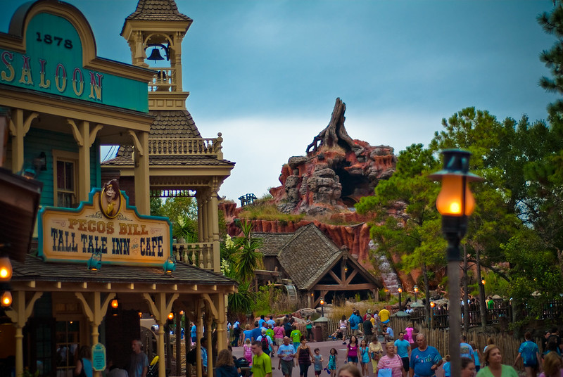
4. Splash Mountain. I need not go on and on here, because you get it. Magic Kingdom wasn’t built with either of Frontierland’s “Mountains” in mind. In retrospect, if they’d just built Big Thunder where Splash ended up, then they could’ve accessed the north side of the river for Splash, giving it its own land. But instead, we ended up with an 1880s frontier town, a desert mountain its residents mine in, and – smack dab between them – a grassy hillside filled with fanciful singing animals telling a Deep South folktale.
To be fair, Imagineers did make sure to plant scrubbier, desert plants on Florida’s Splash Mountain, and added harmonicas and dulcimers to its score to make it more “Western.” But it could never make sense – narratively or operationally – to have two “Mountains” representing vastly different geologies and styles next to each other on a dead end path. Whether Tiana or Brer Rabbit inhabits it hardly matters. And naturally, Magic Kingdom would never remove such an E-Ticket. But in a dreamy build-out, we can use Splash Mountain’s real estate differently, which is exactly what we’ll do.


Curious as to how the announced plans for Magic Kingdom at D23 this year alter your thoughts for how this was created
The answer is yes and no. I feel great for having ferreted out that the park would end up with both a “villains” land and a “geysers” land (by way of the new Cars stuff). Obviously I prefer my layout since it maintains the Rivers of America, but Disney not activating a lot of the expansion space that I did suggests that it’s not suitable for development in the real world for one reason or another.
Magic Kingdom was a hard park for me to play with because like I said too many times in this write-up, I don’t really love it to begin with. I think this is a good build-out, but I like the final product a whole lot less personally than I like my California Adventure or Islands of Adventure build-out… I just can’t know if that’s because I like those parks better to begin with and had more fun making them, you know? Haha. I didn’t make this layout for me, necessarily, but for people who I know love Magic Kingdom and want a build-out that embraces its scale and its Americana and its ’70s-ness. I also think it’s the least “reasonable” build-out I’ve done because it’s so largely character-free in a way that’s not at all realistic. Disney would sooner shut the park down than expand Frontierland like I did, or add a ’60s World’s Fair mini-land. It’s outrageously off-the-mark in that way!
I do like your concept for frontierland, although I think replacing splash mountain with a train themed ride when it’s RIGHT next to two other train themed rides is a bit redundant. It would probably have been wiser to replace it with a different flume ride, because even though you did add grizzly river run in elsewhere, a mix between western river and splash mountain would have been better.
im gonna say this is a great buildout i mean its awsome and great ideas for magic kingdom i do wonder if youre ever gonna do another castle park?
Hiya! Thanks for checking it out! I don’t know exactly what I’ll do next, but Castle Parks are hard since they’re so beloved (making it hard to change things) and often quite full. So, we’ll see!
yeah i do imagine its hard to change castle parks but still you did a great job and i think the changes you made are really good. i cant wait to see whatever you have in store next!
I love this buildout! splitting tomorrowland into two parts seems like a new and good step in fixing the “tomorrowland” problem.
What software do you use for creating these buildouts?
Hello! Thanks for reading! I hand-draw these on Procreate on an iPad with an Apple Pencil. Hope that helps!
Big fan of your buildouts! The idea of splitting tomorroland into two parts seems like a good step in solving the “tomorrowland” problem.
What software do you use to draw your buildouts?
Just finished reading the entire build out, word for word. I am genuinely sad it’s over. This was amazingly written, had beautiful illustrations and fantastic ideas. I want to read more about the individual attractions that you have created! Thank you for putting the work into this magical build out!
(Have you considered creating a print off your reimagined MK? I would definitely buy one if you did!)
Thank you so much for saying this! It’s truly the highest praise I could ever hope for, because this is a lot of reading… ahha! I do have some designs on shop.parklore.com, but if you want a print of this I’d be happy to add one! Just let me know. I appreciate you!