Quickly, let’s take a look at what I decided to do with the space we’ve cleared out by removing Storybook Circus, Dumbo, and the Teacups (the ingredients of which have been strewn about the park and thus, still add to its capacity). What we end up with when all of this area is combined is basically a good amount of space in the park’s northeast corner. We also end up with what’s been probably the least traveled of the spokes branching off of the park’s Hub – the one that runs between the back of Fantasyland and the back of Tomorrowland, right to their awkward overlap at the Tea Cups.
Speaking of being at the start of Tomorrowland, we have another lingering issue to solve. Obviously, Tomorrowland is a mess. To distill it down concisely (my speciality, as you can tell 16,000 words in), I think tomorrowland is pulled in three directions. The future (y’know, the expectation that it should look like tomorrow – whatever that means), the past (the sense that the strongest Tomorrowlands are the ones rooted in a timeless retro-futuristic style), and of course, the siren song of the present (that is, serving as a catch-all for Disney and Pixar films).
So trying to use space wisely and solve several issues, I created here what might be the most narrow land in any Disney Park… but one I’m actually really excited about. Welcome to…
YESTERLAND
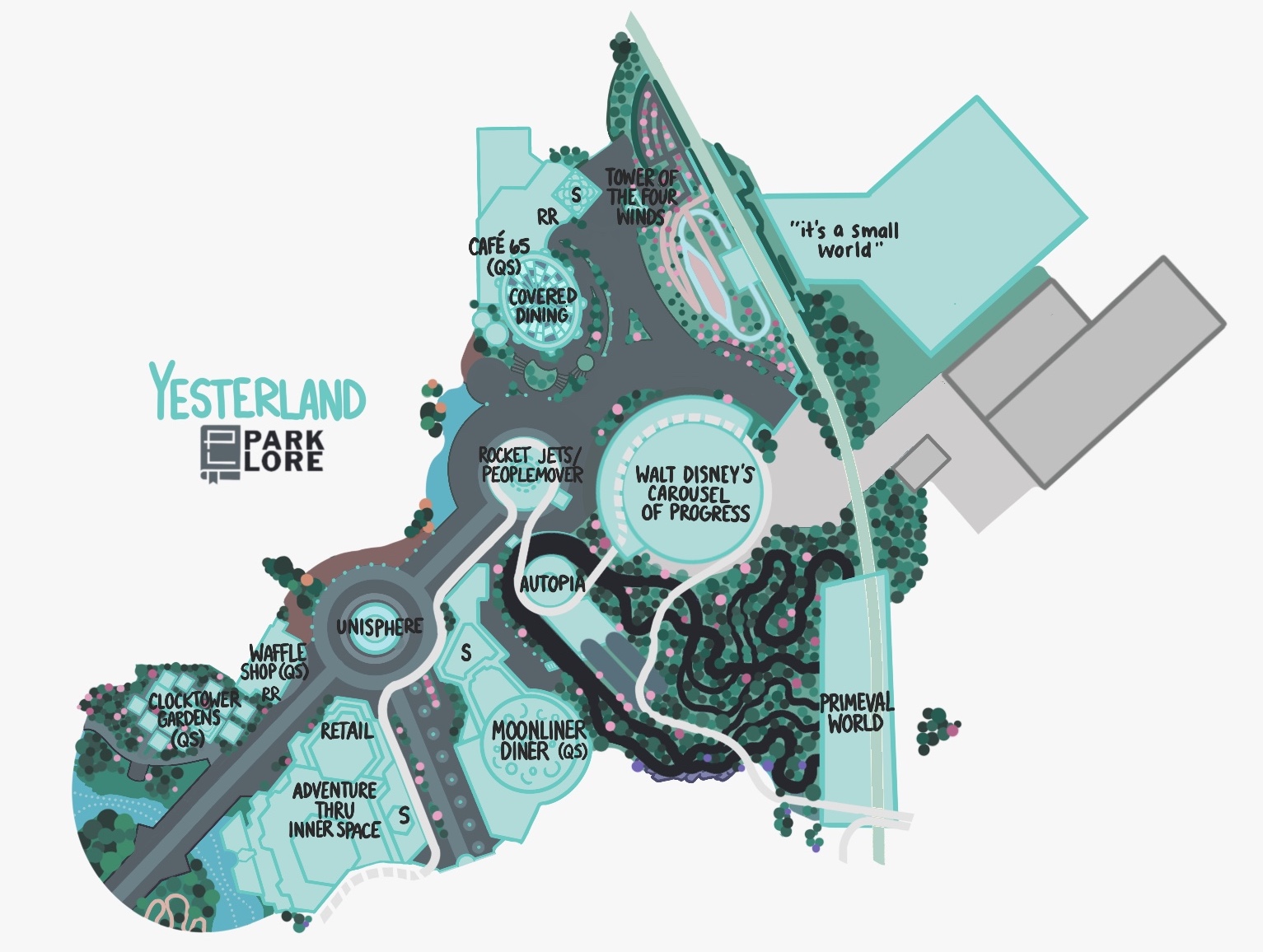
That’s right – with apologies to Werner Weiss (who’s cited across Park Lore), I couldn’t think of a more apt name for this area than Yesterland, a celebration of yesterday’s vision of tomorrow. In Yesterland, we can segment out the retro-futurism of mid-century America Tomorrowland is tethered to, giving it its own space incarnate as a dreamy, romanticized version of the 1964 – 65 New York World’s Fair.
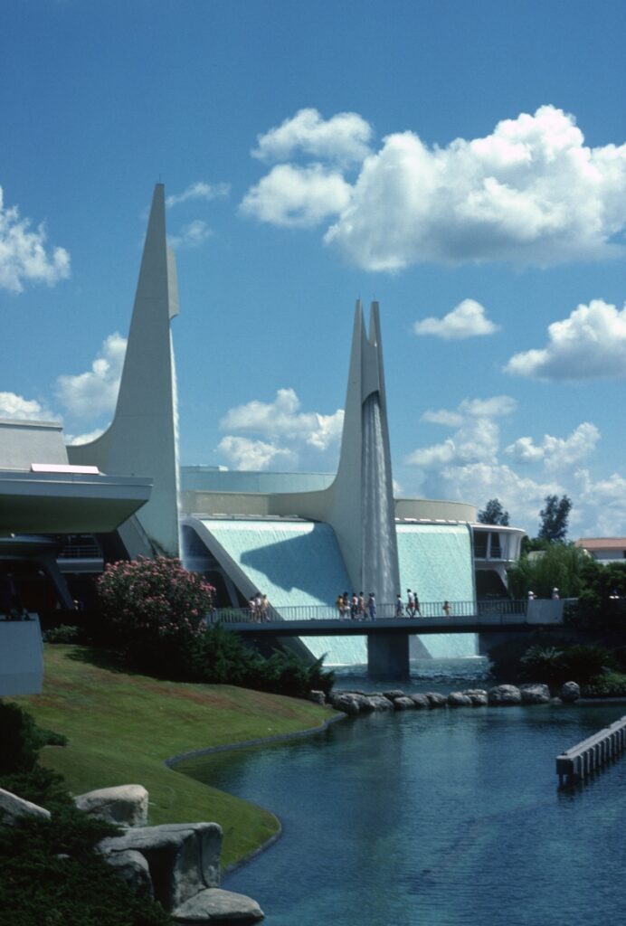
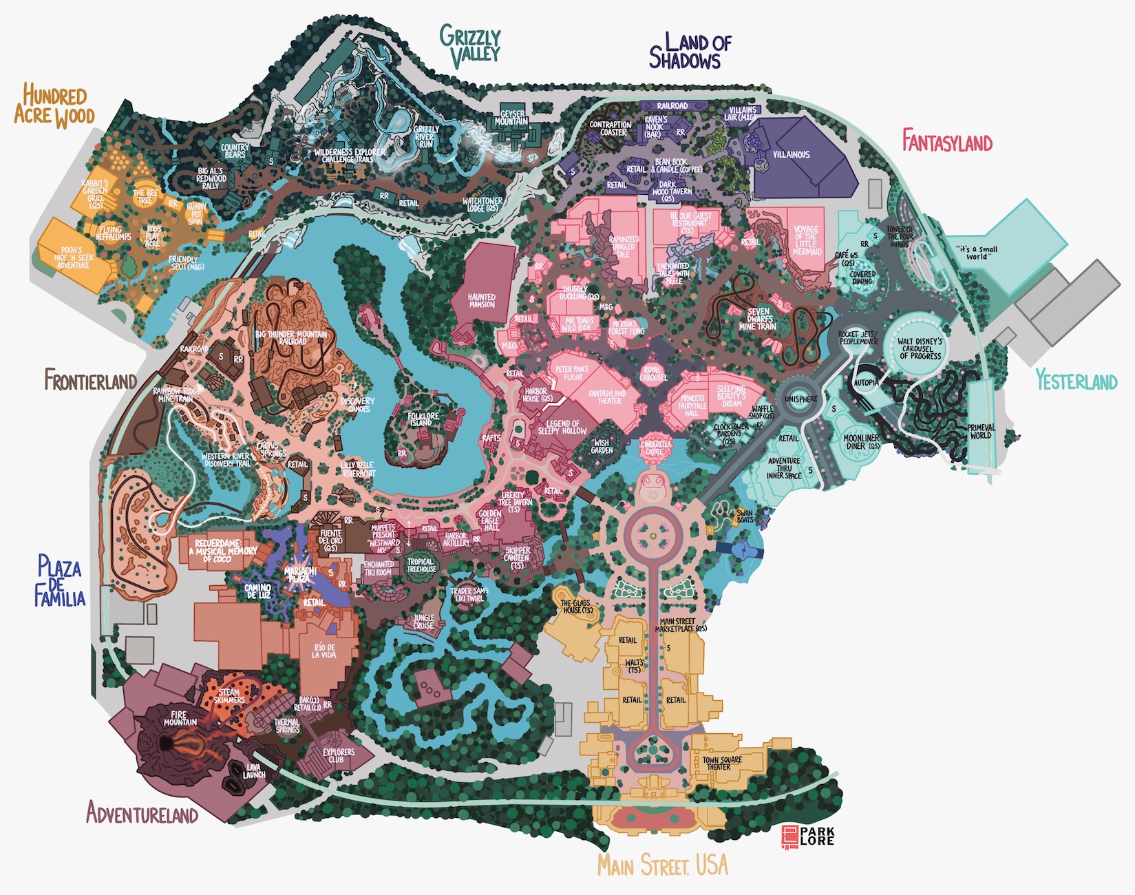
Let’s imagine entering from the Hub, down that once-redundant spoke. Now, this spoke feels like as grand an entrance as any other land off the hub is afforded. To start, I used Yesterland to bring back one of the iconic pointed spires and sprayed waterfalls beloved in Magic Kingdom’s original 1971 Tomorrowland. That fountain – traversed by the Swan Boats – creates a visual icon for this land, setting its Space Age-y timeline.
The building shielded by that waterfall tower – formerly the Starlight Cafe – now becomes ADVENTURE THRU INNER SPACE – a retro-cool, totally abstract, atmospheric dark ride down to the size of an atom. I explored the full story of this Lost Legend in its own feature, but trust me that this ride would still play well today in a “retro” context like Yesterland offers. It also feels like a real tribute to Walt, who was instrumental in the ride’s design and very tuned into the coming Atomic Age.
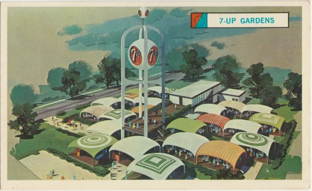
To the left, in the unused space opposite the Garden of Wishes is the CLOCKTOWER GARDENS Quick Service eatery. I’m telling you, I’m obsessed with the 7-Up Gardens at the real Fair – this little food court of perfect, plastic, mid-century popped-parachute structures, a central shipping-container-like kitchen with rooftop deck, and with a single 7-Up tower rising above it. How could you not Mobile Order here, pick it up, and then find a table? (Alternatively, this could be a Magic Kingdom “Club Cool”, sampling retired Coca-Cola products from around the world.) There’s also a WAFFLE SHOP walk-up window (replacing the Cheshire Cafe) whose wares you can enjoy in the Gardens.
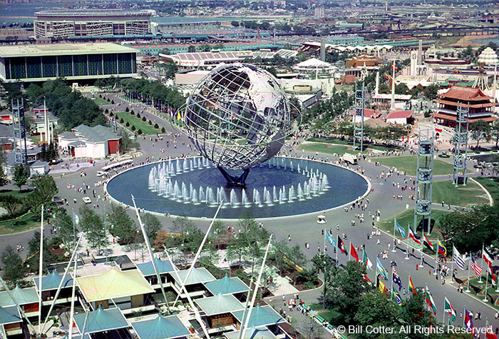
Now, where the Mad Tea Party once stood, you’ll find a scaled version of the UNISPHERE – the steel globe fountain that served as the icon of the Queens expo. The real Unisphere, mind, you, was 140 feet tall – just 40 feet shy of Spaceship Earth. So while Magic Kingdom’s version would need scaled down considerably, this “weenie” would still be an attractive, cooling feature to exist here in this narrow space.
From the Unisphere, Yesterland proceeds in two directions: either turning right and heading toward Tomorrowland, or continuing ahead toward the former Storybook Circus area. Let’s tackle the latter first.
Just to the north resides the relocated ROCKET JETS – a retro embodiment of the Space Age, swirling atop the Yesterland station of the inter-land PEOPLEMOVER. Following that aerial highway deeper into the land, we find to our right WALT DISNEY’S CAROUSEL OF PROGRESS, here proudly restored to its retro rhythm – 1900, 1920, 1940, 1960.
Tucked behind the Rocket Jets, you’ll find the entrance to AUTOPIA – the classic car ride given a proper full-sized installation (rather than the quite boring “Speedway” variety that’s been shortened to within an inch of its life at the real Magic Kingdom). One little element I really like is that the Autopia’s ’60s cars eventually putter their way into the PRIMEVAL WORLD – a giant dinosaur diorama visible from either the Autopia or the Railroad. Perhaps an ode to roadside tourist traps, the mix just seemed to make sense.
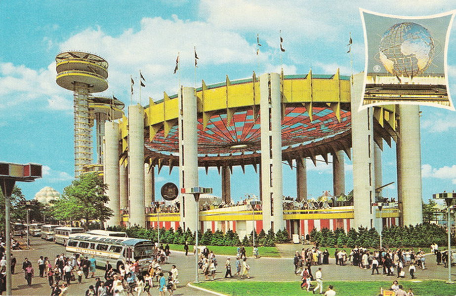
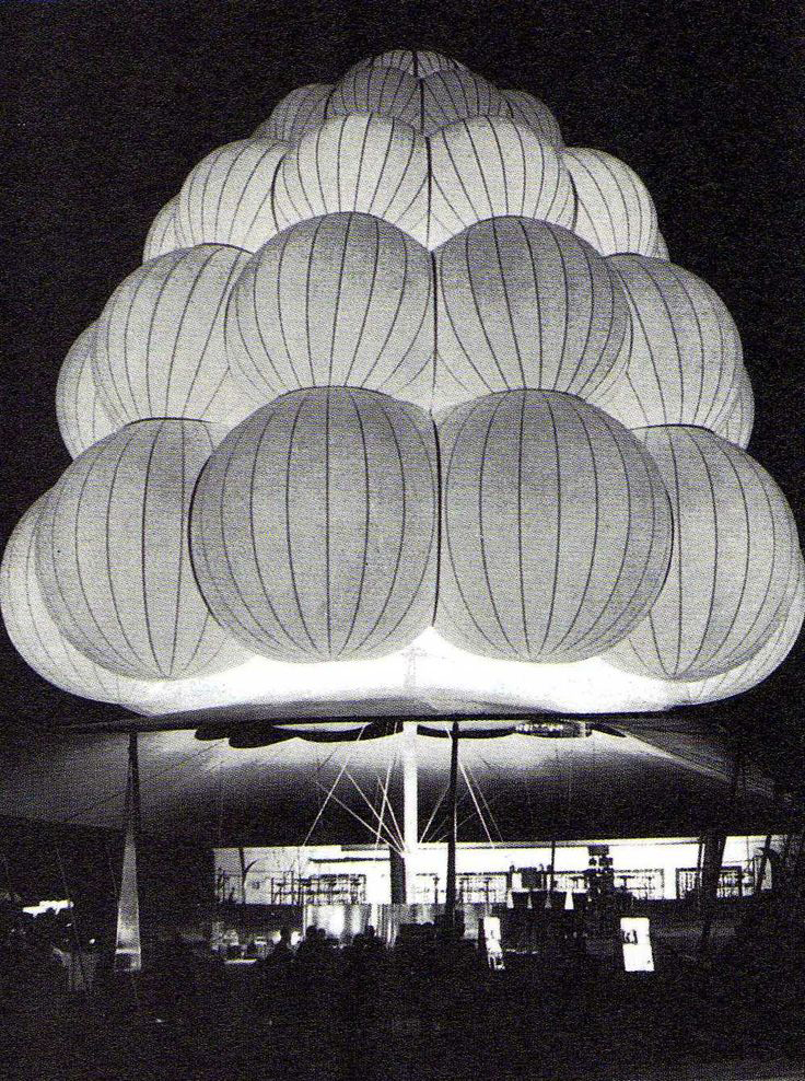
Across from that is CAFÉ 65 – a Quick Service eatery where guests dine beneath the iconic flags of the New York State Pavilion (still standing to this day in Flushing Meadows). Nearby on my map, you’ll see a snack stand labeled. The main food vendor for the Fair was a company called Brass Rail, whose snack stands were designed to be instantly recognizable: they look like inflated pyramids of white spheres. I love that idea, and included a snack stand with the same aesthetic at the land’s far end.
Speaking of which, having made it all the way to the very rear of Yesterland, you’ll be treated to a much-loved backdrop for the space. Yep, it turns out that when we cleared “it’s a small world” out of its space in Fantasyland, it was only temporarily. In fact, the classic IT’S A SMALL WORLD has been relocated here as a tribute to the original version that ran at the fair – a Disney-designed production for the Pepsi pavilion, supporting Unicef.
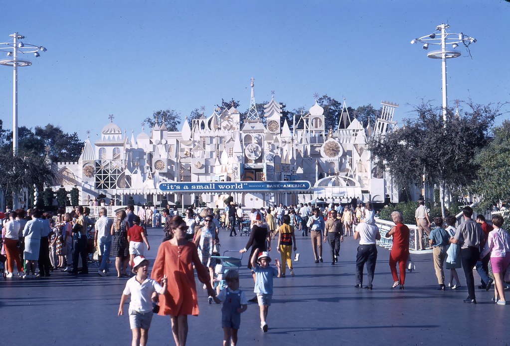
I’ve gone ahead and given the relocated Magic Kingdom version the facade it’s always needed – the beautiful, kinetic, Rolly Crump-designed face that every other Small World enjoys. And just like at Disneyland, it works out perfectly that the Railroad passes directly along the exterior in its Grand Circle Tour of the park. You’ve gotta love it.
Also borrowing from Disneyland, the path we’ve just walked – from the Hub to “it’s a small world” – is the park’s new Parade Route! Yes, I’ve added new parade storage facilities behind the scenes here, so the parade would head out of the backstage gates, past Small World, around the Rocket Jets and Unisphere, then across the new, widened bridge between Inner Space and Clocktower Gardens, depositing the parade at the Hub for a trip down Main Street. Is it perfect? Well, no. But for a build-out, it works!
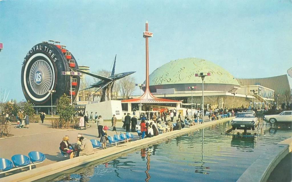
The last, flag-lined street of Yesterland – the one heading toward Tomorrowland – is where you’ll find the MOONLINER DINER – a retro-cool Table Service eatery complete with Circlevision views of the moon, contained in a dome recalling the (chef’s kiss) Spacearium at the Fair. It’s just too bad there’s nowhere for a rubber tire Ferris wheel.
Yesterland, to me, feels like it gets to bring together discordant elements from Fantasyland and Tomorrowland, recontextualizing them as a permanent ode to the retro-future we love. There’s something about optimistic, timeless, mid-century America that feels like a piece of the country’s story that Magic Kingdom – a park very steeped in patriotism – should tell. Now, that vision of tomorrow gets to exist here, preserved, with its messages of world peace, the hopes of the atom, and the wonders of space crystalized.
NEW! YESTERLAND
RIDES
- It’s a Small World
- Walt Disney’s Carousel of Progress
- Rocket Jets
- PeopleMover
- NEW! Adventure Thru Inner Space
- NEW! Autopia featuring Primeval World
RESTAURANTS
- Clocktower Gardens (QS or S)
- Waffle Shop (QS or S)
- Café 65 (QS)
- Moonliner Diner (TS)
That allows Tomorrowland to finally embrace a fantastic and otherworldly view of what the future could hold from today’s point of view…
TOMORROWLAND
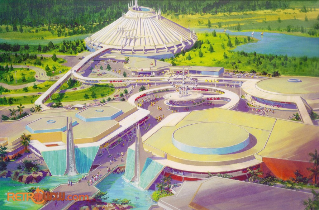
Having tackled so much, we arrive at last in Tomorrowland. Tomorrowland has gone through several iterations – from classic ’71 (now embodied in Yesterland) to a dark, interconnected sci-fi bout in the ’90s, and now into… well… basically a land of cartoons that happens to have mixes of Space Age and sci-fi-mechanical white and metal architecture.
Tomorrowland is tough. Every other land in Magic Kingdom is at least convincing as a real, physical place. Frontierland is a “town.” Adventureland is an “outpost.” Liberty Square is a “village.” Grizzly Valley is a “National Park.” More to the point, each is set at a particular time. That’s what Disney Parks do so well, right? Historic and idealized. So what do you do when you try to hold an environment to the same standard and there’s no real world precedent to build off of?
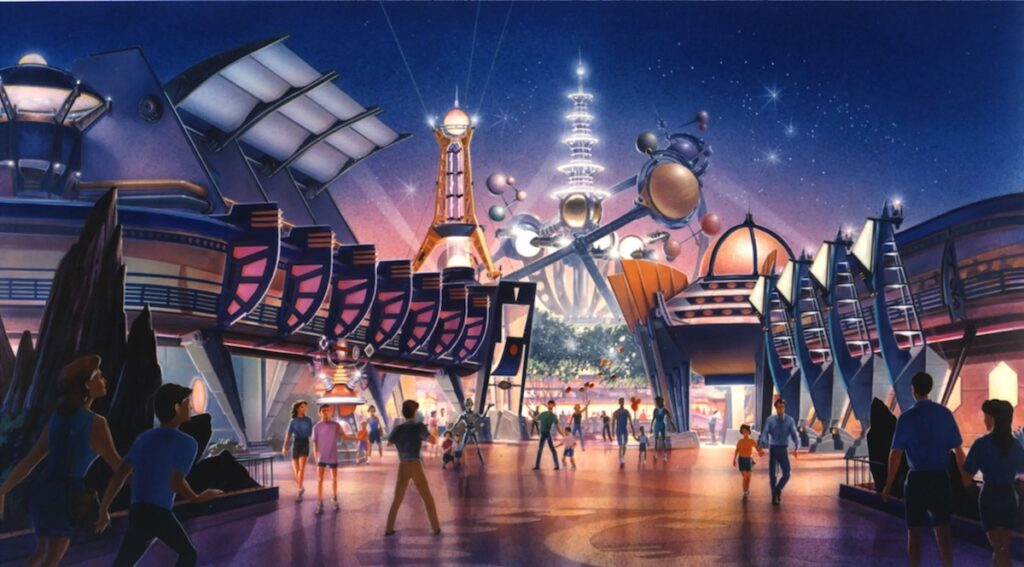
The 1994 “New Tomorrowland” (anchored by the Lost Legends: Alien Encounter and The Timekeeper) certainly did that in pieces, painting the picture of a sort of dystopian alien spaceport; the downtown of a kind of a “sleazy” neon city. It offered a weirdly dark, “tech deco” future that was in places imposing and in others zany. There’s a reason so many of us Millennials remember it fondly. It was bold. Brash. Ambitious. Different. And obviously, it didn’t work. Within three years, Toy Story had arrived, and no Tomorrowland has looked back since.
I don’t think we’re wrong to want the same for Tomorrowland – for it to be a particular setting; a distinct environment that makes sense as a physical place. But I think that what makes a good Tomorrowland feel good is just fundamentally different from what makes any other land strong. It’s not really about a cohesive narrative, or that it convincing passes for a real, habitable place. I would venture to say that no Tomorrowland has been made stronger by some retcon decor that pretends that Space Mountain is a city spaceport. Even though I think the idea of the PeopleMover as one line of a real alien city’s public transit is a cool idea, it clearly didn’t matter to guests.
So I think I might offer that what makes Tomorrowland successful is when it’s a visually compelling environment that offers many flavors of experience that propel us forward. I don’t think there’s anything wrong with Disney and Pixar characters being a part of that. But when we go full toy box and have Toy Story, Finding Nemo, Lilo & Stitch, Monsters Inc, and not a shred of anything meaningful… we’ve just lost the plot.
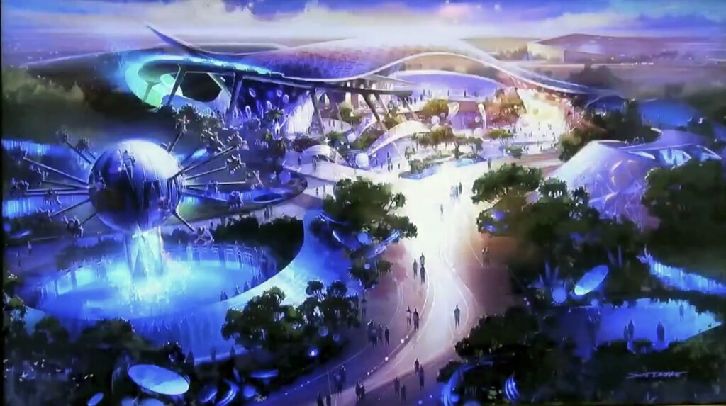
Anyway, having now untethered Tomorrowland from the need to keep a foot in the past and to preserve or at least harken to some retro-remembered version of the land, we can now make this a vibrant, playful space; one focused on the hopes and fears of a future that may never really be; of the stories we tell about tomorrow and the images of it that we share; of other worlds, of other beings, of science, science-fiction and science-fantasy. The possibilities are endless, and as long as we get the wrap right, a whole lot can work. So on the next page, we’ll see how I did…
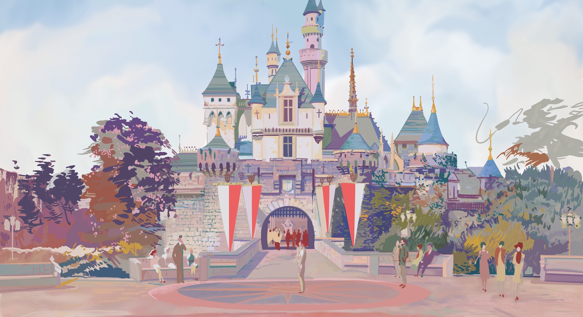


Curious as to how the announced plans for Magic Kingdom at D23 this year alter your thoughts for how this was created
The answer is yes and no. I feel great for having ferreted out that the park would end up with both a “villains” land and a “geysers” land (by way of the new Cars stuff). Obviously I prefer my layout since it maintains the Rivers of America, but Disney not activating a lot of the expansion space that I did suggests that it’s not suitable for development in the real world for one reason or another.
Magic Kingdom was a hard park for me to play with because like I said too many times in this write-up, I don’t really love it to begin with. I think this is a good build-out, but I like the final product a whole lot less personally than I like my California Adventure or Islands of Adventure build-out… I just can’t know if that’s because I like those parks better to begin with and had more fun making them, you know? Haha. I didn’t make this layout for me, necessarily, but for people who I know love Magic Kingdom and want a build-out that embraces its scale and its Americana and its ’70s-ness. I also think it’s the least “reasonable” build-out I’ve done because it’s so largely character-free in a way that’s not at all realistic. Disney would sooner shut the park down than expand Frontierland like I did, or add a ’60s World’s Fair mini-land. It’s outrageously off-the-mark in that way!
I do like your concept for frontierland, although I think replacing splash mountain with a train themed ride when it’s RIGHT next to two other train themed rides is a bit redundant. It would probably have been wiser to replace it with a different flume ride, because even though you did add grizzly river run in elsewhere, a mix between western river and splash mountain would have been better.
im gonna say this is a great buildout i mean its awsome and great ideas for magic kingdom i do wonder if youre ever gonna do another castle park?
Hiya! Thanks for checking it out! I don’t know exactly what I’ll do next, but Castle Parks are hard since they’re so beloved (making it hard to change things) and often quite full. So, we’ll see!
yeah i do imagine its hard to change castle parks but still you did a great job and i think the changes you made are really good. i cant wait to see whatever you have in store next!
I love this buildout! splitting tomorrowland into two parts seems like a new and good step in fixing the “tomorrowland” problem.
What software do you use for creating these buildouts?
Hello! Thanks for reading! I hand-draw these on Procreate on an iPad with an Apple Pencil. Hope that helps!
Big fan of your buildouts! The idea of splitting tomorroland into two parts seems like a good step in solving the “tomorrowland” problem.
What software do you use to draw your buildouts?
Just finished reading the entire build out, word for word. I am genuinely sad it’s over. This was amazingly written, had beautiful illustrations and fantastic ideas. I want to read more about the individual attractions that you have created! Thank you for putting the work into this magical build out!
(Have you considered creating a print off your reimagined MK? I would definitely buy one if you did!)
Thank you so much for saying this! It’s truly the highest praise I could ever hope for, because this is a lot of reading… ahha! I do have some designs on shop.parklore.com, but if you want a print of this I’d be happy to add one! Just let me know. I appreciate you!