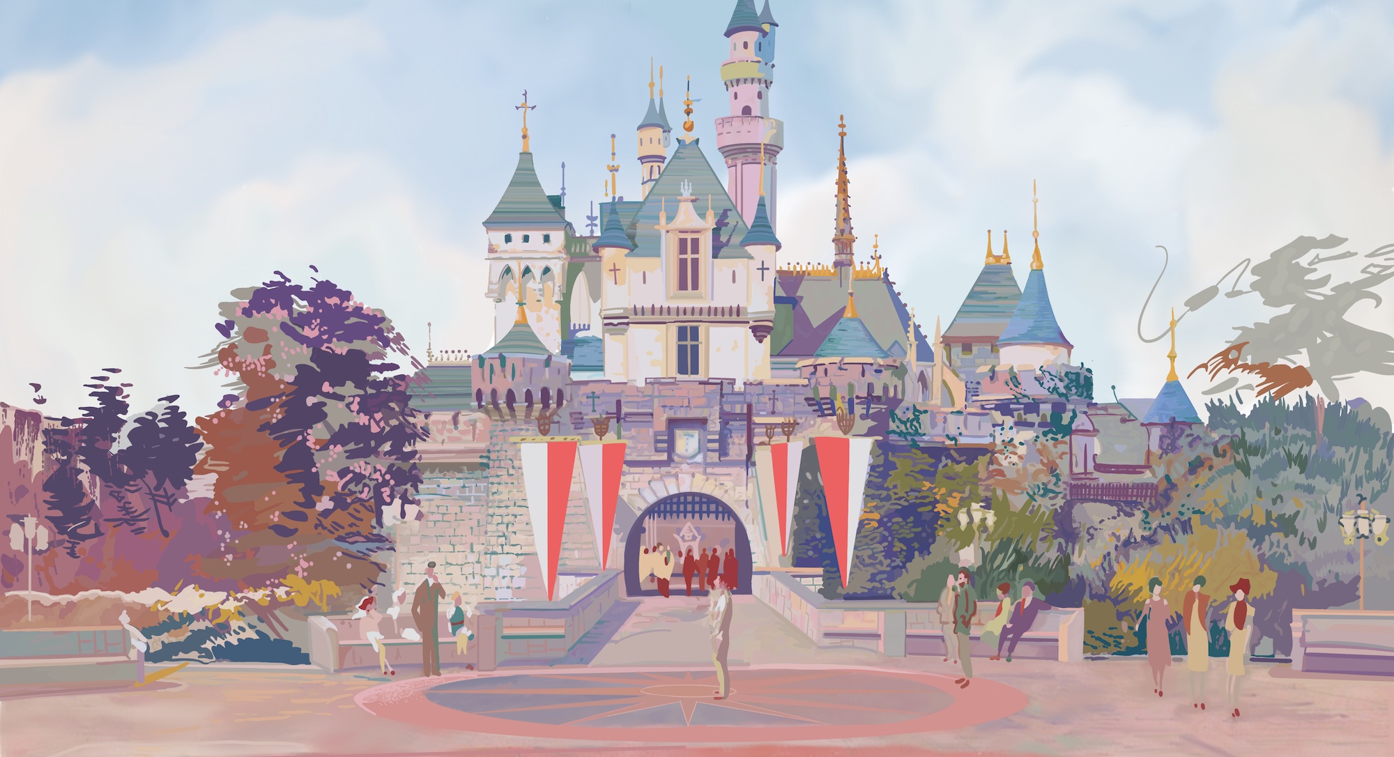
8. UNIVERSAL ORLANDO
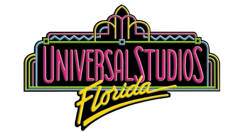
The Universal Studios Florida logo that the park opened with in 1990 was actually borrowed from its older sister, Universal Studios Hollywood, where the neon-inspired graphic had been in use for two years prior (but, of course, with “Hollywood” spelled out in neon script. Bright, bold, and bathed in the neon fluorescence of the late ’80s and early ’90s, the logo was quite a statement about this park’s pulse-of-pop-culture lineup.
But in the over-thirty-years since, a whole lot of change has come to Universal’s studio park in Florida both in its ride lineup and its surroundings, leading to lots of logos. We’d basically group these into four eras…
1. Universal Studios Escape Era (1998 – 2002)
Just before the New Millennium, the existing Universal Studios Florida found itself recast as just one piece of a larger complex. Even before Disneyland, Tokyo Disneyland, and Disneyland Paris would be joined by “second gates,” shopping districts, and on-site hotels beginning in 2001, Universal’s leap to a multi-day, multi-park property took the form of an all-at-once, master-planned expansion.
To communicate that the single Universal Studios Florida was now part of a larger destination, Universal coined the name UNIVERSAL STUDIOS ESCAPE as a moniker for the umbrella property. Tied to an international marketing campaign centered on the mysterious phrase, “Are you ready?”, Universal Studios Escape was meant to draw on the daring, mystical, otherworldly, literary ethos of the resort’s new theme park and that now, the expanded property was a multi-day “escape” from the real world.
The original, eight-year-old studio park lost its neon-inspired opening day visual and upgraded to a new logo recalling the film studio’s cinematic vanity label and its custom, cinematic typeface. The new UNIVERSAL STUDIOS FLORIDA logo retained the saturated colors and dimensional textures of the era, but introduced a new design convention shared by all Universal Studios-branded parks to follow, of the park’s named ringing ’round the Earth – in this case, on a literal bronze ring (despite the fact that Earth doesn’t have any rings).
The new park, meanwhile was called UNIVERSAL STUDIOS ISLANDS OF ADVENTURE. A next generation park comprised of owned and acquired “IP lands,” Islands of Adventure’s logo reflected the park’s marketing: a golden compass containing the Universal globe ringed with lines of latitude and longitude, suggesting discovery, travel, and seafaring. With “Universal Studios” arching across the compass, a modified Friz Quadrata typeface – fading from red to yellow – spelled out “the park’s name “Islands of Adventure,” sweeping away in a perspective reminiscent of the fabled Indiana Jones / Raiders of the Lost Ark logo.
Meanwhile, the retail and dining district connecting the two neighboring parks was called UNIVERSAL STUDIOS CITYWALK. Just reviewing the bolded names above, perhaps you can already sense where the issue arose – “Universal Studios Florida is now Universal Studios Escape with Universal Studios Islands of Adventure, too.” Huh?
It certainly didn’t help that the Universal Studios Escape marketing campaign and the “Are you ready?” tagline were almost intentionally abstract and obscure, playing coy with images of Spider-Man and dinosaurs, but never really explaining what “Universal Studios Escape” was, how it was different from the old “Universal Studios Florida,” and what, exactly, “Universal Studios Islands of Adventure” and “Universal Studios CityWalk” even were. It turns out that Universal’s rebranding was a swing and a miss, self-sabotaging any threat that Islands of Adventure might’ve otherwise been to Disney’s dominance in Orlando…
Via the “School of Hard Knocks,” Universal proved how not to tell the public about a new theme park – a lesson Disney no doubt considered when it launched the Disneyland Resort with Disney’s California Adventure Park just a few years later. Of course, by that time, Universal was already working on a redo of its own.
2. Universal Orlando Resort Gen. 1 Era (2002 – 2017)
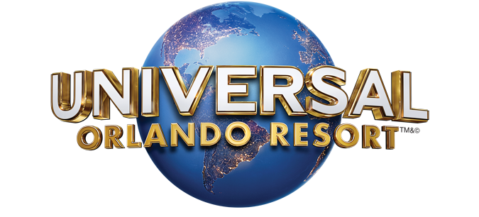
In 2002, Universal Studios Escape officially became the UNIVERSAL ORLANDO RESORT – a clearer umbrella brand for the destination answering the “who, what, and where” that Universal Studios Escape did not. Clearly compatriots with the Universal Studios Florida logo unveiled back in 1998, the new Universal Orlando Resort logo featured the corporate name in its Copperplate Gothic font ringing around Universal’s colorful, texturized ’90s globe with a teal, Rapier brush script “Orlando” and a trailing “Resort” modifier. All in all, a no-brainer.
There really wasn’t a need to change the logo for UNIVERSAL STUDIOS FLORIDA. If anything, the Resort’s branding had been backwards engineered from the park‘s, which had been designed to complement the company’s. Get it?
However, Universal did make an essential edit to the rest of the property’s pieces. In retrospect, it’s easy to see that the possessive “Universal’s” makes more sense as a shared prefix than “Universal Studios.” So in 2002, the resort’s second gate was officially renamed UNIVERSAL’S ISLANDS OF ADVENTURE. Though the swapped prefix may be the most instantly apparent change to the logo, take another look. the “Islands of Adventure” also switched from text that fades from red to yellow to solid red, and the sweeping perspective toward a single point was vastly reduced – likely for legibility.
In other words, the “Universal Orlando Resort Gen. 1” package was visually very aligned, and stood as the longest-lasting visual package for the resort at 15 years. But times change, and so do parent corporation identities…
3. Universal Orlando Resort Gen. 2 (2017 – 2023)
In 2012, Universal Pictures (under the brand new ownership of Comcast) debuted a new logo for the studios’ 100th Anniversary. Generally ridding the logo of its ’90s texture and color saturation, the cooler, crisper logo took a while to fully roll out across the company’s many divisions. It wasn’t until 2017 that Universal Parks & Resorts caught up, coinciding with the debut of the UNIVERSAL ORLANDO RESORT logo, above.
Most contemporary rebranding efforts basically amount to the brand name being printed in Helvetica typeface, joined by a mono-hued icon flattened and simplified to the point of abstraction. The new Universal Orlando Resort logo does drop Copperplate Gothic in favor of a san-serif typeface, but it still manages to retain the Universal logo’s dimensionality – and with it, the appearance of “curving” around the globe.
Speaking of which, the earth behind it has now revolved just a hair (enough to see Europe and a tease of West Africa) and has also switched to a night view, seeing patchworks of cities connected by streams of light. It’s a simple – but effective – change that cools the color palette, freshens and modernizes the iconic globe, and yet sticks close to both Universal’s old visual package and the parks’ corporate parent.
This time, it was UNIVERSAL STUDIOS FLORIDA that got a logo change, falling in line with the corporate and divisional branding. Still, there’s a smart scaffolding to the Russian nesting dolls of identities in both the Gen. 1 and Gen. 2 families given that at the resort level, UNIVERSAL expands to fill the width of the entire graphic, whereas at the park level, UNIVERSAL STUDIOS rings the globe. That at least works to visually tier the resort as a step above the park, even as they otherwise mimic each other.
Arguably, the logo for UNIVERSAL’S ISLANDS OF ADVENTURE began here to feel like an outlier. After all, while both the Universal Orlando Resort and Universal Studios Florida logos became reflective, metallic, dimensional, digital vectors, the logo for Islands of Adventure remained unchanged since 2002, and conceptually unchanged since 1999. That was probably okay. Even if the wonderful, colorful logo looked more hand-drawn and saturated than modern Universal branding, it was a great fit for the park.
Coinciding with the “Gen. 2” branding package, Universal opened a new, on-site “water theme park” called UNIVERSAL’S VOLCANO BAY. On one hand, the waterpark’s logo is decidedly minimalist, modern, and flat, in keeping with contemporary corporate design standards. But there’s also a unique complexity, with a custom, geometric font used for the “Universal’s” and “Water Theme Park” tags, and a sort of mid-century, tropical font (that’s very similar to Screwby Extra Condensed Bold) as the park’s name. It’s topped with a simple, three-brush-stroke icon of a volcano (the park’s Krakatau) and a curling wave.
Similarly, “Gen. 2” introduced the first significant redesign of the logo for UNIVERSAL CITYWALK – unfilled, overlap-kerned block san serif letters, with “UNIVERSAL” and “ORLANDO” contained in lime green boxes on either side. It’s minimalist, modern, and “flat” in the same way that Volcano Bay’s logo was…
Then, in 2019, Universal finally fessed up to its worst-kept-secret: they were building a third main gate in Orlando…
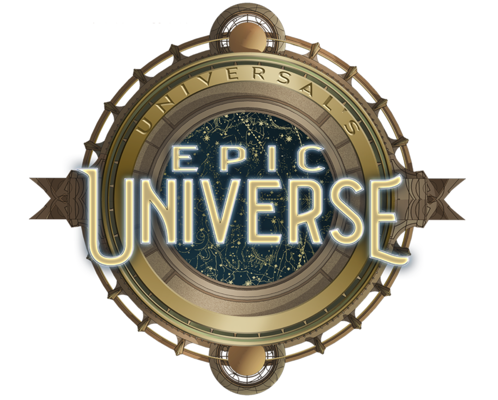
Set to debut in 2025, UNIVERSAL’S EPIC UNIVERSE introduced a spectacular new logo of its own. Recalling Islands of Adventure’s nautical compass, the new park’s logo was comprised of an astrolabe – an antique tool used for mapping the night sky. The bronze device was itself ringed with intricate patterns and art deco accents with a background comprised of golden stars on a dark blue background. With “Universal’s” etched into the astrolabe’s frame, the glowing name “EPIC UNIVERSE” in a custom type is legible, attractive, and unique.
More to the point, scroll between the logo for Islands of Adventure and Epic Universe and you’ll see that while these parks are surely sisters, they read very differently – gold vs. brass; ocean vs. stars; pulpy, vivid, colorful Indiana Jones type vs. something cosmic, art deco, and slim…
But just reviewing the six logos contained in this “Gen. 2” sub-section, it’s clear that Universal Orlando’s branding was speaking several languages. The resort and Studio park were corporate mimics; Islands of Adventure and Epic Universe sharing dimensional, detailed, hand-drawn qualities; then Volcano Bay and CityWalk as modern, flat, 2-D text treatments. But would it be possible to develop a visual style that could unite all of the resort’s pieces in a common language? Well…
4. Universal Orlando Resort Gen. 3 (2023 – 2023)
In March 2023, Universal announced that its Universal Parks & Resorts division would evolve into the more holistic Universal Destinations & Experiences. Given that the subsidiary had announced a standalone, separately-branded family park for Frisco, Texas and a year-round horror-themed attraction in Las Vegas (in addition to rumors of expansion into Europe and the acquisition of regional parks), it the rebrand felt like a loud and clear statement of an ambitious new mindset.
The resulting division logo (above) adds an arch to the shape of the Universal name, but the real surprise is the globe itself. Now, landmasses are precision cut and flattened, lifted via drop shadow from a flatter, shaded “globe” beneath. In an era when logos must be readable on phone screens and Twitter icons, it makes sense why this globe simply removes any landmasses that would fall “behind” the wordmark and thus impair legibility… but the “removal” of Central and most of South America has drawn some scrutiny.


In any case, the Destination & Experiences brand came untethered from Universal’s corporate identity as a whole, being “upgraded” to its own, standalone branding. Unsurprisingly, that division logo quickly “trickled down” to the properties below. An overnight roll-out on March 8, 2023 saw a new UNIVERSAL ORLANDO RESORT logo (above) appear on Universal’s website and social media.
As it had done twice before, UNIVERSAL STUDIOS FLORIDA likewise swapped its logo to account for the new umbrella brand it resides within. As a matter of fact, you might note that this is the fourth logo for Universal Studios Florida. And largely, it works as effectively as every other logo the park has had. Most visitors probably wouldn’t even consciously notice a change to the logo on a park map or app icon.
However, it turns out that the newly-unleashed Universal Destinations & Experiences branding also prompted Universal to finally sweep through all of its style guide. Yes, it was finally time to make sure that Islands of Adventure, CityWalk, Volcano Bay, and Epic Universe were all speaking the same visual “language.” Unfortunately, that language ended up being early-2000s GameCube game box art with a dash of millennial middle school Microsoft PowerPoint presentation WordArt.
The most surprising was probably the logo for UNIVERSAL ISLANDS OF ADVENTURE. (Notice that the “Universal’s” prefix has been replaced with “Universal” – and in a gold modifier that will be copied and pasted on every other logo – signaling that Universal is making the same move Disney began when California Adventure was renamed in 2010.) The park’s logo lost the colorful, hand-drawn stylization of yesteryear in favor of a hyper-detailed, digital vector compass with a glowing orange core scored by topographical lines. While retaining the Friz Quadrata typeface that’s always been part of Islands’ identity, it’s now switched to a narrow, reflective, WordArt-style silver that’s not easy to read…
The new logo for UNIVERSAL EPIC UNIVERSE still features the general shape of the astrolabe, but the carvings and details have been buffed off. Likewise, the unique, hand-drawn, custom typeface has been replaced with a metallic, dimensional, serif font that heavily recalls WordArt in its mega-sized, drop-shadowed EPIC. Plus, looking between the new Islands of Adventure and Epic Universe logo, do they clearly communicate different things? Would you look at those two logos and expect that the parks they represent have a centering aesthetic, ethos, M.O., or style at all?

When Volcano Bay opened just five years earlier, its logo was flat, modern, and minimalist – very of-the-2020s. Now, the new logo for UNIVERSAL VOLCANO BAY looked like it belonged on store brand bottled water two decades ago, built on an odd visual of a splattering blue “wave” perhaps meant to give Volcano Bay a circular backdrop counterpart to the globe, compass, and astrolabe, but instead just looking like the logo of a Wii game. Then, to match the “dimensionality” of its counterparts, the Volcano Bay text was turned into a dimensional silver WordArt graphic, and – even stranger – the “brushstroke” silhouette of a volcano was kept around, but likewise turned dimensional and gold?
Even the logo for UNIVERSAL CITYWALK changed from a modern, flat look introduced in 2017 to a dimensional, WordArt style (and for some reason, emphasizing “Walk” over “City” by making it neon). Like the rest of the package, it looked almost jaw-droppingly dated – like logos Universal should’ve tried out in 2003 or so, then would’ve replaced with simpler, flatter, more stylized, hand-drawn variations in the mid-2010s.
Say what you will about Universal Orlando’s “Gen. 3” branding package… it does all look like it was drawn from the same design aesthetic… it’s just that it’s an odd, amateurish, outdated one – a smörgåsbord of bevels, drop shadows, and metallic shine very at odds with modern design tastes.
Unsurprisingly, the Internet dogpiled on Universal, swiftly, mercilessly (and to our thinking, appropriately) saying the logos looked like someone fed descriptions of the old park logos into an AI art generator. Weirdly skeuomorphic in an era when designs are trending flatter, the CGI-rendered logos just seemed to lack artistry. As evidenced by Scott Walker’s tweet (above), it was almost inconceivable that these digital vector logos would actually be used in and around the parks, where the stylized, colorful, and altogether simpler designs had long reigned. Luckily, Universal seemed to hear the feedback…
4. Universal Orlando Resort Gen. 3.1 (2023 – Present)
On March 17, 2023 – just nine days after the debut of the new, resort-wide logos – Universal officially pulled the Gen. 3 designs down from its public media assets site. Yep. Barely a week after they’d launched the new portfolio of “GameCube” style logos to Twitter mockery, Universal paused the rollout. (As Twitter users sometimes say, “bullying works.”)
Rather than reverting to the Gen. 2 logos, though, the website was updated to replace each of the Gen. 3 logos with its secondary design. Nearly every corporate style guide provides for a secondary, simplified version of any associated logos – often meant to be used on a monochromatic background or when the logo will be small enough on printed or digital material that the secondary variant will read better than the full version. That’s clearly what we’ve ended up with…


It’s funny – these are just “secondary” versions of the much-mocked Gen. 3 logos… but they work! Probably because the need to remove clutter, dimensionality, and 3-D rendering solves many of the issues people had with Gen. 3 to begin with – the silver shines, bevels, and drop shadows of WordArt text; the odd CGI rendered compass and wave and neon; and the general chaos and busyness of overcomplex, over-engineered designs.
In comparison, the “flattened” variants feel like a matching family of logos that are all speaking the same language – and this time, it’s a good, simple, modern, flat, minimalist language that feels like a sleek, appropriate, stylish fit for the 2020s. That said, these are not final logos on their own rights. (You couldn’t after all, replace the giant logo on Islands of Adventure’s lighthouse with the simple line-work logo above – it would need filled and colored to be made into a dimensional marquee.)
For all we know, the Gen. 3 logos could come back tomorrow. Or maybe, modified versions that aren’t so mockable will be released instead. Or we may never see them again. For now, the “3.1” versions are fine placeholders, and show that there are some really nice foundational elements to the Gen. 3 logos – but sometimes strength resides in simplicity.
Thank you so much for reading. Now, it’s your turn to join the story. If you enjoy spending time falling down the “rabbit hole” of Park Lore’s in-depth, ad-free, member-supported stories, consider becoming a Member for as little as $2 / month.
Members can unlock rare concept art in every tale, reveal attraction audio streams in select stories, gain access to over a hundred exclusive articles in our quick-read Extra Features and in-depth Special Features collections, gain exclusive podcast extras, and receive an annual member card and merch in the mail! (Plus, y’know, supporting research-based, ad-free, clickbait-free, in-depth theme park writing!)