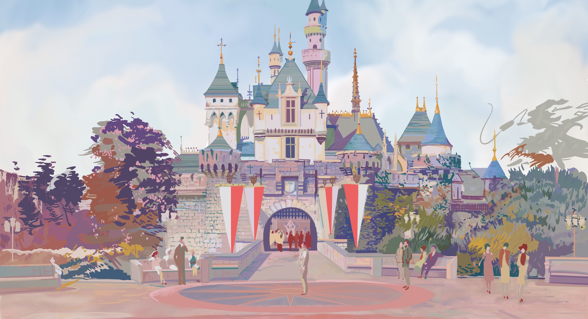
The best theme parks are timeless. Their names and logos? Not always.
Even though so many of Disney and Universal’s theme parks are time capsules, carrying hundreds of years of history between them. Though they may feel like they’ve been around forever, each Disney theme park on Earth is really the product of the time it’s designed in. Colors, typefaces, and even names that makes sense one year may look outdated the next. From time to time, Disney recognizes that it’s time to update the branding of their parks, or even rename parks altogether.
For fans like us, that creates a visual timeline to look back on, seeing the ways Disney Parks have changed by looking at how their names and logos shift! Take a look at the six cases below where major reinventions and surprising name-changes have changed Disney Parks history.
Do you love armchair Imagineering, in-depth storytelling, and seeing the theme parks we love differently? Park Lore is an ad-free, quality-over-quantity, one-person project centered on building a world-class collection of the interconnected stories of theme park attractions, design projects, and industry explorations.
This feature is one that’s usually locked in our Member Vault, where Park Lore patrons can find hand-drawn art, armchair Imagineering walkthroughs, and other in-depth Special Features, as well as quick-read, just-for-fun Extra Features. Thanks to supporting Members, this feature is temporarily unlocked as a preview!
But if you value my mission to provide clickbait-free, ad-free deep dives and new ways to see the parks, consider becoming a supporting Member of Park Lore for as little as $2 / month. That support is what keeps this unique themed entertainment storytelling project open, ad-free, and available to all. Thank you!
1. EPCOT
Fans of Disney Parks are no strangers to change. Growth is simply a part of the parks’ DNA. You know the company line: “Disneyland will never be completed as long as there’s imagination left in the world.” There must be a particular amount of imagination concentrated on Epcot, as its changes have been profound. It’s well-known that Epcot started as Walt’s Experimental Prototype Community of Tomorrow – a living, breathing, functional city he hoped to build in Florida that would act as a blueprint for all global cities to follow.
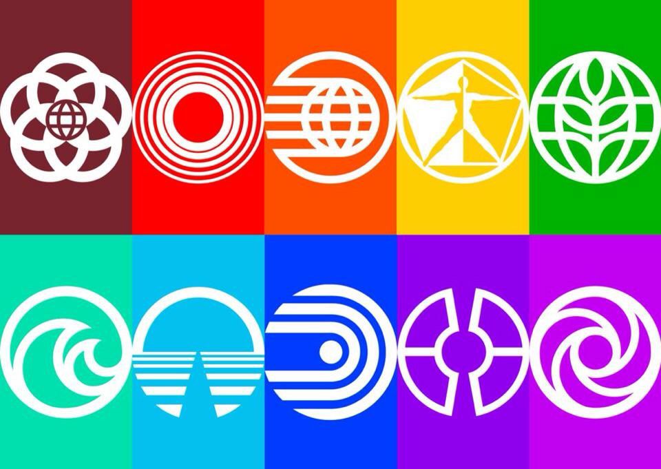
Likewise, it goes without saying that plans for Walt’s EPCOT were abandoned after his death, with Walt Disney World being anchored by a larger version of Disneyland instead. We also know that designers circled around to the concept of EPCOT when they designed the second theme park for the Florida property – EPCOT Center. There, they built a “permanent World’s Fair” with pavilions in Future World dedicated to areas of science and industry (with complementary financing corporate sponsors) and pavilions in World Showcase demonstrating the culture and cuisine of selected countries (with corporations from those countries footing the bill). The logos above are unused concepts Imagineers floated in how best to represent this progressive park.
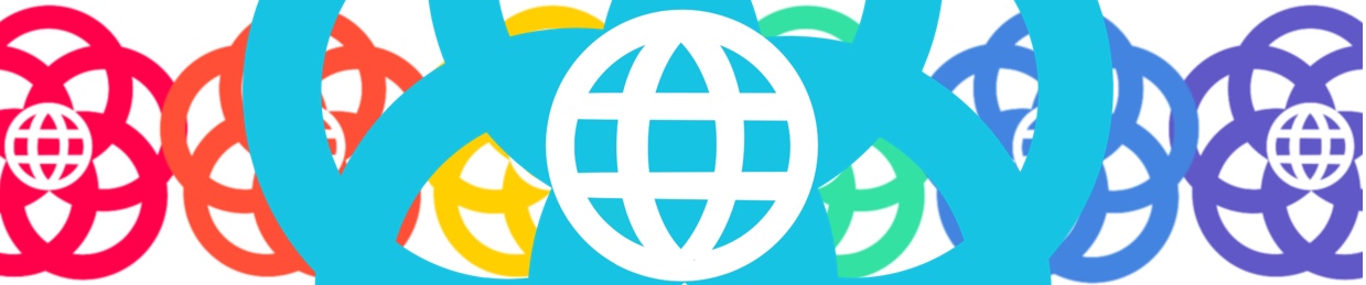
Ultimately, designer Norm Inouye proposed a novel concept: five rings – representing information, technology, environment, education, and entertainment – surrounding a central star. Disney Legend Marty Sklar refined the concept, and the resulting “flower” logo is still an icon forty years later:
The logo developed for EPCOT Center is sheer brilliance in the way it (in Sklar’s words) “symbolizes unity, fellowship, and harmony around the world.” It hints at the larger, intellectual scope of the park with a stylized Earth set inside of a star representing hope. EPCOT Center purposefully did away with fairytales, castles, princesses, and pirates, instead acting as an optimistic and grounded look at the 21st century.
Even still, one of the most iconic visual aspects of EPCOT Center wasn’t its logo, but the custom “World Bold” typeface designed by Imagineer Deborah Lord. Used across the park’s navigational signage, within pavilions, and throughout front and back-of-house facilities, the typeface became a definitive element of EPCOT Center.
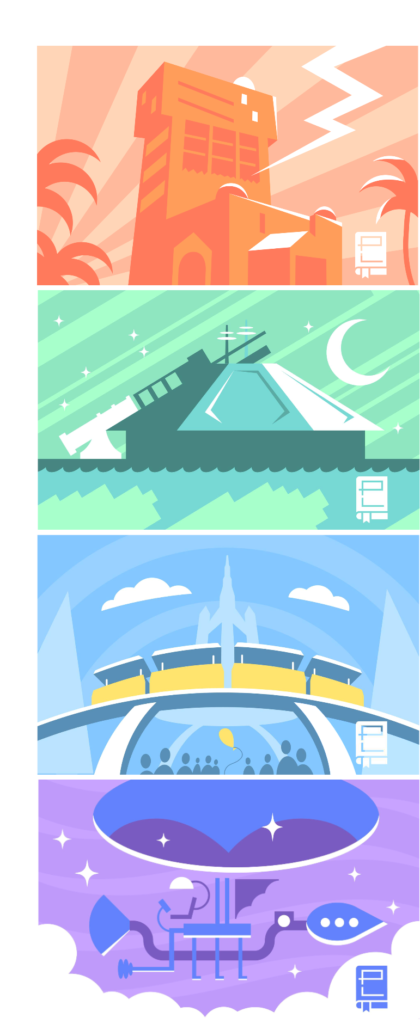
The Seas, Horizons, World of Motion, Communicore, Imagination
Aside from the park’s main logo, Inouye also created individual, contemporary icons for each pavilion. In the end, the results may be one of the most impressive uses of iconography in any park – and surprisingly timeless, at that.
As part of a concerted effort to break from the park’s “edutainment” ’80s roots, the foundational and aesthetic identity of Disney World’s second gate underwent waves of change beginning in the mid-90s. Inouye’s pavilion icons were largely relegated to Easter eggs as the pavilions fell out of sync, with piecemeal swaps for brawn-over-brain thrill rides and character overlays. Before long, ’80s architecture housed ’90s design aesthetics.
In 1994, EPCOT Center’s name officially changed to sentence-case, Center-free, and oddly-timely Epcot ’94. Naturally, the following year its name became Epcot ’95. Then, in 1996, plain old sentence-case Epcot finally stuck. Curiously, the logo during this short era seemingly became any chunky sans serif Microsoft WordArt text treatment of the word before settling on the wordmark below, as still seen on Epcot’s parking toll booth:
This is also when we see the fall of many of the park’s once-firm foundations. In fact, each and every one of Future World’s science-themed pavilions has at least one entry in our Lost Legends series, from The Living Seas to Horizons; The Land’s Kitchen Kabaret to Body Wars in Wonders of Life. In the span of two decades, the transportation pavilion has contained both World of Motion and the original Test Track, while Imagination has hosted both the beloved Journey into Imagination and the ride that some call Disney’s worst ever, Journey into YOUR Imagination.
It all started here in the mid-90s. Shortly thereafter, the park debuted its next logo and identity to shepherd in its Millennium era of characters and thrills:
This Epcot logo has the letters E, p, and t in Berling typeface with the o stylized as the park’s original icon and c stretched as if tracing the trajectory of an orbiting satellite, each colored purple, pink, orange, teal, and yellow. By the mid-2010s, many fans were calling for the retirement of this oversaturated ’90s logo thart seemed at odds with both Epcot’s past and its future. Boy were they on the right track…
At the semi-annual D23 convention in 2019, Epcot was the star. Or should we say, EPCOT? There, Disney finally fessed up to ambitious plans not only to bring the park into the 21st century, but do do it with Disney, Marvel, or Pixar characters. For Imagineering fans, one real win was the debut of a new logo:
Look familiar? Yep, the new EPCOT logo is a beautifully modern refinement of the one used from 1982 – 1994. The next evolution of the World Bold typeface keeps the iconic retro-futuristic shapes with updated weights and treatments.
The end result is a typeface that reflects the retro opening day look, but that’s more tuned to modern taste. The E echoes the original, but it’s rounder and more organic. The C and O even resemble an infinity symbol. Altogether, the new logo is a perfect mix of forward-thinking and reverently nostalgic, just like the park should be.
World Celebration: EPCOT Experience, Spaceship Earth, Celebration, Imagination;
World Discovery: Test Track, Play, Cosmic Rewind, Mission: SPACE (Image: Josiah DePaoli)
…and it even came with the return of matching pavilion icons, too!
2. DISNEYLAND PARIS
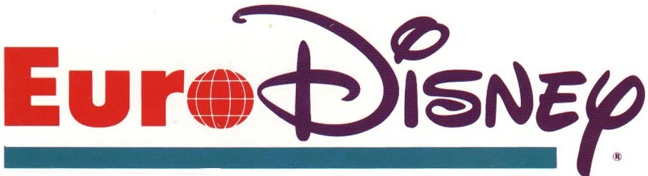
What do you call a brand new Disney destination resort meant to serve all of Europe? The Euro Disney Resort, of course! Except…
When the Euro Disney Resort opened in 1992, it had just a single theme park (Euro Disneyland). Of course, it also boasted a jaw-dropping seven hotels to accompany it. Especially given that the very concept of a Disney Park near Paris had endured years of embattled resistance from French politicians and press that had practically made a pariah of the place, it turned out that Euro Disney Resort had far, far too many hotel rooms, restaurants, and service facilities, and far, far too few guests.
Overbuilt and bleeding money, Euro Disney Resort was enough of a failure to turn CEO Michael Eisner off from any large-scale projects, cancelling and closing rides across the globe. Eisner even suggested aloud in the media that Euro Disney might close altogether.
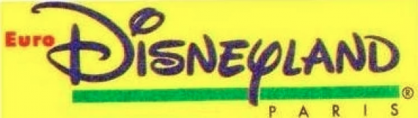
But as part of a concerted effort to right the sinking ship, Disney did some quick rebranding. In late 1992, marketing began to refer to the property as Euro Disney Resort Paris in an effort to build a more direct association with the tourist-friendly City of Lights rather than the broad and geographically diffuse idea of Europe. It was the first of many small changes to come.
For example, Disney’s ongoing evaluation reportedly showed that while “resort” meant one thing in the U.S., Europeans associated the word “resort” with luxury beachside villas or mountaintop ski lodges… Obviously, neither was anywhere to be found in the remote, agricultural, pastoral Marne-la-Vallée outside Paris. In June 1994, Euro Disney Resort was quietly renamed Euro Disneyland Paris with “Euro” becoming conspicuously smaller in the updated logo…
It was a short-term transitionary test to eventually tackle another sticking point: the word “Euro.” Eisner spoke presciently about the naming misfire, stating “As Americans, the word ‘Euro’ is believed to mean glamorous or exciting. For Europeans it turned out to be a term they associated with business, currency, and commerce.” (The 1994 change was good timing. The “euro” would become the shared, common currency of European Union countries in 1999, making the prefix even less warm and fuzzy.)
In autumn 1994 – just four months after adding “Paris” – “Euro” was dropped and a new logo debuted:
In October 1994, the resort was renamed Disneyland Paris while the theme park became Parc Disneyland (French for “Disneyland Park”). Eisner continued: “Renaming the park ‘Disneyland Paris’ was a way of identifying it with one of the most romantic and exciting cities in the world.” In retrospect, the new logo retained the distinctly ’90s colors and shapes of the original, but succinctly identified the property accounting for European culture.
One of the unfortunate cop-outs that came from Eisner’s low-budget strategies post-Paris was a contractually-obligated second theme park for the French resort. The subject of its own Declassified Disaster: Walt Disney Studios Park, the second gate was bad… no, really bad… Maybe the worst park Disney’s ever built. It didn’t matter. Disneyland Paris contained both Disneyland Park and Walt Disney Studios Park, which meant it needed a new logo:
In 2001, the original Disneyland back in California had become the Disneyland Resort thanks to the opening of a second park and thus, the need to more clearly differentiate the property’s “Castle Park” with the broader name of the destination. Memories can be short at corporate Disney, so it wasn’t much of a surprise when – despite the agreed-upon misfire of the “Resort” term less than a decade earlier – Disneyland Paris opted to follow its older sister, becoming Disneyland Resort Paris.
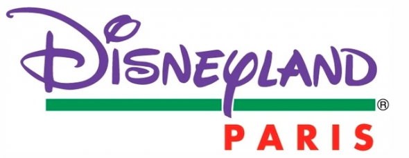
At least axing the ’90s color palate, the updated resort logo was meant to convey that there were now two theme parks to visit – one with a castle, and one with a studio water tower donned with Mouse ears. It worked, but only until word spread that the new “studio” themed park was a bust. In 2009, Disney came to its senses and rebranded the resort once more in time for its 20th anniversary. Naturally, a cleaned up logo came along with the celebration:
Disneyland Paris‘ logo cleanly utilizes the corporate “Disney” script with a complementary “land.” (Each Disneyland across the globe uses a localized or otherwise specific typeface for “land.”) It’s clean, bright, simple, and communicates to Europeans and tourists the two most important things about the property: Disney and Paris. Voila. Check out the park and resort’s unbelievable twelve distinct logos in 25 years here.